Saturday, August 6, 2005

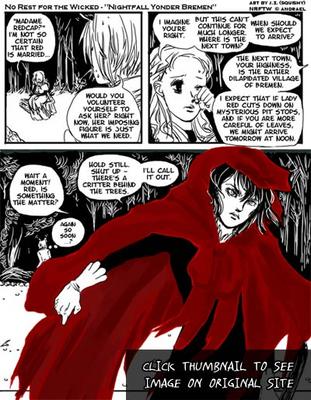
Stopover at No Rest for the Wicked and Nightfall Yonder Bremen: Well, I'd say it's a pretty good indicator...

Ok, there are few comics out there that I can genuinely admit to waiting breathlessly for updates because they have me hooked so badly. But I can certainly say Andrael Peterson's No Rest for the Wicked is one of them.

For those of you who need an introduction to NRFTW, I point you towards the 6th Leg of the blog, which is where I fins stumbled across it (and was very very very glad I did).

But what I want to talk about today isn't NRFTW. Instead it's the little bit of news that's currently on the front page of NRFTW.

You see, No Rest for the Wicked now has its own fancomic.

It's called Nightfall Yonder Bremen, and while it has barely started, it shows a lot of promise, seems competently executed and most importantly, tries to stay faithful to the original material.


I can't help but wonder how many webcomics out there have their own well... fancomics? Heck, some of the more popular webcomics out there ARE fan-comics (See Powerpuff Girls Doujinshi). Sure, many have had guest comics and fan art. A few have fan-works like fanfiction... but a fancomic of a webcomic?

At the very least, it does say something for No Rest For the Wicked. I'd say that it's a pretty good indicator of being a good read. ;)

Thursday, August 4, 2005

Stopover at Astronaut Elementary: The WCN Effect

I'm not sure how I missed it, seeing that it was on Websnark, but Dave Roman's Astronaut Elementary apparently moved from GAM to WCN, which is the webcomics equivalent of shifting rooms in the same building, except that one is behind the subscription curtain and one isn't.

I like Dave Roman and his stuff, and naturally his being able to unleash his creativity unrestricted upon the rest of the webcomics world can only be a good thing in my view. But I can't help but wonder about this new shift in direction, especially when I know Dave isn't the only one to be/who will be doing this.

From the point of view of Joey Manley of course, it probably wouldn't make that much of a difference, because whether it's Girl-a-Matic or Graphic Smash or WebcomicsNation, they'll all under the Modern Tales umbrella. Still, I can't shake off the feeling that things are going to change a lot after this. Like it or not, the WCN effect is in motion, and I highly doubt that there is much anyone can say or do to change that.

Ps: I realise that with that last link I am admitting to reading the webcomics tabloid, but tee hee... that silly stuff is interesting sometimes. ;)

32nd Leg: Cartharsis

After a nice long rest, we're back to travel the world of webcomics again! Today we're continuing from where we left off. If you recall (I highly doubt you do, it's been a heck of a time) the last time I was over at Super Hero Vindibudd and the banner of the ninja-cat caught my eye, leading me to...



Comic: Catharsis
By: J. Boeke

Setting and Elements: Modern Day, Slice of Life, Surreal
Content Type: Adventure, Drama, Humour, Severe Cuteness Overload ;)

Art Medium: Inked and coloured, Later Strips appear to be drawn digitally.
Art Style: Hand-Drawn, Stylised, Mix of B/W and Full-colour

Is About: Gwen, who happens to have a dragon as a pet in her apartment... along with a bad-tempered squirrel... and a ninja-cat... and a colony of dust-bunnies and fluffs...

Website: http://www.catharsiscomic.com
Frequency: Daily
Availability: Free

First Impressions and Presentation:
The dragon and stuff looks familair, then I realise that I've seen Catharsis being endorsed by Adis over at Count Your Sheep before. Other than the given that if Adis endorses a comic it's probably good, the art looks really good, especially the dragon.

The website is simple, but enhanced with lots of em... tribal-looking... erm cherries(?) that make up the navigation. I have to idea what they are but OMG they are cute!


The Concept:
Comparisons to Calvin and Hobbes in envitable in this genre, because it's well, the story of a kid and his/her imaginary friend. Now imagine what happens if the kid has grown up and has to take on the challenges of being grown up, but the imaginary friend isn't imaginary but mythical instead. And despite the kid having grown up, she's still very in-tune iwth her inner child. Heck, she even turns into her inner child from time to time.

That's pretty much describes the concept behind Catharsis.

The Art:
While early art is done in grayscale, and differs from what you see on the front page, art is always competent, done in a very individual semi-realistic but stylised cartoony art-style. As the series progress, the art keep improving dramatically until it reaches the very attractive a recognisable stuff you see on the front page.

The artist seems to particularly excel at (how can I say this without sounding idiotic?) drawing cute stuff. Ranging from the balls of fluff with darling beady eyes to the crazy tribal cherries and naked squirrels, the plethora of of excellent cute character designs never fail to astound me.

There's not much background in most of the strips, but where there's a need for them, they're there and competently executed. All in all the art while although not jaw-droppingly awesome, is excellent in a comfortable sort of way, and very distinctive, which most of you know by now scores major points with me.


The Writing:
As good as the art is, the writing for Catharsis is the major pull. It alternates between 'funny' and 'light-drama', but it never lets itself get too serious, and the jokes are consistently funny. JB also has the knack of capturing those 'slice-of-life' moments that most of us have been through, like constantly making a fool of yourself in front of the cute guy from your building, or those awww when something bad happens and all you have is your dragon friend to hug.

The thing that makes my cup run over, however, has to be the characters themselves. Gwen is a very easy character to identify with, while Rremly is endearing, all the more so because of his apparent naivete despite being a dragon with a long lifespan. The other supporting characters have individual personalities that are well fleshed-out. Seriously, when the writer can give three balls of fluff distinct and lovable characters, it's hats off to the creator's writing skills.

Oh, and Bitey rocks.


Problems:
Frequent fillers in the archives are annoying, but given that a comic of this quality updates daily it's understandable, although it doesn't make going through the archives any easier.

Other than that, no major quibbles I can lay my hands on.


Overall:
It's not often that I come across a comic that I start reading and forget that I'm reading, because I'm so caught up in the escapades of the characters. Catharisis is a Find of Finds, and I'm very glad I discovered this little gem.

As an added plus, Cartharsis is suitable for kids to read, which as you remember I was stating not too long ago, is a rare amongst webcomics.

And I want a shirt with one of those cherries on it. :D


The Next Leg:

The Catharsis link page has to be one of the cutest I've ever seen. Being responsible, it even has a ratings system for the links.

The Dementia of Magic looks intriguing. Besides, something with "Magically magnificent!" as a description sounds good ;)
Wednesday, August 3, 2005

Pinging Art #0.6: A Quick Note on Composition and The Importance of Camera Angles

So here I am drawing the last page of The Jaded Chapter 3: Black Earth.

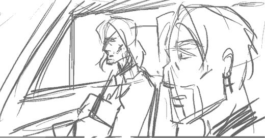
The scene I'm trying to illustrate is Doc Ice sitting in the passenger seat of a car, with Jade in the driver's seat and his crucifix earring very visible. Jade asks Ice a question, Doc answers cryptically.

So here's the preliminary sketch (digital equivalent of a penciled sketch) that I use for layouts.


As you can see, there's nothing particularly wrong with this composition. Everything that needs to be depicted is being depicted, but for some reason, the whole scene just looks rather... boring. It's flat and there's nothing particularly interesting about it.

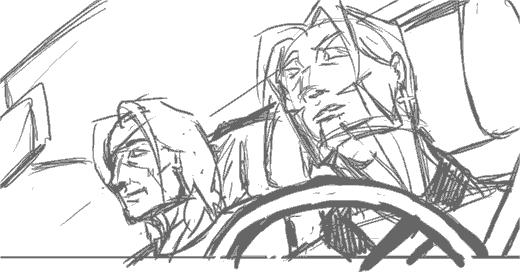
So I decide to give the same scene a second go, this time using a different camera angle and a more dramatic viewpoint. The result:


I really liked this composition. It's important to note that the steering wheel in the foreground helps break up the motony and gives the panel more depth. Unfortunately, at this point, I realise:

  1. British cars have the driver's seat on the right side
  2. I can't flip the image because Jade's earring is on the left ear.
  3. Jade is supposedly nursing a recently broken arm, and shouldn't be driving anyway


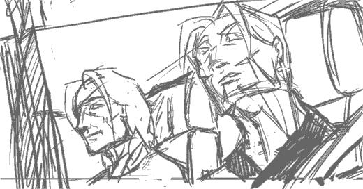
Ok you can laugh at me now. So for the sake of consistency we relegate the two to the back seat, and someone else (presumably Juno or Lysanne) will be driving.


This is kind of a blow because that means I have to remove my steering wheel, but adding the window and the little rain shield at the top of it will help give a kind of frame to the picture. The result is a more 'closed' look, and hence a less empty-looking panel and better comic page overall.

Now back I go to sketching, or T won't be pleased at the state of my buffer! ;)

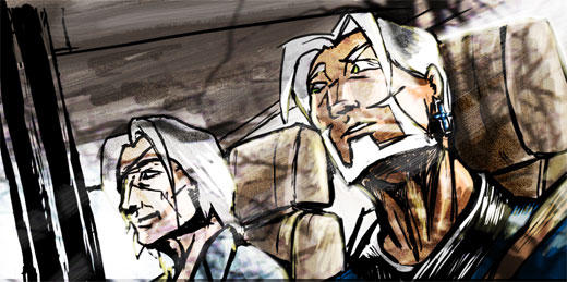
Edit: Thought you might be interested in the final result. I added theoverlay of the trees to give it a reflection-on-the-glass effect. Since it was the last page I thought it deserved something special.


Edit 2: Abby and Mos pointed out the perspective error on Jade's face which I missed, so here's the correction.


Having my mistakes pointed out to be is great, BTW. I can't improve without knowing what I'm doing wrong!

Tuesday, August 2, 2005

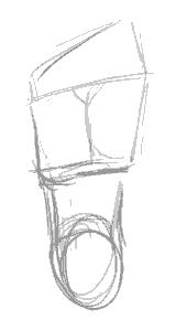
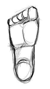
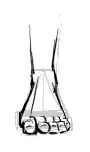
Pinging Art #0.5: A Study of Drawing the Human Foot

Ah, my great nemesis. The foot. Worse than the hand... mainly because I don't get to draw it as much.

So today I decided: "Enough of avoiding the monster!", sat down and devoted a couple hours to studying the human foot.

One thing I hate about drawing the foot is that it's so hard to find detailed tutorials on it. Most books devote pages after page of how to the draw the face, body and hands, but barely include a page on feet as an afterthought. Even the great Loomis glosses over it, which annoys me to no end.

So here I go, Google for reference (BTW, don't google "bare feet" on Image Search. Just... don't). After a solid hours of attempts at drawing feet I won;t bore you with, I realised several things.

1. From the front, the human feet are a major a pain in the ass to draw.

Seriously, that wasn't really a revelation, but I just realised that anew. But back to the other points:

2. The human foot slants to the side.


There seems to be a line from the center of the foot to the center of the big toe which marks the split in directions the foot slants.

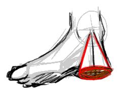
3. The heel is a cone.


I picked this one up from my copy of Action Cartooning by Ben Caldwell (An interesting book I'd recommend). The heel is sort of a cone, aligning with the leg bone at the point.

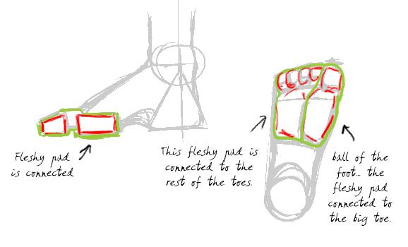
4. The human toes aren't just the bits you see at the end of the foot. They are connected to the pad thing at the base of the foot. (I never realised this before)


Don't forget to click on the image to read the notes I've scribbled on the diagrams. This is probably the most essential thing to understand to have the feet look right. Without the fleshy pads the feet don't look like feet.

5. The toes have joints. (Don't laugh, I should have known, but it just never occured to me)


This is the thing that make toes look like toes. They have to look crimped, otherwise they look unnatural. There's got to be that knuckle like bump and the little gap between the fleshy pad and the toe ends.

So with this new-found info, I'm going to test it out by drawing a series of feet from different positions:


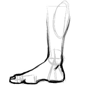
The side of the foot is relatively easy. The important thing is to lay out the fleshy pads and the heels in the right places. The big toe is also bigger than the flesh pad, so it overlaps it.


This is the side of the foot, but from the side of the little toe. More common in view than the other side, it's imparative to note the little toe is smaller than the fleshy pad so you can see a bit of it over the toe end and knuckles.


View of feet from the top. I'm told by a very reliable source (my podiatrist friend) that the fleshy pad sticks out so exaggerating it makes for more realistic -looking feet when there's an in-curve.


The sole. Not particularly interesting, other than being a good map of the layout of the fleshy pads and toes. Note the you can't really see the second joint of the big toe from this angle.


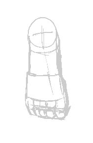
The most difficult view to draw the foot from. You need to have good grasp of geometry and perspective to be able to lay the shapes in line and get the right shape. Important things in making it look right is having the fleshy pad in the right place and showing that it's slightly wider than the toe rows.

And that's it. While I would not like to pass myself off as an expert in drawing feet, I'm reasonably happier and won't be dreading drawing feet the next time they come up in any of my art projects!

Friday, July 29, 2005

Stopover at WebcomicsNation

Webcomics Nation launched today. Granted, I've been a beta tester for WCN for a while so it hasn't really felt very different for me.

I do find myself in an interesting position of course, as you know I'm involved in Comic Genesis (formerly known as Keenspace) and now I'm also in the rival WCN camp. Given that CG is having humoungous teething problems at the moment (Teething? More like sabre-toothed Fangs) it probably couldn't be a better time for Joey to lauch WCN.

Personally, I think WCN is quite easy to use. People have been making comparisons to Blogger and Flickr, and they're almost spot on except the interface isn't as shiny yet. The only thing that recently I realised annoyed me about it is the dubious HCI-design aspect of it, where it commits a cardinal sin in HCI (Human Computer Interface) and has a shifting interface. Bad Bad Bad. You want all your navigational stuff to stay the same if possible.

However, putting up a comic in WCN is something like

1) Press button that says "Add New Page"
2) Press button that says "Upload Comic"
3) Enter date you want comic to display.

It's much simpler, though more restrictive compared to CG, but there are a lot of cool features, such as this "tooncasting" which I would use on a lot of my pages if the green "Hosted by WCN" text wasn't so big and ugly. Automated gallery and cast pages are pretty cool too, I admit. And having free advertising doesn't hurt either.

The price is $9.99 per month, which some people have mentioned as 'steep'. It'll be interesting to see if the price remains there or if it goes up or down.

All in all, I think WCN will be a good thing for webcomics. Anything that makes it easier to put up a webcomic is a good thing, certainly, and I like the idea that there's an alternative for Comic Genesis.

Granted I may have ulterior motives since I help run the Comic Genesis Help Center and less complaining is always welcome ;)

Edit: And it's ad free. I forget to mention that.

Thursday, July 28, 2005

Pinging Art #0.4: A Study of Drawing the Male Torso (Sideways)

Today I'm sketching a logo image for The Longest Sojourn. So here's another grand opportunity for a study of the male anatomy again.


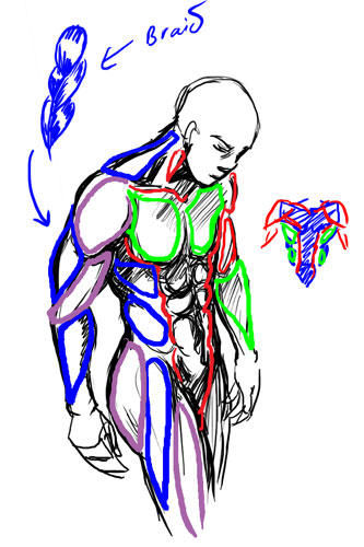
This is based off a reference picture, but some fun things to notice. End of the shoulder muscles (deltoids?) line up with the bottom of the breasts in an arc. You'll also notice I used the symmetry grids from the first study to draw the muscles in. The way of drawing the pelvis and leg-bones is a technique I picked up from Loomis' Mannikins. (Incidentally, Loomis' Figure Drawing For All Its Worth is an amazing book I'd recommend to anyone. You can learn loads off it if you don't mind the textbook approach.


We'll ignore the muscles in green and red, since those were the ones we studied in the Man-Chest tutorial. What we want are the muscles in blue and purple, which are the side view ones.


One thing you'll notice is that from the side, the arm mucles sort of resemble a braid. From this angle the triceps are visible, and the lower arm muscles (It's actually a group of several muscles) stretch over from the end of the bicep to the elbow. This is not really anatomically accurate, but very much simplified. You want detailed muscles Loomis has a very detailed chart.

Another good thing to notice is the huge neck muscle stretching all the way from the nape of neck to the shoulder muscle. Memorise that one.

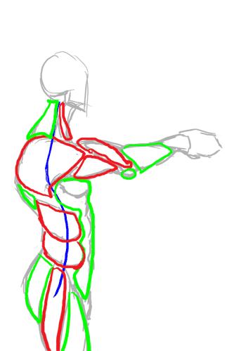
So from this study, we can summarise the visible muscles from the side as such:


And turn them into a chart for easy reference in the future.


Hopefully that makes it easier to draw the male figure from sideways.

Incidentally, for those of you who wondered what was the outcome of this study:


This is the imagemap logo I got after I finished, which hopefully will feature on the next incarnation of the TLS website.