Showing posts with label Tutorial. Show all posts

Saturday, June 6, 2009

Pinging Art #2: Back in Black: It's Not About What's Black and What's White


I've done a couple of different styles of comics, from full colour to sepia-tinted greyscale. But pure black and white is not something that I've really explored or practiced, so it's only been recently that I've really paid it close attention.

I actually did fine-art for my A-Levels, but I try not to talk about it too much lest I be mistaken for a "snotty fine artist". IMHO that fine art attainment is nothing if it doesn't help me improve my comics, and fortunately, something I learnt back then does actually help, even though I didn't figure out how to apply it until recently.

Because I'm lazy, I'm just going to repeat something I said in a discussion over at Bengo's blog about what I discovered about doing art black and white. It's mainly my observation, but:

The bottomline is: doing good black and white requires the artist understand very well the concept of positive and negative space, and how to use it.

So what is this positive and negative space anyway?

The easiest way to describe it is thus:

positive space = important parts of the picture that we want to focus on.
negative space = the parts that are not parts of the important parts.


A lot of people will mistake positive space as "white" and negative space as "black" or vice versa. This is NOT the case and it took me a while to break out of this kind of thinking as well. What I really needed to know is that it changes according to context. Take this example below:


In both cases, the lines and shapes that make up the mouse are the "positive spaces". The background, whether white or black is the negative... the key point is the positive space needs to be in a contrasting colour from the negative space.

So now that we've shattered that particular mental barrier, black and white art suddenly becomes easier to understand, because we know it's not about whether the object we are trying to depict IS black or white. It's about conveying the important information to the reader in the correct contrasting colour.

We're used to drawing black on white, so we naturally define our positive space lines and shapes by drawing in black. But if the background is supposed to be black, use white for the lines. It's that simple. Or if you want it put the other way, fill in the negative spaces with black, so that the white left over is the positive.

Sometimes the rules aren't so clear cut. When two objects that are black are drawn next to each other, what does one do? Colour the whole thing black with white lines in-between? Or keep them black? Or for the sake of visibility, we need to defy reality and pick one and turn it white to they they form a contrast?

For this there is no set answer. It comes back to what we want to communicate to the reader.

Let's look at this example of a shady-looking guy. For the sake of the setting we want his face shrouded in shadow and he wears dark glasses to boot.


If he's a regular member of the cast, maybe the sunglasses are his identifying feature. To make sure the reader is able to tell it is him, sometimes the artist is obliged to flip the colours to make it clear he has a pair of sunglasses on his eyes.


On the other hand he could be a vital plot point and we don't want his identity to be revealed yet. So in this case we forget about contrast and all that and blend the face (glasses and all) into the shadows.


Like I said, it depends on what you want to convey.

Of course black and white art isn't just that simple, else anyone could just draw something and use and invert the colours to make it look cool. 


There are different techniques such as crosshatching, screentones etc. etc. But they're advanced techniques, not a base principle.

So the few things I learned about black and white art:

1. It's not about picturing black as black and white as white.
2. The choice of whether you want to use black or white depends on what message you are trying to convey.
3. Having both large areas of black and white spaces provides a pleasing visual balance to an image.

Anyway that's what I learned so far. Hope that came in handy, and as usual feedback and additions are always welcome.

Friday, November 4, 2005

Pinging Art #0.8: A Demonstration of Inking with Chinese Calligraphy Brushes

Hey everyone! It's been a while, but I've been too busy (god forbid) to draw so the blog didn't get updated in the meantime.

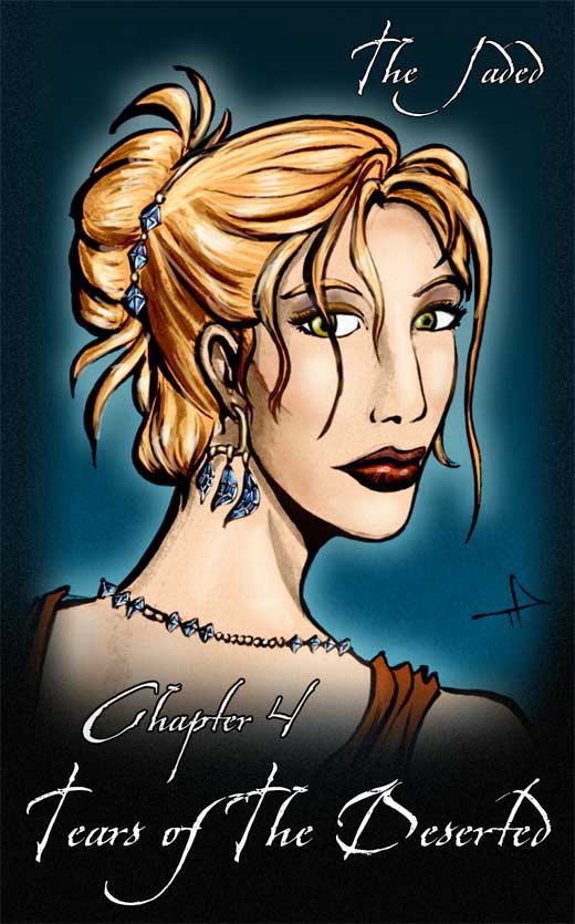
Today I'm making a cover for Chapter Four of The Jaded. It's been a custom for me to have a portrait of a different character for each cover, so we had Jade for Chapter One, Jin for Chapter Two, Doc Ice for Chapter Three... now it's Lysanne for Chapter Four.

The chapter name is "Tears of the Deserted" and there's some fun stuff in store as I get to draw lots of fancy-dress. I want Lysanne posing in fancy dress with a set of tanzanite jewelry.


These are my pencils of the picture. You'll notice they're quite finished and clean. My friend Steve Bryant from Athena Voltaire once told me that best inking is done on good pencilling, and muddy, messy pencils are very difficult to ink, so I'm taking his advice as a philosophy to inking.

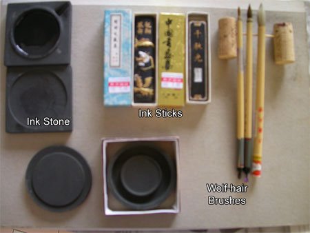
Let me introduce you to my new arsenal of inking tools. I like inking using brushes. Recently I switched from my usual sable brush and india ink setup to something closer to my roots: Chinese brushes and inks.


There are several reasons why I prefer the brushes and ink to their western counterparts.

Firstly, grindiing the ink sticks on ink stone to make ink everytime I want to ink may sound tedious, but I actually quite enjoy doing it. I'm told the process of grinding is supposed to calm you down and get you into the mood for writing/inking, but for me the main two advantages of this is 1) I can control how black I want the ink to be, which can be ridiculously black, and which my luckless india-ink counterparts have to resort to searching for super-black inks or drying out their ink bottles for. 2) My second advantage is I get fresh, new ink each time I ink. Anyone who has used india ink before should know that about half-way through the bottle, most india inks tend to "go off" after a few weeks/months, and start sedimenting (I hate it when that happens, it makes for horrible blotchy inking). With the sticks, I only make enough to use each time, so there's hardly any surplus left to go bad.

Secondly, the good chinese brushes, while larger at the base than the sable brushes, can retain just as sharp a point, and hold far more ink, making it easier to make long, smooth strokes as you need not dip the brush in as often. An added plus is that even the more expensive hair for the brush (xiao lang mau or wolf-hair) is still cheaper than sable. (Well, at least where I live). I guess they charge cut-thoat prices for these in America and Europe, but here they're literally a fraction of the price. Plus they actually have decent pencil-thick handles, instead of those ridiculously toothpick-thin ones. (Ok, I'm exaggerating, but you know what I mean).

It's worth noting that for any kind of brush inking, it's always worth investing in the best brush you can afford. For chinese brushes, steer clear of the goats-hair brushes. Those are horrible.


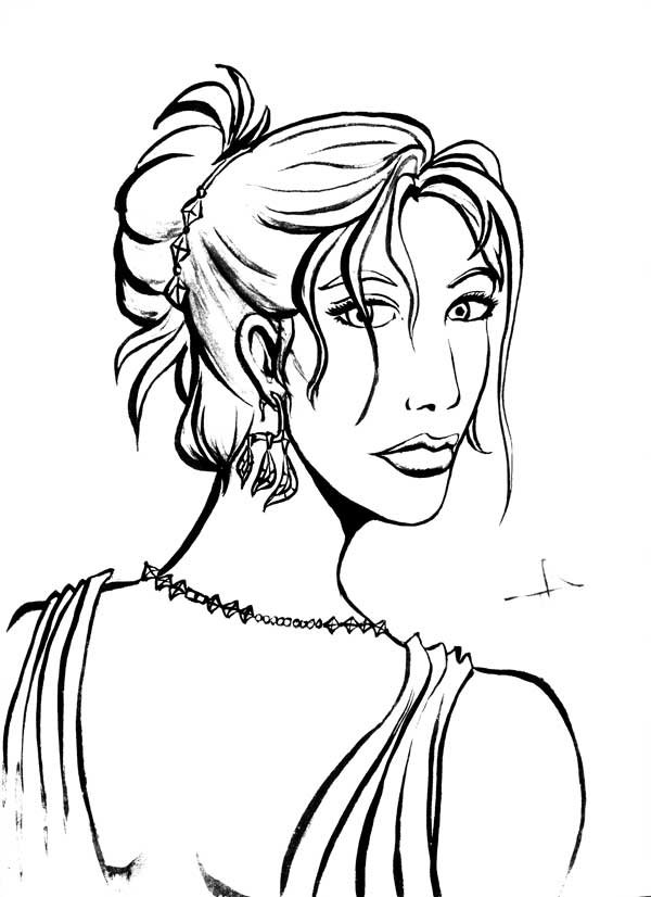
These are the results of my rough inking. As you can see, despite my best attempt to keep the paper clean, I smudged some ink across Lysanne's nose.


After scanning the image into Photoshop, I do some painting over (to get rid of the smudge) and some levels tweaking to emphasize the black and get rid of the paler greys. The lighter grey washes I use for shading,


I make a copy of the clean inks and do some further levels tweaking, so that the images becomes almost pure black and white. I'll use this layer for quick colouring (easier to paint-bucket), then toss it away when I'm done.


Going banzai with the paint-bucket, I quickly fill in the large spaces with flat areas of colour, using a brush to fill in any spots the bucket misses.


After that's we toss away the stark black-and-white layer, and superimpose the clean inks on top of the colours. I usually like to add a bit of colour and shading to this, and not to mention the high-lights. Note how alive the highlighting makes her hair look.


Add a frame, background and the text, and we're done.

Around this time I notice the mistakes in perspective and facial features in my original pencil, but it's rather late to do corrections now, which will be a pain and proves why Steve is right, it's always best to correct your mistakes at the pencil stage, and not when you've gotten to the end of the whole process!

Thursday, August 18, 2005

Pinging Art #0.7: A Quick Note on Drawing The Jaded Summer Afternoon Stories

Today I'm working on a page of The Jaded. "Summer Afternoon Stories" is a run of short stories I'm planning on having in-between chapter instead of "Outtakes". I'm also using this opportunity to try out some experimental stuff.

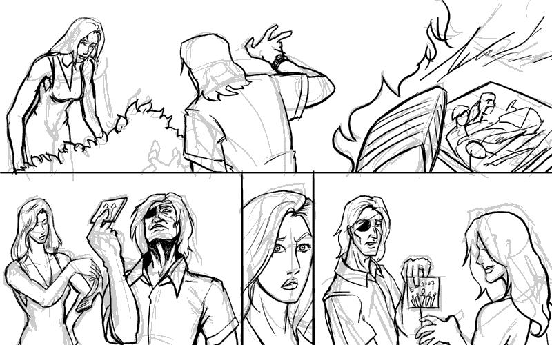
I'm drawing a page where Lysanne and Doc Ice are tramping around in the Lanner Place shrubbery looking for Lysanne's lost shoe. Why the shoe is lost I won't get into, but what's important is when they find the shoe they also find a chewed-up CD case.

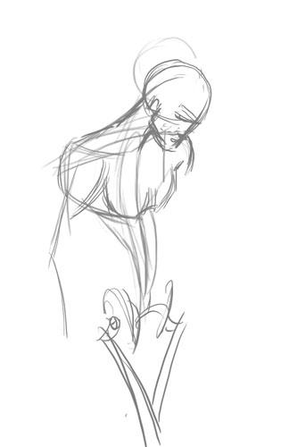
First, the preliminary scribbles:


Then it's redrawing over the lines on a different layer:


And then we add colours. I'm using the experimental washy-white colouring style to get a sketchy look for the comic. Ironically it takes me more time in the normal method I use for colouring, but such is experimentation.


I think the hard thing about not using heavy colour is having to restrict my use of the colours. I'm using the colours as the shadows, and by deafult everything else is white. It's like colours, you try to work with less and let the viewer's brain fill in the gap. Tricky. Full colour is so much more easier.

And that's it for today.

Wednesday, August 3, 2005

Pinging Art #0.6: A Quick Note on Composition and The Importance of Camera Angles

So here I am drawing the last page of The Jaded Chapter 3: Black Earth.

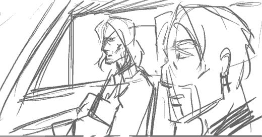
The scene I'm trying to illustrate is Doc Ice sitting in the passenger seat of a car, with Jade in the driver's seat and his crucifix earring very visible. Jade asks Ice a question, Doc answers cryptically.

So here's the preliminary sketch (digital equivalent of a penciled sketch) that I use for layouts.


As you can see, there's nothing particularly wrong with this composition. Everything that needs to be depicted is being depicted, but for some reason, the whole scene just looks rather... boring. It's flat and there's nothing particularly interesting about it.

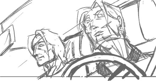
So I decide to give the same scene a second go, this time using a different camera angle and a more dramatic viewpoint. The result:


I really liked this composition. It's important to note that the steering wheel in the foreground helps break up the motony and gives the panel more depth. Unfortunately, at this point, I realise:

  1. British cars have the driver's seat on the right side
  2. I can't flip the image because Jade's earring is on the left ear.
  3. Jade is supposedly nursing a recently broken arm, and shouldn't be driving anyway


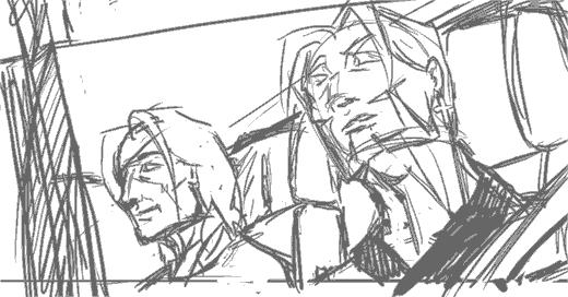
Ok you can laugh at me now. So for the sake of consistency we relegate the two to the back seat, and someone else (presumably Juno or Lysanne) will be driving.


This is kind of a blow because that means I have to remove my steering wheel, but adding the window and the little rain shield at the top of it will help give a kind of frame to the picture. The result is a more 'closed' look, and hence a less empty-looking panel and better comic page overall.

Now back I go to sketching, or T won't be pleased at the state of my buffer! ;)

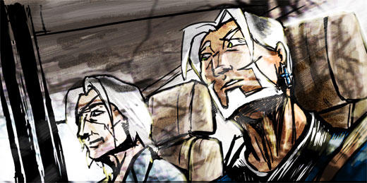
Edit: Thought you might be interested in the final result. I added theoverlay of the trees to give it a reflection-on-the-glass effect. Since it was the last page I thought it deserved something special.


Edit 2: Abby and Mos pointed out the perspective error on Jade's face which I missed, so here's the correction.


Having my mistakes pointed out to be is great, BTW. I can't improve without knowing what I'm doing wrong!

Tuesday, August 2, 2005

Pinging Art #0.5: A Study of Drawing the Human Foot

Ah, my great nemesis. The foot. Worse than the hand... mainly because I don't get to draw it as much.

So today I decided: "Enough of avoiding the monster!", sat down and devoted a couple hours to studying the human foot.

One thing I hate about drawing the foot is that it's so hard to find detailed tutorials on it. Most books devote pages after page of how to the draw the face, body and hands, but barely include a page on feet as an afterthought. Even the great Loomis glosses over it, which annoys me to no end.

So here I go, Google for reference (BTW, don't google "bare feet" on Image Search. Just... don't). After a solid hours of attempts at drawing feet I won;t bore you with, I realised several things.

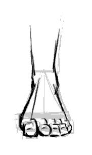
1. From the front, the human feet are a major a pain in the ass to draw.

Seriously, that wasn't really a revelation, but I just realised that anew. But back to the other points:

2. The human foot slants to the side.


There seems to be a line from the center of the foot to the center of the big toe which marks the split in directions the foot slants.

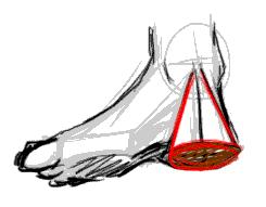
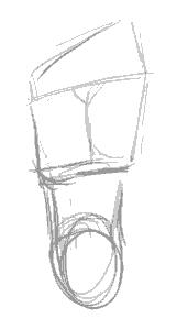
3. The heel is a cone.


I picked this one up from my copy of Action Cartooning by Ben Caldwell (An interesting book I'd recommend). The heel is sort of a cone, aligning with the leg bone at the point.

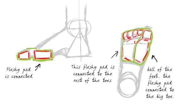
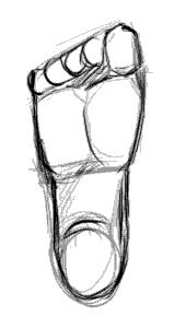
4. The human toes aren't just the bits you see at the end of the foot. They are connected to the pad thing at the base of the foot. (I never realised this before)


Don't forget to click on the image to read the notes I've scribbled on the diagrams. This is probably the most essential thing to understand to have the feet look right. Without the fleshy pads the feet don't look like feet.

5. The toes have joints. (Don't laugh, I should have known, but it just never occured to me)


This is the thing that make toes look like toes. They have to look crimped, otherwise they look unnatural. There's got to be that knuckle like bump and the little gap between the fleshy pad and the toe ends.

So with this new-found info, I'm going to test it out by drawing a series of feet from different positions:


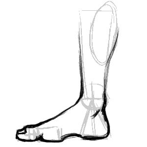
The side of the foot is relatively easy. The important thing is to lay out the fleshy pads and the heels in the right places. The big toe is also bigger than the flesh pad, so it overlaps it.


This is the side of the foot, but from the side of the little toe. More common in view than the other side, it's imparative to note the little toe is smaller than the fleshy pad so you can see a bit of it over the toe end and knuckles.


View of feet from the top. I'm told by a very reliable source (my podiatrist friend) that the fleshy pad sticks out so exaggerating it makes for more realistic -looking feet when there's an in-curve.


The sole. Not particularly interesting, other than being a good map of the layout of the fleshy pads and toes. Note the you can't really see the second joint of the big toe from this angle.


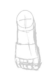
The most difficult view to draw the foot from. You need to have good grasp of geometry and perspective to be able to lay the shapes in line and get the right shape. Important things in making it look right is having the fleshy pad in the right place and showing that it's slightly wider than the toe rows.

And that's it. While I would not like to pass myself off as an expert in drawing feet, I'm reasonably happier and won't be dreading drawing feet the next time they come up in any of my art projects!

Thursday, July 28, 2005

Pinging Art #0.4: A Study of Drawing the Male Torso (Sideways)

Today I'm sketching a logo image for The Longest Sojourn. So here's another grand opportunity for a study of the male anatomy again.


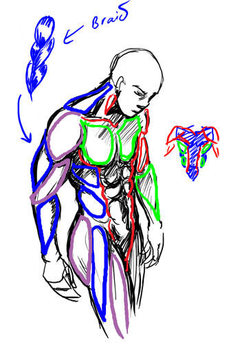
This is based off a reference picture, but some fun things to notice. End of the shoulder muscles (deltoids?) line up with the bottom of the breasts in an arc. You'll also notice I used the symmetry grids from the first study to draw the muscles in. The way of drawing the pelvis and leg-bones is a technique I picked up from Loomis' Mannikins. (Incidentally, Loomis' Figure Drawing For All Its Worth is an amazing book I'd recommend to anyone. You can learn loads off it if you don't mind the textbook approach.


We'll ignore the muscles in green and red, since those were the ones we studied in the Man-Chest tutorial. What we want are the muscles in blue and purple, which are the side view ones.


One thing you'll notice is that from the side, the arm mucles sort of resemble a braid. From this angle the triceps are visible, and the lower arm muscles (It's actually a group of several muscles) stretch over from the end of the bicep to the elbow. This is not really anatomically accurate, but very much simplified. You want detailed muscles Loomis has a very detailed chart.

Another good thing to notice is the huge neck muscle stretching all the way from the nape of neck to the shoulder muscle. Memorise that one.

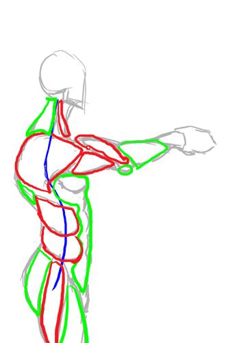
So from this study, we can summarise the visible muscles from the side as such:


And turn them into a chart for easy reference in the future.


Hopefully that makes it easier to draw the male figure from sideways.

Incidentally, for those of you who wondered what was the outcome of this study:


This is the imagemap logo I got after I finished, which hopefully will feature on the next incarnation of the TLS website.

Monday, July 25, 2005

Pinging Art #0.3: A Walkthrough of Drawing Comic Genesis Chan

Today I'm taking an hour or two off to draw a picture of Comic Genesis (Formerly Keenspace)'s mascot, Gen-Chan. I've also decided to use the opportunity to study women's anatomy from sideways.

I want to draw space-chan with a cannon over her shoulder, from a semi-sideways view, which I'm generally not good at, so A good reference is very important to get it right.

As usual, I turn to the internet for reference. Domai is a 'simple nudes' site, which by it's own definition presents "tasteful nudes of beautiful women". While it makes no pretense on who its target audience is, I find it very useful for finding references for female figures. Although not safe for work because of the well... nudity, the pictures aren't explicit, have good and varied postures and are generally on par with what you'd get in a life-drawing class or a life-drawing reference book.

Jops of The Menagerie drew the this rendition of Gen-chan. I'm going to follow his design.

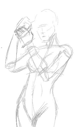
Having found an image with a posture close enough to what I want, I start sketching on my tablet to get the basic wire frame.


According to Jop's design, Gen has a snub nose, so I try and replicate it in a more realistic fashion. She also has a roundish face so I give her a heart-shaped face. I like having little imperfections in drawing characters, because it makes them more interesting.

I decided to dump the cannon and have her priming her wrist blaster instead.

Sadly the posture I chose blocks the logo she has on her costume, but... umm... oh well... bad planning, Ping. *sheepish grin*


The first stage is almost complete, so I check the posture and do some minor corrections, plus lots of cleaning up.


(By the way, you can click the images to see larger versions of sketches)

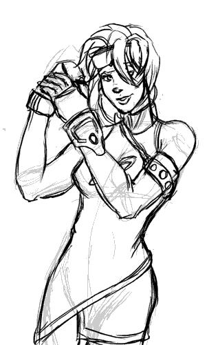
I briefy considered inking this with illustrator, but I decide for now I like the sketchy quality of the art and will colour it that way. Perhaps some other time I'll do the vector version.

Set the line art layer on multiply, and create a new layer beneath it for the foreground colours. I then colour in the large spaces with my paint bucket tool with set to "All Layers". I also have my brush set to "Behind" so I don't colour over areas I've already coloured when I do the smaller areas.


For the metallic areas I colour using magic wand set on "All Layers" and run it through an open-close algorithm. Someday I'll talk about what that does but not today. Let's just take it for granted it takes a selected area and gets rid of the little stray lines and stuff inside.


Now add different colours for the shadows. I've found using different colours on a opaque layer over the lineart instead of a black multiply layer makes for more colourful pictures. It also gives the image the "painted" quality I'm after.

Highlights are added next. I also burn the shading layers where I want it to be especially dark so they contrast well with the highlights. A background instead of blank white space is also good.


For some final touches we add the glowy effect (Screen layer) and a little frame.


And that's it. Blogger's thumbnailing system uses rather high JPEG compression, so the images look a little grainy, but as I mentioned, you can click on them to get the original image, which looks better. Now I'm off to submit this in case they're doing a rotation for the Comic Genesis front page!

Incidentally, the non-Blogger compressed version is here.

Sunday, July 24, 2005

Pinging Art #0.2: A Study Drawing Man-Chest

I've never been good at drawing man-chest. You can tell from some of my earlier work I haven't any godly idea how to depict that very um... vital part of attractive men without it looking grotesque. Since I constantly complain about men who can't draw women's breasts right without looking like a pair of helium balloons, it's only fair I learn to draw men's chest properly too. So today I decided to sit down and explore the secret of man-chest.

The first thing any reasonable artist does when learning a new topic is get some reference. A friend of mine recommended this website for sexy hunk wallpapers, of which there's plenty of man-chest on display without it actually being porn. If you want more detailed erm... reference, Google Image Search is your friend. I'd recommend googling something like "simple nude male" but be warned you'll be likely to get lots of porn results mixed in them.

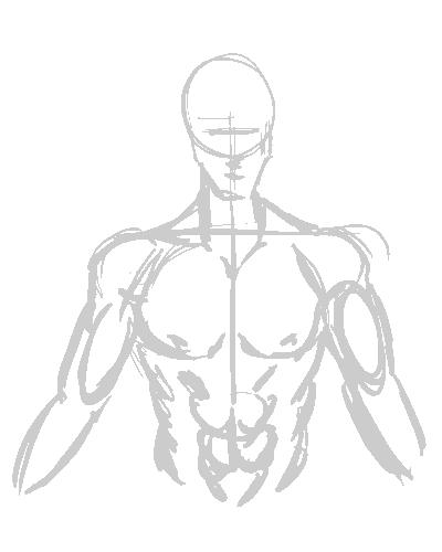
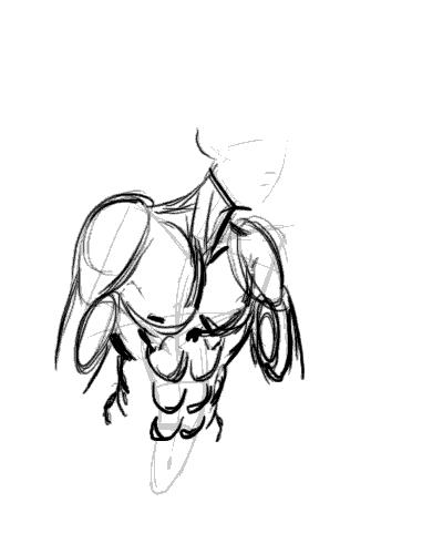
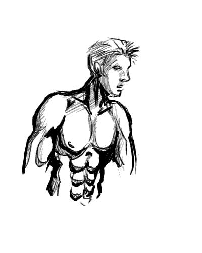
I picked the picture of this guy from the wallpapers website, because his posture is relatively natural and unobscured. Then I make a study of the chest by sketching it:


This is a very quick, very basic copy-sketch of the original picture. You can see where I used the construction lines to keep it aligned.

Next I do some shading in. This will help me understand the form of the muscles by studying the shadows and protrusions.


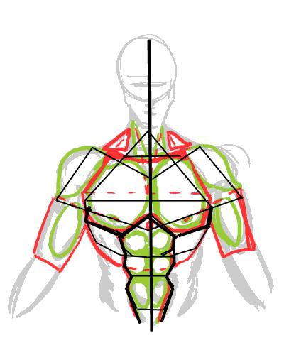
This is vitally important as I learn the geometric shapes that I will need to be able to memorise the overall form.


It's also good to study the symmetry lines so I know where to plonk the muscles the next time I draw wihout reference.


Okay we've done the study. Now to see if it pays off...

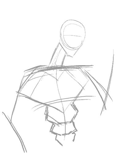
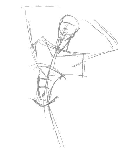
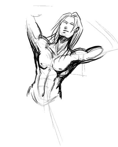
The position I chose to draw my next subject is slightly to the side. This is where the symmetry framework becomes important, sincei t allows me to be able to work out where all those muscles go when mapped out from a different angle:


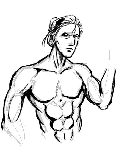
Here's me loosely adding the muscles into the frame. It's not exactly accurate, but once the muscles are more or less in place, you can guess where to tweak.


The end result. I'm not too happy with the result as the body seems too muscular for the guy's slimmish face. I'd really put more flesh onto the guy's cheek if he's that buff, really. Also, his shoulders look too narrow, making him look rather awful.


Note to self: Exaggerate shoulders for better effect.


So let's try this again. This time with a slightly less ambitious posture...


I'm happy to say the second try came out much better, with the very broad shoulders working well to give this guy the "sculpted from marble" look of of a hardened warrior. I forgot to draw the nipples this time around, but for some reason missing nipples seem to be considered acceptable on men. However, since I whine about comic book women having no nipples, I won't be hypocritical and will make a mental note not to forget them in the future.

Now comes the REAL challenge, a not-overly muscly man-chest.


I'm quickly discovering that getting the frame in the right place is by far the most important factor in making the body look right.


Adding the memorized mucles and adjusting them to fit the posture. Drawing a less muscly build turns out to be the process of simplification. Instead of individually drawing the muscles, use suggestive lines to give the overall curves of the muscle masses (if you look at the earlier study-charts, they're the lines in red.)

Of course I quickly realise that unless the guy is fat, he doesn't have voluminious breasts and thus they should not sag as much as you'd expect with women. A little correction is in order:


Another interesting thing I never noticed before undertaking this study was that there is a little depression in the center of the chest. A cute little touch that gives balance to the belly button, IMHO.

Edit: Smight of Soulgrind Squeezebox pointed out that "Something you might consider though is that when the shoulders move in certain ways the pectorals stretch to follow the arm a bit more so that the defining lines benieth them should be thinner and sharper on chest disappearing near the center of the chest."

And he's right. This looks more right than my last attempt before this, I think... and handily solves my problem of "Man-boobs" on "man-chests".


At this point I'm quite happy with my new-found knowledge of drawing man-chest, and with good fortune, I should be able to draw better-looking men in the future. I hope you enjoyed this study/tutorial, and found it helpful. Any comments, questions, and suggestions for improvements are welcome.

Stay tuned for the next entry to my art journal and thanks for reading!