Showing posts with label Theory. Show all posts

Tuesday, June 16, 2009

Hotspot #20: Breaking Beyond the Comics Format

It is inevitable... after I read a comic that presents something new, my brain has been running over time thinking about webcomics.

"Eh... How is this different from what you usually do, Ping?"

That's probably what you're thinking. I should probably rephrase that better: Maybe my use of "web comic" is a bad choice. A digital comic is probably closer to the truth.

Hm... a Comp-mic? Pixelmic? Comixel? *cue groans*

Fine. For now... online comic.

In any case, I'm thinking about comics that are made solely to be showcased on a computer screen, and would not be able to be printed out without losing some or all of its impact.

Keep in mind that I am NOT talking about distribution methods. I'm not talking about a comic that happens to reach its readership through a website. Or the clandestine sort that gets forwarded around in office emails, or transferred through flash keys or even bit-torrented.

I'm talking about comics that break tradition by exclusively using digital technology as a format. 

The recently reviewed Hero and the hovertext in place of speech bubbles being an example of a deviation. Of course, Hero was still strongly traditional in some other ways, and there were limitations to the hovertext approach. But it was still a refreshingly new way of doing things.

And there's then-pioneering background animations in Aargon Zark. Of course everyone knows Scott McCloud's infinite canvas.

But honestly up to now, a lot of experiments in digital comicism so far tend to feel... gimmicky. Even the best of them suffer from Marmite syndrome, they either are love or hated, and most of the time are only tolerated for being a novelty.

However, novelty is NOT what I am interested in. What I've been searching for is a stable, universal something that improves upon the old tried and tested way of presenting panels and speech bubbles in sequential order.

At the end of the day, what we associate as the fundamental parts of a comic are still methods that were designed and optimised to be presented on paper. When comics shifted to the web, the same mentality remained.

And honestly, the longer I write about webcomics the more I begin to feel that the word "webcomic" has long since passed its expiry date. There really is no distinction between it and its traditional counterpart anymore. 

It's just comics. Period. 

Maybe I should just rename "Webcomic Finds" to "Lonely Panel" and be done with it.


...


I think I really might.


Back to the topic... I used to get annoyed whenever someone brought up Reinventing Comics by Scott McCloud, mainly because of the stigma it gave online comics that we were just a bunch of geeks trying out gimmicky stuff with the comic format that would never work long term (though it wasn't his fault we were seen that way, really).

Ok, so now it still annoys me a little, but I understand a little bit of what Scott saw in the potential of the web now, although what he covered was but barely scratching the surface, and some of his ideas weren't exactly the most practical things ever.

But the point is in the experimenting. You don't experiment without failing. Fact. You don't find out new things if you don't try.

Talk to others. Try stuff. Fail. Explore, See other people's ideas, try something else. Fail. Research more.

This is what this blog is supposed to be about after all. Exploration of the online comic, not just exploration of online comics.

Heck I did my own experiments with the format myself, though by any standards what I tried was pretty conservative. And to be honest even I didn't think it worked that well.

But most of the experimental stuff we've seen in the last ten years or so art just that... experiments. Prototypes. When they fail, maybe we shouldn't just dismiss them as gimmicks, but give them a bit more thought on what when wrong, and what we could have done to make the new format and presentation better.

Yes I know. I'm sure I'm not the first to be talking about this. The attachment to the traditional format is very strong. Let's face it... we're not going to lose the old panels and bubbles formats until someone comes up a new format that is an improvement in every way that people are convinced they like it enough to adopt it.

It just hit me the other day that after I finish my current project, I really don't want to make conventional comics any more. 

I don't want to follow. I don't want to stagnate in pursuit of minute perfection.

I want to explore. I want adventure in my art.

In short, I want to try going beyond the current comics format.

As web technology progresses, more developments are bound to crop up. Some are going to be gimmicks and fall along the wayside. And some... some may revolutionize the comics art form.

Or destroy it.

Or supersede it.

Maybe it's the right way to go.

At the very least, I'd like to give it a go. 

Yes I know I'm probably aiming for the impossible.


But hey... I can live with that.


Saturday, June 6, 2009

Pinging Art #2: Back in Black: It's Not About What's Black and What's White


I've done a couple of different styles of comics, from full colour to sepia-tinted greyscale. But pure black and white is not something that I've really explored or practiced, so it's only been recently that I've really paid it close attention.

I actually did fine-art for my A-Levels, but I try not to talk about it too much lest I be mistaken for a "snotty fine artist". IMHO that fine art attainment is nothing if it doesn't help me improve my comics, and fortunately, something I learnt back then does actually help, even though I didn't figure out how to apply it until recently.

Because I'm lazy, I'm just going to repeat something I said in a discussion over at Bengo's blog about what I discovered about doing art black and white. It's mainly my observation, but:

The bottomline is: doing good black and white requires the artist understand very well the concept of positive and negative space, and how to use it.

So what is this positive and negative space anyway?

The easiest way to describe it is thus:

positive space = important parts of the picture that we want to focus on.
negative space = the parts that are not parts of the important parts.


A lot of people will mistake positive space as "white" and negative space as "black" or vice versa. This is NOT the case and it took me a while to break out of this kind of thinking as well. What I really needed to know is that it changes according to context. Take this example below:


In both cases, the lines and shapes that make up the mouse are the "positive spaces". The background, whether white or black is the negative... the key point is the positive space needs to be in a contrasting colour from the negative space.

So now that we've shattered that particular mental barrier, black and white art suddenly becomes easier to understand, because we know it's not about whether the object we are trying to depict IS black or white. It's about conveying the important information to the reader in the correct contrasting colour.

We're used to drawing black on white, so we naturally define our positive space lines and shapes by drawing in black. But if the background is supposed to be black, use white for the lines. It's that simple. Or if you want it put the other way, fill in the negative spaces with black, so that the white left over is the positive.

Sometimes the rules aren't so clear cut. When two objects that are black are drawn next to each other, what does one do? Colour the whole thing black with white lines in-between? Or keep them black? Or for the sake of visibility, we need to defy reality and pick one and turn it white to they they form a contrast?

For this there is no set answer. It comes back to what we want to communicate to the reader.

Let's look at this example of a shady-looking guy. For the sake of the setting we want his face shrouded in shadow and he wears dark glasses to boot.


If he's a regular member of the cast, maybe the sunglasses are his identifying feature. To make sure the reader is able to tell it is him, sometimes the artist is obliged to flip the colours to make it clear he has a pair of sunglasses on his eyes.


On the other hand he could be a vital plot point and we don't want his identity to be revealed yet. So in this case we forget about contrast and all that and blend the face (glasses and all) into the shadows.


Like I said, it depends on what you want to convey.

Of course black and white art isn't just that simple, else anyone could just draw something and use and invert the colours to make it look cool. 


There are different techniques such as crosshatching, screentones etc. etc. But they're advanced techniques, not a base principle.

So the few things I learned about black and white art:

1. It's not about picturing black as black and white as white.
2. The choice of whether you want to use black or white depends on what message you are trying to convey.
3. Having both large areas of black and white spaces provides a pleasing visual balance to an image.

Anyway that's what I learned so far. Hope that came in handy, and as usual feedback and additions are always welcome.

Wednesday, May 6, 2009

Pinging Art #1: Back in Black!


Wayfinder and Kensington Mouse, the two mascots for Webcomic Finds. Wayfinder is something of my avatar, and is based on my physical appearance except for the Explorer's hat. They both made their first appearance in the "The Essence of Infinite Canvas" comic I did for Comixpedia (now Comixtalk). The drawing is done in pencil and inked by fountain pen. Not the best of tools, but it was the only thing handy at that time.

Most of you probably don't know it, but I have an art blog called "Ping Art" that I don't really update anymore. It focused more on art techniques and equipment, but I never could find enough time to divide between my comics, blogs and other projects to update it more than a few times.

Time of Death: Around the same time I went on my 3-year hiatus. 

But now that Webcomic Finds has been brought back from the dead, I've been toying with the idea of resurrecting it and merging it with Webcomic Finds. After all as I have mentioned, I've come to the realisation my creativity comes in cycles... I read other comics, I learn and take notes, then I stop and start think-tanking and getting into long complicated talks about theory and stuff. Then I draw. And draw some more until I get tired and out of ideas and then I start reviewing again.

Yes that's my handwriting. On a graphics tablet though.

You already see the process of the first two steps in this blog (Reviews are Journey Legs and Postcards, Brainstorming comes in the form of Hotspots), so shouldn't I just continue and show you the third as well?

Recently a lot of people have started asking me about the comics I do. Generally I don't advertise my comics much on this blog, especially now since my main active one is an experimental one I started when I was around 14 (oops the magic age 14 again... and NO I'm not 14 now).

It's interesting to read for being able to see my progression through the years, but art-wise and writing wise it's also inconsistent because of the said passage of years, leading to a not very smooth end product. And while I love doing it it's not the best representation of what I can do.

And I'm certainly not cruel enough to introduce someone to my other comic while THAT is on hiatus...

But still... I would like to showcase some samples of how the stuff I learn from blogging can be applied to my own work, and making a point of showing that not only can I talk about comics, but I DO them too. 

Thus, I present a new Webcomic Finds feature, called "Pinging Art". 

Voila! The cycle is complete.

ps: The "Back in Black!" refers to me newly cracking the secret of black and white art into my rather thick skull ;) It is also a prelude to what will be the topic of the next Pinging Art installment.

UPDATE: I've now imported the old Ping Art entries into Webcomic Finds. You should be able to see them all here.

Friday, May 1, 2009

Hotspot #19: Webcomic Finds-Now Written By An Evil 14-Year Old!

When I'm in my contemplative mood, which usually comes after a slew of reviews, I take a break and think... and experiment. It's part of the learning process, and I've learnt to just go along with it instead of pushing myself to do reviews despite the requests that pour in. (The waiting list is well into double figures now, but uh... until next review cycle?)

However I can't refrain from checking out links some some er... little birds send to me from time to time, including this rather amusing comment thread over at Addanac City.

Warning: This is a ranty rant of the highest order.

If you recall, Addanac City was on the receiving end of one of my more controversial Postcards, where I gave it a rather sound thrashing for the very bad presentation and obnoxious tagline. It was so distracting that it coloured my entire perception of the comic, and put me in a bad mood to boot. But it was a very very valuable lesson in how a bad preconceived notion and presentation can influence how a reader "sees" a comic, and how they can be offended by it.

Of course, the most wonderful part of the whole thing was the reaction of the creator, George Ford, who politely thanked me for the review and got to work improving the site. We even exchanged a couple of reasonably friendly (well respectful, at the very least) emails and comments, so I thought to myself that even if I did not enjoy his comic, I could totally admire his work ethic and receptiveness to criticism. 

In fact I even dropped in from time to time to check how he was doing and gave him further feedback on the changes he made. 

Recently I received a post on the blog with a request to check out his website redesign. I'm always happy to give feedback to people who are willing to ask nicely for it and listen, so accordingly, I checked it out, left some comments and suggestions on how it could be improved, and thought that was the end of it. This is it, verbatim from the comment in the other post.


Hi George,

I see you've been hard at work!

I have a couple of points about the new web design:

1) I'm not a big fan of the bright turquoise background. It makes the text very hard to read. I would suggest either a) toning the colour down b) putting a white backing layer for whenever there's text. That way you can still have your turquoise without straining the reader's eyes.

2) I actually liked your old header better. This new one is nicely done and attention-grabbing, but it's TOO attention grabbing. It's got waaay too much going on in the image, it's even interfering with the comic itself as the reader's eye is drawn to the banner more than the comic.

The rest of the layout is a massive improvement. I like how it's a lot easier to navigate, the calendar function is a plus! And reducing the number of ads really does help massively.


So imagine my surprise when a little bird tells me that I'm being badmouthed by readers over at Addanac City. *raise eyebrow* Eh?

Honestly I fully expected it when I released that Postcard, but this is months later, so it's a little late isn't it? But my curiosity got the better of me, so I had a look. I have to admit while "badmouthed" was probably an exaggeration... I was amused to see some rather impotent personal attacks directed at me there.

Sadly, there was precious little constructive criticism in the comments, mainly the usual you-must-be-a-comic-artist to review fallacy (which I am, but that is totally irrelevant to the issue... I do not have to be one to review as explained here. If you disagree I will be more than happy to take you on in a debate on this topic.) and the you're not being fair argument (more on that later, I have my own practical reasons for rejecting it).

Most of them missed the point of my review and George's post. Maybe I need to improve my writing to get my point across better. But I do despise pandering to the lowest common denominator. Since I'm already being vilified, I might as well go with it; besides, some of the comments are too delicious not to share. 


Wow George,
As always you were super sweet to that reviewer. All of that, despite the fact that she was just rude, mean and behaved like a ,well I won’t say. I even read her follow up to your last comment and she doesn’t like the color of the page…. Please. She reviews and behaves like a mean 14 year old. Very unprofessional.
Enough about her, I do now and did before love, love your page.

[SKIP TO NEXT RELEVANT PART]

The one thing I would say about reviews in general is to consider the source when you make changes. I would make changes based on positive criticism.Is that an oxymoron? Meaning, If you start changing based on those that clearly don’t appreciate you it will end up changing for the worse. IMO
Forget about them. You are and will always be a great artist


This one is by far my favourite. I guess I'm supposed to be offended and outraged or something, but in truth when I read that comment, I chuckled in delight for a good half hour.

You might wonder why I should be delighted. Well, I've been told I have a tendency to see patterns and connections that most other people don't see. It's probably responsible for my unorthodox sense of humour, and how I occasionally break into maniacal laughter for no apparent reason.

The irony is delicious here. My point in the Postcard was a preconceived notion and being presented badly influences how a comic is received. It's foolish to assume potential readers will be fair and give each comic a fair chance. Hell no, first impression, website presentation, first three pages... that's all you get at most. Fail to impress by then... there are thousands of other webcomics out there in the web. You've blown your chance. Tough. That reader is going away and not likely to come back.

In the case of Addanac, it gave me a bad impression, the website enforced that, the tagline amplified it and by the time I got to the comic I hated it already.

Now many people will whine it was "unprofessional" and "unfair".

Incidentally: To that I say: Oi! What cloud do you live on? Come down to earth and back to reality, please. Life is not fair.

Oh, I fully admit I am human and thus I write from my point of view. If you want fair try one of those other reviews that try and write from some detached, 3rd person perspective. That's not what Webcomic Finds is about. It's about exploring comics from the point of view of a new reader. I really shouldn't have to explain this... it's in the bloody blog description.

People are not paragons of virtue and will not be fair. You're bloody damn lucky if they give you a chance and check out your link. People WILL judge on first impressions, and many WILL check out a link, see a bad presentation and shuffle off elsewhere without even looking at the comic. I'm a practical reviewer. This is what I take into account.

Interestingly, in the same way, the commenter quoted above got a preconceived notion on the newspost, came here expecting a bad review, glossed over parts I did praise and focused on the criticism.

Never mind that the review was specifically requesting feedback and criticism from me. It was not unsolicited.

Never mind that I warned the creator the review might not be positive, the creator accepted that.

Never mind that I gave some points I felt were valid... they weren't sugar coated and gift-wrapped... THEY MUST BE WRONG AND SHOULD BE DISREGARDED.

The best of all... the follow up comment was specifically requesting me to check out the website design. I did so and gave critical feedback. *GASP* I did not like the colour? How dare I?!? I must be EVIL INCARNATE! *sarcastic*

Back to my point, this commenter got a preconceived notion, came expecting an evil reviewer, saw what she only wanted to see and let it influence her judgement of what she saw.

Sound familiar? Yep. Exactly the point I was trying to make. She reacted exactly how I did in the Addanac City review. (See how important first impressions are? People WILL judge your work even before they see it. It's human nature to do so, and it's futile to make apologies for it).

I have to admit, I'm as human as the next person, and I do enjoy being proved right. And I must say it tickles me to death when someone who so violently disagrees with me and who probably wished to call yours truly something that rhymes with "witch" (And probably refrained from doing so by their utmost reverence for the sacrosanct female canine ;) ), ended up doing the exact same thing and proving my hypothesis right without me having to so much as lift a finger .

It's like having your cake, getting to eat it and being presented with the recipe after that... with compliments.

The world is a wonderful place. That comment really made my day. It had me chuckling into my glass of Orvieto. Mmm... Delicious.

Too much sweetness in a wine sickens me. It's like drinking cheap supermarket Ribena. Ick. Initially sweet, but shallow and boring after the second sip, and containing far too much sugar and flavouring to be any good for you. I like my aperitifs a little more complex, slightly dry, less cloying and pandering.

The same also applies to creative feedback. Vacuous praise like "You'll always be a great artist!" is all very nice and all, but abhorrently useless except for inflating one's ego. Let's be realistic... neither George nor I are "great artists" yet. We're journeymen at best. This kind of praise is more damaging than helpful. It encourages people to slack and rest on their laurels. And then they never improve because they get too settled in their comfort zone.

I'd rather have something like "Your writing uses too many parentheses; they break the flow of reading" or "Your posing and camera angles are rather predictable and conservative, you should try more adventurous approaches." You know something that actually helps me get better at doing what I am doing. That quality of critique is hard enough to come by, why should you expect someone to be NICE on top of that? It's like expecting someone to help you AND then compliment you. For Free. WTH?

Oh and I know I've bemoaned about this before, but why the heck do people keep referring to me as a professional? This is my NOT my profession. I am very proud to be an amateur comic artist.
Amateur
1 : one who engages in a pursuit, study, science, or sport as a pastime rather than as a profession
2 : one lacking in experience and competence in an art or science

Both apply to me. I do this not because it's my job, but my hobby and I love it; And I am not presumptuous enough to disclaim I do not fit in the category of the second definition. I don't do this full time so my experience is not to the level of a professional. When I see my stuff I always see where I can improve further (and I suspect it'll be that way till the day I die). Like I say I think it's a good thing.

Does that mean I do not know what I am talking about? I do know my skill level. I have miles to go yet, but I don't believe in false modesty either. At this level I DO know what I'm talking about. If you feel I'm fudging, point out the part when you think I ring false. I'll be happy to come back with proof and reasonings why I said what I said to back it up, if I didn't already.

Why else would people ask me for a review if I didn't? Why not ask the commenter above for a review if they wanted cotton candy make-you-feel-good reviews?

If George hadn't ASKED me for a review, I wouldn't have even bothered to spend my time writing about someone who was so obviously happy in what he was doing. I'm happy with leaving people who don't want my opinion alone, and I respect their right to be left alone and be happy with their comic. I've taken down reviews from people who asked me to out of respect for them, no questions asked.

But when people ask me for a review, I'm relentlessly honest. I will not lie to spare someone's feelings. And in this case George asked me. Twice. So I was honest, even when it was painful to be so. Oh sure it'd be easier to always write nice reviews and make friends, but I'd be a liar by extension. What's that you say? I can critique more nicely? News flash. I already do. I just don't bend over backwards to do it. 

You want harsh? This is harsh. And probably not as useful. It seems to be harsh for the sake of being harsh.

I can understand people not listening to me if I offer unsolicited advice. Fair enough. They never asked for it. I usually save myself the trouble and don't give it either.

But I do get a teensy-weensy bit irritated when people go out of their way to ask me for a review, people (or others) get offended and hurt when they didn't get glowing words of praise and ignore the points I make because "they weren't put in a nice enough way". These type of people really need to wake up, and grow up and stop living in their sheltered little ivory towers. People aren't always going to, and have no obligation to sugar-coat everything just because someone couldn't handle criticism without tears welling in their eyes.

Writing reviews take time. If I took the time to bloody write a review I obviously gave a damn about it. There are many more people who would like the critique in their place. I could be working on my own projects and improving MY comics with that time. People do not pay me to write this review. Heck, I don't even ask for a link back. I write them for my own development, my satisfaction, and everything else is a bonus.

Wasting my time annoys ME. I'd thank people to not waste my time by not asking for what I've already warned them in advance they might get. Let's get this straight. If I hate something I don't tear it down. I freaking ignore it. My time is precious and it's not worth my effort to take notice of. I'll only do it if A) They ask for it, and I think they can benefit from it B) I can learn something from it. Sometimes B comes before A.

I'm not here to be nice. I'm here to be honest. If I see something praiseworthy, I'll say so. If I say something that deserves to be shot, I will shoot it with a AK-47 and a full magazine of bullets. I try to be nice most of the time, but if your presentation puts me off, well... It's your own fault for putting me in that mood. That's the mood like-minded readers are going to be in anyway, and sometimes one has to be harsh to make a point get through. Can't take the heat? Kindly remove self from kitchen.

My observation so far has been: mainly webcomic creators who read other people's webcomics make any attempt to be "fair" when reviewing. This is because they know how hard it is to make a comic and keep it running (Incidentally I give credit for both which people who didn't skim over the review would have noticed). But your main audience, the majority of people who read webcomics... they don't give a damn. So either you have a readership of mostly sympathetic webcomic creators (whom you've probably left nice comments on their blogs/comics to win their affections before), or you suck it up and adapt.

In any case, if George wasn't prepared to get a negative review, he wouldn't, and shouldn't have asked for it. (If I am not mistaken, he pretty much said so to me himself, and because I have respect for him, I will take him at his word that he really meant it, and not that because it was the right thing to say.)

Ah well. I am aware people do like rushing to defend the underdog for the warm fuzzy feeling it gives. Me? I prefer helping them in a constructive manner. And so I'm prepared to help people by being their harshest critic and giving my unreserved opinion when they ask for it. 

If I have to play the evil villain and be vilified before the eyes of their readers, so be it. :D


Maybe I should do a Sherlock Holmes policy and only pick up review requests that intrigue me. Hm yes. That's not a bad idea at all... maybe I will. 

I'd still have done Addanac City though, that was a very educational review.


Thus ends a long rant in which I got to trot out two new words in my vocabulary. :D All in all it's been a good day. Signing off... Evil 14-year old Comic Reviewer. 

I even have my maniacal laugh ready!


Thursday, April 23, 2009

Hotspot #18:And This Is Why I Review.

If I have a fault, it is I try to do too much and end up doing too little at the same time.

In the same way, I try to get learn too many things and end up not mastering any of them. Or at least that is how it feels to me. It's only been recently when I finally resolved to pick a select few skills I wanted to really really hone, and stick with them. Right now they are sort of limited to comics, writing, scuba-diving and poi. And maybe cooking/baking, but that's a necessity ;).

Anyway, I write this blog for reasons of my own. Sure, I enjoy discovering new comics, but if it was just left at that, I wouldn't have bothered spending hours taking notes and typing out reviews, would I? Of course Ping Teo has a secondary objective for exploring new comics. No it's not the noble reason of giving lesser-known comics exposure, although it has inadvertently served that purpose in the past. I have mentioned this before, my reasons for writing this blog aren't that altruistic.

Writing this blog is good practice for honing my writing skills. It also ties in to my other hobby:writing and creating better comics. I've gone through a lot of comics. (At least 50 by my rough estimate). Some were excellent. Some were mediocre. Some made me want to claw my eyes out and smash my laptop.

But all of them had one thing in common. I learned things from them. When I had to write and analyze them, stopped reading comics and starting studying them.

From the good ones I learned what makes inspiring comics, how small touches make memorable moments. How the hardest part of making a comic is having the courage to deviate from the norm, the originality to come up with new ideas, and the acumen to balance the strange and the familiar. How each truly good comic has to have a soul made from the little bit of the author that has been breathed into it.

From the mediocre ones I learned how creating something that can be a pleasant read can only take you so far.  How it's worst to be mediocre and forgettable than either bad or good. And how every single mediocre comic still had something for special me to discover; even the mediocre ones had areas that they excelled at that I could learn from.

And lastly, the bad ones taught me what to watch out for.  They made the mistakes that I myself might have made on my behalf. The danger of trying to imitate what you like instead of being honest about what you know. I learnt to see what went wrong and how it could be avoided. Or even amended.. And I try my best to remember it and not do it myself. 

All this learning has to go somewhere. I believe creativity comes in cycles. You learn, you get inspired, you create. Then you get feedback and from that you start feeling you can get better. And that drives you to learn more from feedback or exploration until the urge to try out what you learnt overwhelms you again.

I haven't reviewed much this month. I'm not going to apologize for that. I don't believe in posting reviews for the sake of reviews. Reviews to me aren't just about prattling my opinion off on a comic so others can ooh and aaah over them. They aren't shameless plugs to drive up traffic to the comics in question. So if any of you are thinking of asking me a review because you want the exposure, please forget it. I don't do things that way.

These reviews are my studies.

Right now I'm in a craze to create. Ideas are flooding in, I need to trot them out before I can continue with the reviews. There's no point learning if you don't practice.

Don't worry, I've still got that list of comics to review, and once I test out my theories and tips I'll be back searching for more.

One thing is for sure, as long as I look at my old work and cringe at how horrible it is, I'll know I am on the right track. It's a good sign.

If I ever look back at my old stuff and wistfully wish I could still draw like that and write that well... now THEN I would worry.

Sunday, March 15, 2009

Hotspot #17: Decom(ic ex)pression stop @ 5m...


If I didn't have that regulator in my mouth, I'd be grinning my trademark cheesy grin, I bet. Incidentally, trying to draw comics underwater... not so good when there's a current, actually.


So... I do other things in my life besides making comics and writing about comics... and making them. I work in a totally non-comic related job, I indulge in culinary endeavors (and enjoy them), I brave leeches, bugs and other pestilent things to see wildlife that most people wouldn't understand WHY I want to see, I toss around balls of fire on chains for the heck of it... and I scuba dive.

I often wonder what part of me is it that makes me feel alive when I'm swimming in a sea of blue, with the surface a blindingly bright glimmer far above me and all I can hear is the stream of bubbles issuing from my regulator. Is it the danger? Is it the disconnect from the everyday world and the entry into a new one that makes you feel that even if you died the next second, it would all be worth it?


Floating around in the big blue... Nothing to see here, all the good stuff is at the bottom.

I don't know. But one thing I do know... When making comics, you need to do other things as well.

I truly believe this is important as someone who spends most of their time only making comics and not living life can't connect with what they are supposed to make comics about. Like it or not, to make a comic come alive, you need to be honest. You need to put in a bit of your own life experience in, else it's going to be a sad, flat, soul-less thing. 

If there was one thing I can say I finally learned in my love affair with comics for over a decade, that was it. I used to churn out a lot of shallow rubbish that had 0% Ping content in it, and I couldn't understand why I couldn't find the heart to finish them. As it turns out... I'm one of those people who can't write about things that I don't understand. I can't connect. So I need to write about things that do, or make it so that even though it's something that I may have not personally experienced before, it has some similarities to something that I have.

Back to the topic of doing other things... In the one period in my life when I stopped doing all these other things, my comic work suffered until I couldn't do it. Then I stopped comicking (yes this was during my hiatus). And I was miserable. Then I tried to start comicking again, and almost panicked when I found I couldn't. Not until I'd gotten myself out of the funk I was in.

I've found out recently that I'm not the only creator who has experienced something of this sort. 

Anyway... during a decompression stop while on my recent dive trip (it's this thing we do where we stay at 5m below the surface and bum around for a few minutes, to give the nitrogen in our blood time dissipate.) Anyway, on my decompression stop while hanging on to this painfully barnacle-encrusted rope, my mind wandered and I thought about the current problem I was having with one of my comics, The Jaded. 

The truth is, The Jaded is currently hiatused not just because I'm focusing on finishing The Longest Sojourn, but also because I'm having trouble re-identifying with it. 

There. I admitted it.

Compounding my problem is my stubbornness and insistence that I at least plan to finish what I started. But I have a massive problem there. One can't just drop a comic for over 3 years and go back to it like nothing has happened. Things have changed. My mindset has changed. When I read my own comic all I see is the discrepancy between how I think now and how I used to think. 

I could drop it and start anew. I have lots of other ideas for comics that would strike truer to what I feel now. But I want to finish The Jaded. I'm not going to be one of those creators who start something and leave it hanging.

I could restart The Jaded and start from scratch again. But that would be going backwards. I do not want to go backwards. 

So, while still underwater and thinking about it while checking my depth gauge, it suddenly occurred to me that what I was doing now is a very likely thing for a one of the characters to be doing on some covert op. In a flash, the obvious solution came to me. 

I needed to make situation in The Jaded match what I'm doing now. I need to make it identify it with me by dumping my old plans on how it was supposed to go and adapt it to what I feel now. I need to make the character change and grow just like I have. I need to change how the story goes, and scrap what attempts I have made so far because they no longer fit. I may even have to put in a timeskip to match real life.

It's not an easy solution, because it means a lot of what I previously planned will now never see the light of day. But it feels... right.

Maybe in a year from now when I finish TLS and restart The Jaded I won't feel this way... but right now... for the first time in years, I'm feeling optimistic about having to finish this comic again.


Barnacled ropes don't make good descent lines. Really. Ouch!

Now... if only my poor blistered hands would hurry up and heal so I can draw properly...

Tuesday, August 26, 2008

Hotspot #14: To Tell or Not to Tell?

I have to admit, I have having a bit of a conundrum about something.

I enjoy writing my reviews, and I know a number people do enjoy reading them, and a good number of creators enjoy getting feedback. Some have even written to me to specifically ask for reviews (I'm still trying to figure out how to respond to that. As you know I daisy chain my comic reviews, so even if I do oblige I might have to figure out how to work in detours)

Speaking as a person who draws comics, I value constructive criticism more than praise. I love it when I do get it. 

I believe it's a sign of a mature creator when they can take feedback without getting offended.

So before I start rambling again and such... I was wondering, most of the people whom I review never get to know I review them unless one of their fans stumbles across the review and let them know. And given my penchant to go for lesser known comics this is highly unlikely unless said webcomic creator does a vanity search for themselves on Google.

Would it be wrong... or right for me to let them know via email or whatever that I have reviewed them? 

While admittedly it would be easy to do so for the positive reviews, I am hesitant about doing so for ones I have not been enthusiastic on. For example the creator of Kristy VS the Zombie Army seemed to be so happy in what they were doing, it does not feel right to burst their bubble. On the other hand, I do think they would benefit from reading review and feedback. 

What a dilemma. 

If you were a webcomic creator which would you prefer? What would you do?

Friday, November 4, 2005

Pinging Art #0.8: A Demonstration of Inking with Chinese Calligraphy Brushes

Hey everyone! It's been a while, but I've been too busy (god forbid) to draw so the blog didn't get updated in the meantime.

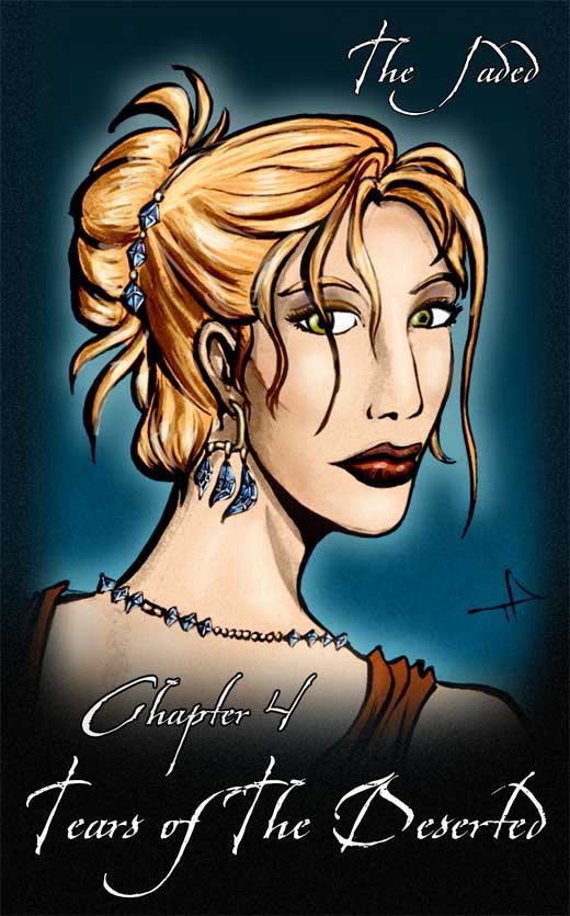
Today I'm making a cover for Chapter Four of The Jaded. It's been a custom for me to have a portrait of a different character for each cover, so we had Jade for Chapter One, Jin for Chapter Two, Doc Ice for Chapter Three... now it's Lysanne for Chapter Four.

The chapter name is "Tears of the Deserted" and there's some fun stuff in store as I get to draw lots of fancy-dress. I want Lysanne posing in fancy dress with a set of tanzanite jewelry.


These are my pencils of the picture. You'll notice they're quite finished and clean. My friend Steve Bryant from Athena Voltaire once told me that best inking is done on good pencilling, and muddy, messy pencils are very difficult to ink, so I'm taking his advice as a philosophy to inking.

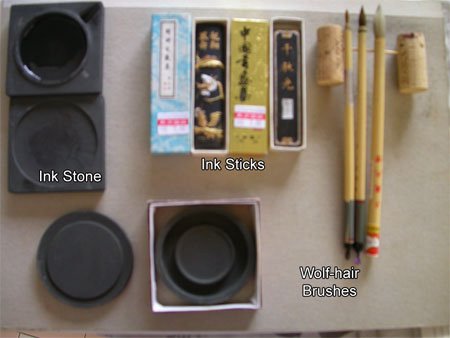
Let me introduce you to my new arsenal of inking tools. I like inking using brushes. Recently I switched from my usual sable brush and india ink setup to something closer to my roots: Chinese brushes and inks.


There are several reasons why I prefer the brushes and ink to their western counterparts.

Firstly, grindiing the ink sticks on ink stone to make ink everytime I want to ink may sound tedious, but I actually quite enjoy doing it. I'm told the process of grinding is supposed to calm you down and get you into the mood for writing/inking, but for me the main two advantages of this is 1) I can control how black I want the ink to be, which can be ridiculously black, and which my luckless india-ink counterparts have to resort to searching for super-black inks or drying out their ink bottles for. 2) My second advantage is I get fresh, new ink each time I ink. Anyone who has used india ink before should know that about half-way through the bottle, most india inks tend to "go off" after a few weeks/months, and start sedimenting (I hate it when that happens, it makes for horrible blotchy inking). With the sticks, I only make enough to use each time, so there's hardly any surplus left to go bad.

Secondly, the good chinese brushes, while larger at the base than the sable brushes, can retain just as sharp a point, and hold far more ink, making it easier to make long, smooth strokes as you need not dip the brush in as often. An added plus is that even the more expensive hair for the brush (xiao lang mau or wolf-hair) is still cheaper than sable. (Well, at least where I live). I guess they charge cut-thoat prices for these in America and Europe, but here they're literally a fraction of the price. Plus they actually have decent pencil-thick handles, instead of those ridiculously toothpick-thin ones. (Ok, I'm exaggerating, but you know what I mean).

It's worth noting that for any kind of brush inking, it's always worth investing in the best brush you can afford. For chinese brushes, steer clear of the goats-hair brushes. Those are horrible.


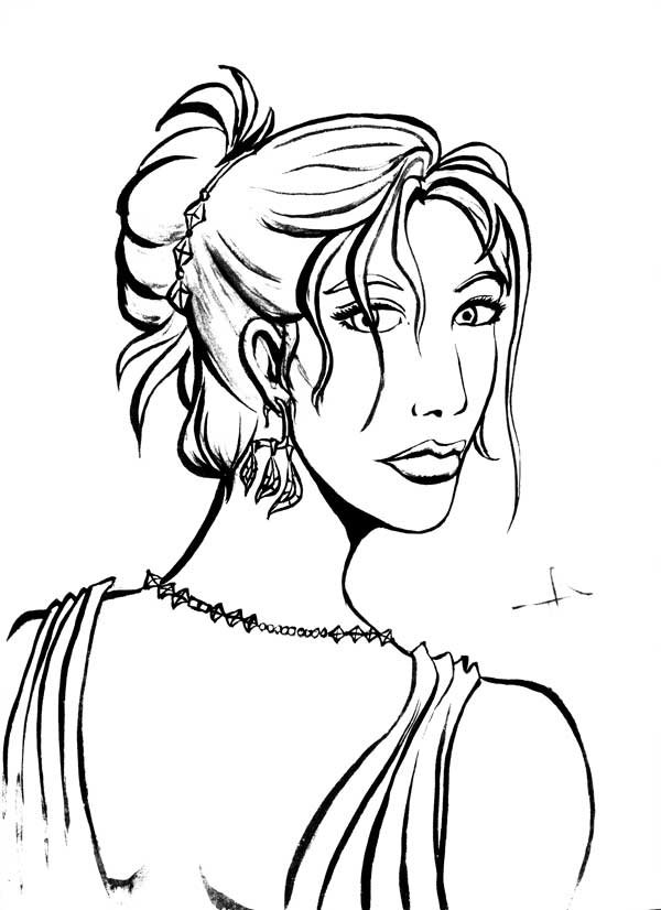
These are the results of my rough inking. As you can see, despite my best attempt to keep the paper clean, I smudged some ink across Lysanne's nose.


After scanning the image into Photoshop, I do some painting over (to get rid of the smudge) and some levels tweaking to emphasize the black and get rid of the paler greys. The lighter grey washes I use for shading,


I make a copy of the clean inks and do some further levels tweaking, so that the images becomes almost pure black and white. I'll use this layer for quick colouring (easier to paint-bucket), then toss it away when I'm done.


Going banzai with the paint-bucket, I quickly fill in the large spaces with flat areas of colour, using a brush to fill in any spots the bucket misses.


After that's we toss away the stark black-and-white layer, and superimpose the clean inks on top of the colours. I usually like to add a bit of colour and shading to this, and not to mention the high-lights. Note how alive the highlighting makes her hair look.


Add a frame, background and the text, and we're done.

Around this time I notice the mistakes in perspective and facial features in my original pencil, but it's rather late to do corrections now, which will be a pain and proves why Steve is right, it's always best to correct your mistakes at the pencil stage, and not when you've gotten to the end of the whole process!

Wednesday, August 3, 2005

Pinging Art #0.6: A Quick Note on Composition and The Importance of Camera Angles

So here I am drawing the last page of The Jaded Chapter 3: Black Earth.

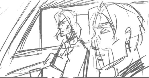
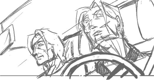
The scene I'm trying to illustrate is Doc Ice sitting in the passenger seat of a car, with Jade in the driver's seat and his crucifix earring very visible. Jade asks Ice a question, Doc answers cryptically.

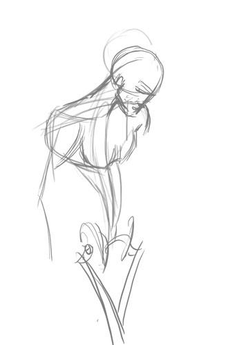
So here's the preliminary sketch (digital equivalent of a penciled sketch) that I use for layouts.


As you can see, there's nothing particularly wrong with this composition. Everything that needs to be depicted is being depicted, but for some reason, the whole scene just looks rather... boring. It's flat and there's nothing particularly interesting about it.

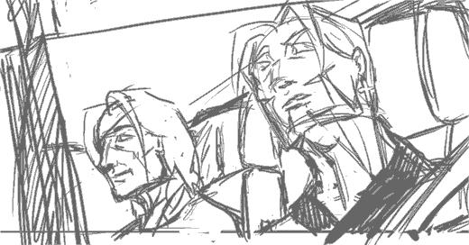
So I decide to give the same scene a second go, this time using a different camera angle and a more dramatic viewpoint. The result:


I really liked this composition. It's important to note that the steering wheel in the foreground helps break up the motony and gives the panel more depth. Unfortunately, at this point, I realise:

  1. British cars have the driver's seat on the right side
  2. I can't flip the image because Jade's earring is on the left ear.
  3. Jade is supposedly nursing a recently broken arm, and shouldn't be driving anyway


Ok you can laugh at me now. So for the sake of consistency we relegate the two to the back seat, and someone else (presumably Juno or Lysanne) will be driving.


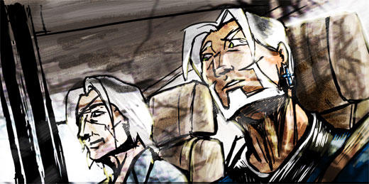
This is kind of a blow because that means I have to remove my steering wheel, but adding the window and the little rain shield at the top of it will help give a kind of frame to the picture. The result is a more 'closed' look, and hence a less empty-looking panel and better comic page overall.

Now back I go to sketching, or T won't be pleased at the state of my buffer! ;)

Edit: Thought you might be interested in the final result. I added theoverlay of the trees to give it a reflection-on-the-glass effect. Since it was the last page I thought it deserved something special.


Edit 2: Abby and Mos pointed out the perspective error on Jade's face which I missed, so here's the correction.


Having my mistakes pointed out to be is great, BTW. I can't improve without knowing what I'm doing wrong!

Tuesday, August 2, 2005

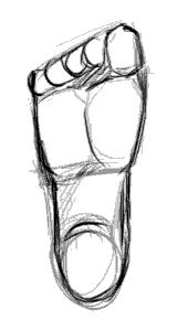
Pinging Art #0.5: A Study of Drawing the Human Foot

Ah, my great nemesis. The foot. Worse than the hand... mainly because I don't get to draw it as much.

So today I decided: "Enough of avoiding the monster!", sat down and devoted a couple hours to studying the human foot.

One thing I hate about drawing the foot is that it's so hard to find detailed tutorials on it. Most books devote pages after page of how to the draw the face, body and hands, but barely include a page on feet as an afterthought. Even the great Loomis glosses over it, which annoys me to no end.

So here I go, Google for reference (BTW, don't google "bare feet" on Image Search. Just... don't). After a solid hours of attempts at drawing feet I won;t bore you with, I realised several things.

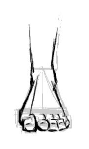
1. From the front, the human feet are a major a pain in the ass to draw.

Seriously, that wasn't really a revelation, but I just realised that anew. But back to the other points:

2. The human foot slants to the side.


There seems to be a line from the center of the foot to the center of the big toe which marks the split in directions the foot slants.

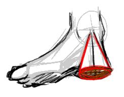
3. The heel is a cone.


I picked this one up from my copy of Action Cartooning by Ben Caldwell (An interesting book I'd recommend). The heel is sort of a cone, aligning with the leg bone at the point.

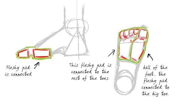
4. The human toes aren't just the bits you see at the end of the foot. They are connected to the pad thing at the base of the foot. (I never realised this before)


Don't forget to click on the image to read the notes I've scribbled on the diagrams. This is probably the most essential thing to understand to have the feet look right. Without the fleshy pads the feet don't look like feet.

5. The toes have joints. (Don't laugh, I should have known, but it just never occured to me)


This is the thing that make toes look like toes. They have to look crimped, otherwise they look unnatural. There's got to be that knuckle like bump and the little gap between the fleshy pad and the toe ends.

So with this new-found info, I'm going to test it out by drawing a series of feet from different positions:


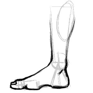
The side of the foot is relatively easy. The important thing is to lay out the fleshy pads and the heels in the right places. The big toe is also bigger than the flesh pad, so it overlaps it.


This is the side of the foot, but from the side of the little toe. More common in view than the other side, it's imparative to note the little toe is smaller than the fleshy pad so you can see a bit of it over the toe end and knuckles.


View of feet from the top. I'm told by a very reliable source (my podiatrist friend) that the fleshy pad sticks out so exaggerating it makes for more realistic -looking feet when there's an in-curve.


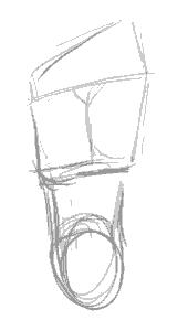
The sole. Not particularly interesting, other than being a good map of the layout of the fleshy pads and toes. Note the you can't really see the second joint of the big toe from this angle.


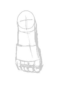
The most difficult view to draw the foot from. You need to have good grasp of geometry and perspective to be able to lay the shapes in line and get the right shape. Important things in making it look right is having the fleshy pad in the right place and showing that it's slightly wider than the toe rows.

And that's it. While I would not like to pass myself off as an expert in drawing feet, I'm reasonably happier and won't be dreading drawing feet the next time they come up in any of my art projects!

Thursday, July 28, 2005

Pinging Art #0.4: A Study of Drawing the Male Torso (Sideways)

Today I'm sketching a logo image for The Longest Sojourn. So here's another grand opportunity for a study of the male anatomy again.


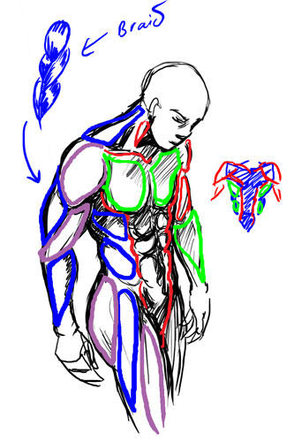
This is based off a reference picture, but some fun things to notice. End of the shoulder muscles (deltoids?) line up with the bottom of the breasts in an arc. You'll also notice I used the symmetry grids from the first study to draw the muscles in. The way of drawing the pelvis and leg-bones is a technique I picked up from Loomis' Mannikins. (Incidentally, Loomis' Figure Drawing For All Its Worth is an amazing book I'd recommend to anyone. You can learn loads off it if you don't mind the textbook approach.


We'll ignore the muscles in green and red, since those were the ones we studied in the Man-Chest tutorial. What we want are the muscles in blue and purple, which are the side view ones.


One thing you'll notice is that from the side, the arm mucles sort of resemble a braid. From this angle the triceps are visible, and the lower arm muscles (It's actually a group of several muscles) stretch over from the end of the bicep to the elbow. This is not really anatomically accurate, but very much simplified. You want detailed muscles Loomis has a very detailed chart.

Another good thing to notice is the huge neck muscle stretching all the way from the nape of neck to the shoulder muscle. Memorise that one.

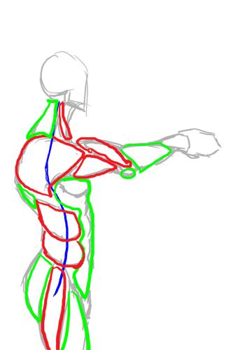
So from this study, we can summarise the visible muscles from the side as such:


And turn them into a chart for easy reference in the future.


Hopefully that makes it easier to draw the male figure from sideways.

Incidentally, for those of you who wondered what was the outcome of this study:


This is the imagemap logo I got after I finished, which hopefully will feature on the next incarnation of the TLS website.

Sunday, July 24, 2005

Pinging Art #0.2: A Study Drawing Man-Chest

I've never been good at drawing man-chest. You can tell from some of my earlier work I haven't any godly idea how to depict that very um... vital part of attractive men without it looking grotesque. Since I constantly complain about men who can't draw women's breasts right without looking like a pair of helium balloons, it's only fair I learn to draw men's chest properly too. So today I decided to sit down and explore the secret of man-chest.

The first thing any reasonable artist does when learning a new topic is get some reference. A friend of mine recommended this website for sexy hunk wallpapers, of which there's plenty of man-chest on display without it actually being porn. If you want more detailed erm... reference, Google Image Search is your friend. I'd recommend googling something like "simple nude male" but be warned you'll be likely to get lots of porn results mixed in them.

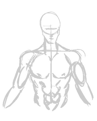
I picked the picture of this guy from the wallpapers website, because his posture is relatively natural and unobscured. Then I make a study of the chest by sketching it:


This is a very quick, very basic copy-sketch of the original picture. You can see where I used the construction lines to keep it aligned.

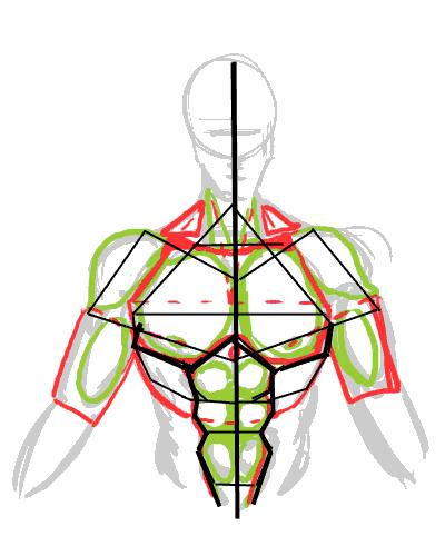
Next I do some shading in. This will help me understand the form of the muscles by studying the shadows and protrusions.


This is vitally important as I learn the geometric shapes that I will need to be able to memorise the overall form.


It's also good to study the symmetry lines so I know where to plonk the muscles the next time I draw wihout reference.


Okay we've done the study. Now to see if it pays off...

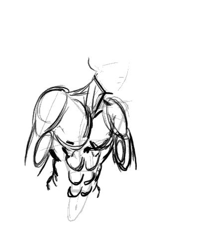
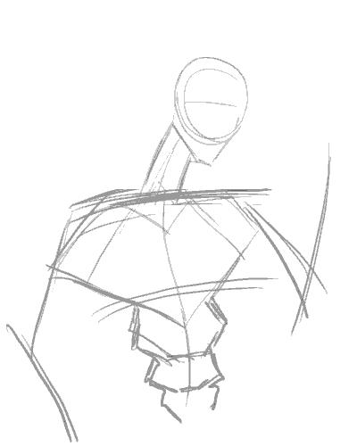
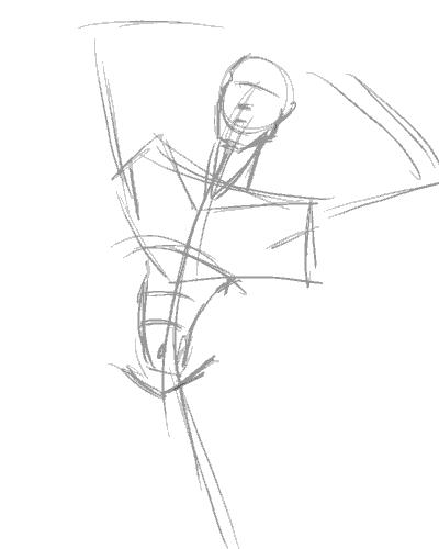
The position I chose to draw my next subject is slightly to the side. This is where the symmetry framework becomes important, sincei t allows me to be able to work out where all those muscles go when mapped out from a different angle:


Here's me loosely adding the muscles into the frame. It's not exactly accurate, but once the muscles are more or less in place, you can guess where to tweak.


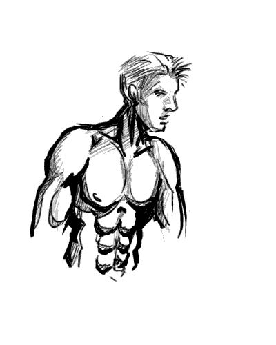
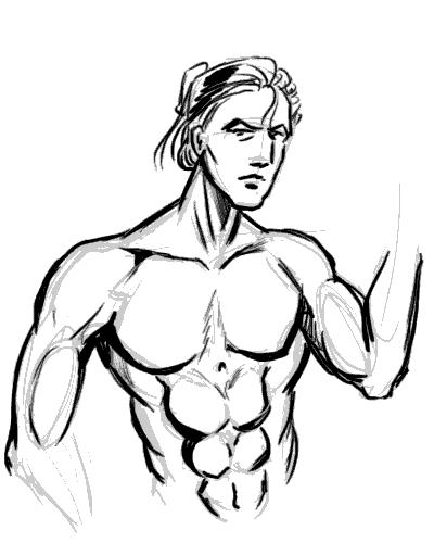
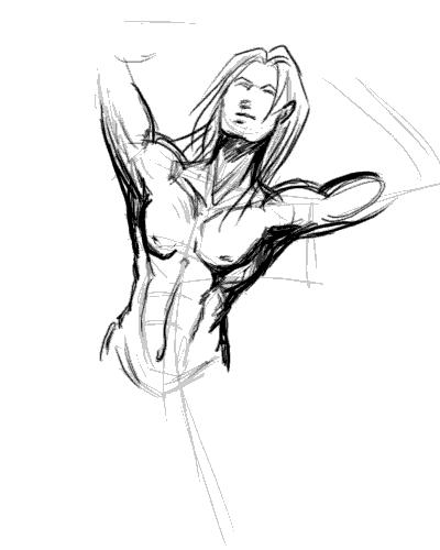
The end result. I'm not too happy with the result as the body seems too muscular for the guy's slimmish face. I'd really put more flesh onto the guy's cheek if he's that buff, really. Also, his shoulders look too narrow, making him look rather awful.


Note to self: Exaggerate shoulders for better effect.


So let's try this again. This time with a slightly less ambitious posture...


I'm happy to say the second try came out much better, with the very broad shoulders working well to give this guy the "sculpted from marble" look of of a hardened warrior. I forgot to draw the nipples this time around, but for some reason missing nipples seem to be considered acceptable on men. However, since I whine about comic book women having no nipples, I won't be hypocritical and will make a mental note not to forget them in the future.

Now comes the REAL challenge, a not-overly muscly man-chest.


I'm quickly discovering that getting the frame in the right place is by far the most important factor in making the body look right.


Adding the memorized mucles and adjusting them to fit the posture. Drawing a less muscly build turns out to be the process of simplification. Instead of individually drawing the muscles, use suggestive lines to give the overall curves of the muscle masses (if you look at the earlier study-charts, they're the lines in red.)

Of course I quickly realise that unless the guy is fat, he doesn't have voluminious breasts and thus they should not sag as much as you'd expect with women. A little correction is in order:


Another interesting thing I never noticed before undertaking this study was that there is a little depression in the center of the chest. A cute little touch that gives balance to the belly button, IMHO.

Edit: Smight of Soulgrind Squeezebox pointed out that "Something you might consider though is that when the shoulders move in certain ways the pectorals stretch to follow the arm a bit more so that the defining lines benieth them should be thinner and sharper on chest disappearing near the center of the chest."

And he's right. This looks more right than my last attempt before this, I think... and handily solves my problem of "Man-boobs" on "man-chests".


At this point I'm quite happy with my new-found knowledge of drawing man-chest, and with good fortune, I should be able to draw better-looking men in the future. I hope you enjoyed this study/tutorial, and found it helpful. Any comments, questions, and suggestions for improvements are welcome.

Stay tuned for the next entry to my art journal and thanks for reading!