Webcomics Nation launched today. Granted, I've been a beta tester for WCN for a while so it hasn't really felt very different for me.
I do find myself in an interesting position of course, as you know I'm involved in Comic Genesis (formerly known as Keenspace) and now I'm also in the rival WCN camp. Given that CG is having humoungous teething problems at the moment (Teething? More like sabre-toothed Fangs) it probably couldn't be a better time for Joey to lauch WCN.
Personally, I think WCN is quite easy to use. People have been making comparisons to Blogger and Flickr, and they're almost spot on except the interface isn't as shiny yet. The only thing that recently I realised annoyed me about it is the dubious HCI-design aspect of it, where it commits a cardinal sin in HCI (Human Computer Interface) and has a shifting interface. Bad Bad Bad. You want all your navigational stuff to stay the same if possible.
However, putting up a comic in WCN is something like
1) Press button that says "Add New Page"
2) Press button that says "Upload Comic"
3) Enter date you want comic to display.
It's much simpler, though more restrictive compared to CG, but there are a lot of cool features, such as this "tooncasting" which I would use on a lot of my pages if the green "Hosted by WCN" text wasn't so big and ugly. Automated gallery and cast pages are pretty cool too, I admit. And having free advertising doesn't hurt either.
The price is $9.99 per month, which some people have mentioned as 'steep'. It'll be interesting to see if the price remains there or if it goes up or down.
All in all, I think WCN will be a good thing for webcomics. Anything that makes it easier to put up a webcomic is a good thing, certainly, and I like the idea that there's an alternative for Comic Genesis.
Granted I may have ulterior motives since I help run the Comic Genesis Help Center and less complaining is always welcome ;)
Edit: And it's ad free. I forget to mention that.
Friday, July 29, 2005
Thursday, July 28, 2005
Pinging Art #0.4: A Study of Drawing the Male Torso (Sideways)
Today I'm sketching a logo image for The Longest Sojourn. So here's another grand opportunity for a study of the male anatomy again.
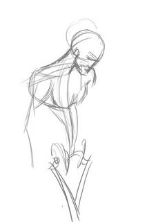
This is based off a reference picture, but some fun things to notice. End of the shoulder muscles (deltoids?) line up with the bottom of the breasts in an arc. You'll also notice I used the symmetry grids from the first study to draw the muscles in. The way of drawing the pelvis and leg-bones is a technique I picked up from Loomis' Mannikins. (Incidentally, Loomis' Figure Drawing For All Its Worth is an amazing book I'd recommend to anyone. You can learn loads off it if you don't mind the textbook approach.
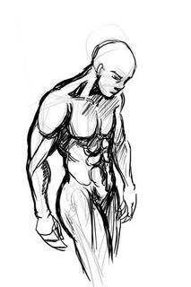
We'll ignore the muscles in green and red, since those were the ones we studied in the Man-Chest tutorial. What we want are the muscles in blue and purple, which are the side view ones.
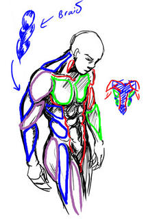
One thing you'll notice is that from the side, the arm mucles sort of resemble a braid. From this angle the triceps are visible, and the lower arm muscles (It's actually a group of several muscles) stretch over from the end of the bicep to the elbow. This is not really anatomically accurate, but very much simplified. You want detailed muscles Loomis has a very detailed chart.
Another good thing to notice is the huge neck muscle stretching all the way from the nape of neck to the shoulder muscle. Memorise that one.
So from this study, we can summarise the visible muscles from the side as such:
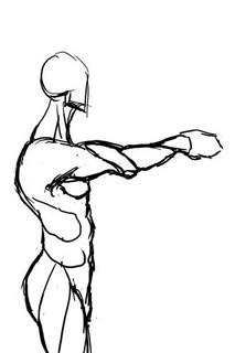
And turn them into a chart for easy reference in the future.
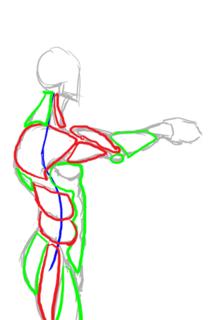
Hopefully that makes it easier to draw the male figure from sideways.
Incidentally, for those of you who wondered what was the outcome of this study:
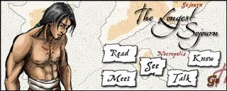
This is the imagemap logo I got after I finished, which hopefully will feature on the next incarnation of the TLS website.

This is based off a reference picture, but some fun things to notice. End of the shoulder muscles (deltoids?) line up with the bottom of the breasts in an arc. You'll also notice I used the symmetry grids from the first study to draw the muscles in. The way of drawing the pelvis and leg-bones is a technique I picked up from Loomis' Mannikins. (Incidentally, Loomis' Figure Drawing For All Its Worth is an amazing book I'd recommend to anyone. You can learn loads off it if you don't mind the textbook approach.

We'll ignore the muscles in green and red, since those were the ones we studied in the Man-Chest tutorial. What we want are the muscles in blue and purple, which are the side view ones.

One thing you'll notice is that from the side, the arm mucles sort of resemble a braid. From this angle the triceps are visible, and the lower arm muscles (It's actually a group of several muscles) stretch over from the end of the bicep to the elbow. This is not really anatomically accurate, but very much simplified. You want detailed muscles Loomis has a very detailed chart.
Another good thing to notice is the huge neck muscle stretching all the way from the nape of neck to the shoulder muscle. Memorise that one.
So from this study, we can summarise the visible muscles from the side as such:

And turn them into a chart for easy reference in the future.

Hopefully that makes it easier to draw the male figure from sideways.
Incidentally, for those of you who wondered what was the outcome of this study:

This is the imagemap logo I got after I finished, which hopefully will feature on the next incarnation of the TLS website.
Tuesday, July 26, 2005
Stopover at Comixpedia and Ping Art
I forget to mention my latest "The Essence of..." column is up on Comixpedia. Also up are a couple of other articles, including "Feeding Snarky" by Eric Burns and an interesting soapbox by Kelly J Cooper.
There's also a Inverloch interview, for those of you who are Sarah Ellerton fans.
Speaking of Inverloch, I must say the writing really tightened up recently. I didn't think you'd be able to explain away the thieves code silliness, but as comebacks in writing go, that's pretty impressive.
I've also decided to keep an art journal so I can keep track of my progress in art, for those of you interested in such things. I'm rather explicit in stuff like what I decided to learn and draw today, as evidenced by the fact the first real entry is called "Drawing Man-Chest".
And that's the blurb for today. We're going to have the next leg of your long-postponed journey up next for your reading pleasure.
Monday, July 25, 2005
Pinging Art #0.3: A Walkthrough of Drawing Comic Genesis Chan
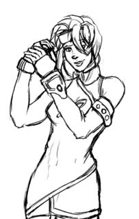
Today I'm taking an hour or two off to draw a picture of Comic Genesis (Formerly Keenspace)'s mascot, Gen-Chan. I've also decided to use the opportunity to study women's anatomy from sideways.
I want to draw space-chan with a cannon over her shoulder, from a semi-sideways view, which I'm generally not good at, so A good reference is very important to get it right.
As usual, I turn to the internet for reference. Domai is a 'simple nudes' site, which by it's own definition presents "tasteful nudes of beautiful women". While it makes no pretense on who its target audience is, I find it very useful for finding references for female figures. Although not safe for work because of the well... nudity, the pictures aren't explicit, have good and varied postures and are generally on par with what you'd get in a life-drawing class or a life-drawing reference book.
Jops of The Menagerie drew the this rendition of Gen-chan. I'm going to follow his design.
Having found an image with a posture close enough to what I want, I start sketching on my tablet to get the basic wire frame.
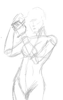
According to Jop's design, Gen has a snub nose, so I try and replicate it in a more realistic fashion. She also has a roundish face so I give her a heart-shaped face. I like having little imperfections in drawing characters, because it makes them more interesting.
I decided to dump the cannon and have her priming her wrist blaster instead.
Sadly the posture I chose blocks the logo she has on her costume, but... umm... oh well... bad planning, Ping. *sheepish grin*
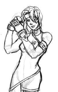
The first stage is almost complete, so I check the posture and do some minor corrections, plus lots of cleaning up.
(By the way, you can click the images to see larger versions of sketches)
I briefy considered inking this with illustrator, but I decide for now I like the sketchy quality of the art and will colour it that way. Perhaps some other time I'll do the vector version.
Set the line art layer on multiply, and create a new layer beneath it for the foreground colours. I then colour in the large spaces with my paint bucket tool with set to "All Layers". I also have my brush set to "Behind" so I don't colour over areas I've already coloured when I do the smaller areas.
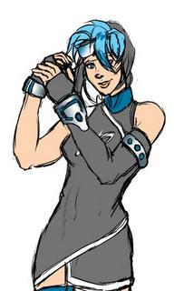
For the metallic areas I colour using magic wand set on "All Layers" and run it through an open-close algorithm. Someday I'll talk about what that does but not today. Let's just take it for granted it takes a selected area and gets rid of the little stray lines and stuff inside.
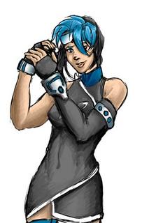
Now add different colours for the shadows. I've found using different colours on a opaque layer over the lineart instead of a black multiply layer makes for more colourful pictures. It also gives the image the "painted" quality I'm after.
Highlights are added next. I also burn the shading layers where I want it to be especially dark so they contrast well with the highlights. A background instead of blank white space is also good.
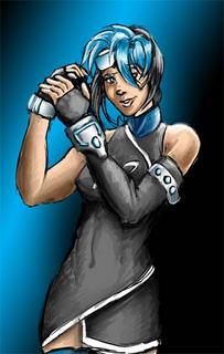
For some final touches we add the glowy effect (Screen layer) and a little frame.

And that's it. Blogger's thumbnailing system uses rather high JPEG compression, so the images look a little grainy, but as I mentioned, you can click on them to get the original image, which looks better. Now I'm off to submit this in case they're doing a rotation for the Comic Genesis front page!
Incidentally, the non-Blogger compressed version is here.
I want to draw space-chan with a cannon over her shoulder, from a semi-sideways view, which I'm generally not good at, so A good reference is very important to get it right.
As usual, I turn to the internet for reference. Domai is a 'simple nudes' site, which by it's own definition presents "tasteful nudes of beautiful women". While it makes no pretense on who its target audience is, I find it very useful for finding references for female figures. Although not safe for work because of the well... nudity, the pictures aren't explicit, have good and varied postures and are generally on par with what you'd get in a life-drawing class or a life-drawing reference book.
Jops of The Menagerie drew the this rendition of Gen-chan. I'm going to follow his design.
Having found an image with a posture close enough to what I want, I start sketching on my tablet to get the basic wire frame.

According to Jop's design, Gen has a snub nose, so I try and replicate it in a more realistic fashion. She also has a roundish face so I give her a heart-shaped face. I like having little imperfections in drawing characters, because it makes them more interesting.
I decided to dump the cannon and have her priming her wrist blaster instead.
Sadly the posture I chose blocks the logo she has on her costume, but... umm... oh well... bad planning, Ping. *sheepish grin*

The first stage is almost complete, so I check the posture and do some minor corrections, plus lots of cleaning up.

(By the way, you can click the images to see larger versions of sketches)
I briefy considered inking this with illustrator, but I decide for now I like the sketchy quality of the art and will colour it that way. Perhaps some other time I'll do the vector version.
Set the line art layer on multiply, and create a new layer beneath it for the foreground colours. I then colour in the large spaces with my paint bucket tool with set to "All Layers". I also have my brush set to "Behind" so I don't colour over areas I've already coloured when I do the smaller areas.

For the metallic areas I colour using magic wand set on "All Layers" and run it through an open-close algorithm. Someday I'll talk about what that does but not today. Let's just take it for granted it takes a selected area and gets rid of the little stray lines and stuff inside.

Now add different colours for the shadows. I've found using different colours on a opaque layer over the lineart instead of a black multiply layer makes for more colourful pictures. It also gives the image the "painted" quality I'm after.
Highlights are added next. I also burn the shading layers where I want it to be especially dark so they contrast well with the highlights. A background instead of blank white space is also good.

For some final touches we add the glowy effect (Screen layer) and a little frame.

And that's it. Blogger's thumbnailing system uses rather high JPEG compression, so the images look a little grainy, but as I mentioned, you can click on them to get the original image, which looks better. Now I'm off to submit this in case they're doing a rotation for the Comic Genesis front page!
Incidentally, the non-Blogger compressed version is here.
Sunday, July 24, 2005
Webcomic Prints #1: Alpha Shade Chapter One
I actually wrote and finished this review over two months ago. However, by some accursed misfortune, my first attempt got eaten by Blogger, and I stupidly did not save a copy. Frustrated, I wrote up the same review a second time, posted it, and found to my horror, half of it got eaten by blogger again. And like the idiot I was, I forgot to save the article again.
Ever since then, with interruptions in real-life, I've been having a hard time finding the motivation to rewrite something I've already done TWICE, but I really needed to get this off my chest. I really must apologise to the Brundlos brothers for having the review so late, though. -Ping
There have been rather heated arguments about the usefulness of webcomic reviews. Some people love reading them, while others question the usefulness of reviewing something that is (mostly) available for free. The arguments for and against often run from the profound to the ludicrous, but since you're reading this blog, I'm guess you're more likely to be a "for" than "against".
Personally I think time is a precious commodity, and for the casual reader, it's simply more fun and less tedious to read the description of a comic from a review and then checking it out instead of trawling webcomic directories for a hit. (Mind you, there's a difference between someone taking the time to discuss a comic seriously, and some attention-seeking kid who thinks that bashing a comic is a great way to boost thy ego). However, if we were to take credence in the argument that webcomic reviews are not useful because they usually don't cost money to read, then pay comics and webcomics going into print should be the focus of webcomic reviews.
Over the last few months, I've had a lot of people ask me to critique/review them on Webcomic Finds. And I'm sorry to say I've yet to fulfil any of those requests. Not because I don't want to, but with so many requests, it's a bit difficult to decide how to prioritise them. Ironically it was the "against webcomic reviews because they are free" argument that handed me my solution.
Webcomics are free... part of the reason they are free is because of the existence of free hosting space. Don't worry, I'm not going to start talking about the importance of Keenspace... Eric Burns has done it already. But the point is, because the creator needs not invest too much money (other than the internet connection fee) for the distribution of the comic, they can afford to let people read their comic for free.
However, when it comes to printing comics, it's a rather big blow to the pocket. Check out the prices for printing a comic book. This can come as a shock, especially if you've been used to webcomics and not needing a capital to invest before you do something. Yes, if you have a comic that's moderately popular you probably can keep yourself afloat with ads and merchandising in the long run, but first you need the capital to start off with until you earn what you invested back.
Now here comes the part where Ping stops blathering and starts getting to the point. Right... requested reviews. From now on I'm going to consider taking them. I'm not going to guarantee that I'm going to take on every one that comes my way, but if you've invested your hard-earned capital and need an opinion/reassurance on whether that's a good idea, then I figure the least I can do is give a review to someone who really wants/needs it. But first you need to convince me.
That done we go on to the first of the Webcomic Print series. Well, the first, the third time I've written it from scratch. *hopes to goodness this one doesn't get eaten up by a computer this time.*
Comic: Alpha Shade
By: Joseph and Christopher Brundlos
Setting and Elements: Steampunk (?), Fantasy, War
Content Type: Action/Adventure
Art Medium: "Ink" lines, Full colour
Art Style: Manga-influenced, Realistic
Is About: In a world torn by war, the outcome of the conflict may lie on the shoulders of one woman.
Website: http://www.alpha-shade.com
Book size: 8.5" x 11", Perfect Bound
Price: Sale Price $19.95 (Regularly $24.95)
First Impressions and Presentation:
The first thought I had the moment I had the book in my hands was how... large it was. Maybe it was because of the manga art style, I thought the book would be manga-novel sized. Personally, I'm a practical person, and I like books and comics that make it easy for me to carry around and read. The criteria I buy bags by isn't whether it is a Prada or Versace or God-knows-what-not. It's whether they allow me to carry a book or a sketchpad in them. Go figure.
So the book is a little big for my taste (hint: 8.5" x 11" is bigger than A4 size), but the quality of the whole thing does make up for it somewhat. The whole thing is done in high-quality glossy paper, and there doesn't seem to be much loss (if any) of quality in the transition from pixels to paper.
Another thing that stuck me was that the font seems disproportionately large for a comic. I compared it to the size of a normal font in Hellboy and it was probably 1.5 times the size. While it makes for easier reading, I do get an odd feeling when seeing it.
I'm particularly pleased at the cover page being signed. I like the personal touch it gives. It makes a lot of difference.
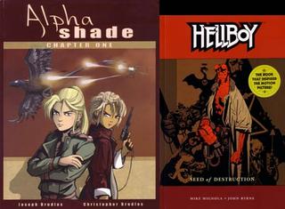
(Alpha Shade Chapter One. Next to it is a A4 sized Hellboy book for comparison.)
The Concept:
In all honestly, I find it difficult to discourse on the concept behind Alpha Shade. Not because it's incomprehensible or anything, but I have a feeling if I were to start talking about the concept, I'd be talking on something with insufficient information.
All that said, the concept of Alpha Shade seems to be interesting thus far. The action centers around Laura Stone, who seems to be the commander of an army trying to retake a city. Unfortunately, the opposition has other plans, among them an assassination attempt.
That's about as much as I can tell. There's definite hints that there is much much more behind the story than what it initially appears as, but at the present, the entire concept of chapter one can be summarized as "The enemy tries to assassinate Commmander Laura Stone"
And that's all you need to know, really.
The Art:
The art is definitely heavily manga-influenced, but I hesitate to call it manga. It's so far developed into its own individual style within manga that it feels unjust to give people the wrong stereotyped idea.
The art style is greatly augmented by the colour-work, which is stunningly good. Unlike the usual air-brushed gradient-filled style commonly found in webcomics, Alpha shade uses areas of flat color to define shadow and light. It also varies from the norm in that it uses lines for foreground, but uses mostly areas of flat colour to define shapes in the background.
Some mentions must be made of the breath-taking level of detail that has been put into the art. While the characters themselves aren't highly realistic (that is, they're stylized to a level) the machinery, structure and costumes have been painstakingly designed and drawn. There's more detail in the background of one panel of Alpha Shade than what you usually find in a page of most webcomics out there.
As a result of the fine attention to detail and planning, the action sequences in Alpha-Shade are one of the best I've ever seen in comics, and that is no exaggeration. Actions sequences have a tendency to be well... tedious after a while, but the action in Alpha-Shade is varied and mind-blowing. Particularly of note is the aerial fight-scene between in planes and flyers, which is one of those classic breathtakingly 'coooool" moments in comic books.
The Writing:
My first thought on the writing of Alpha Shade was "geez, it's a little bit slow". It took several re-readings before I realised that it wasn't really slow. Well... ok, it's not exactly fast-paced storytelling despite there being a lot of fast-paced action throughout the comic, but there is a surprising lot of subtle detail and plot hints in the seemingly random series of action scenes. I won't give anything away here, but let me just say the clues are there if you know where to look.
The whole of chapter one could be very succinctly described as a teaser pre-lude to hook the reader in. One might argue that it's a rather extensive pre-lude that runs on too long. However, thinking about it, I keep getting the feeling that Alpha Shade was never written with a comic in mind. In fact if I didn't know better I'd say it was written with an animated series in mind, which would explain a lot, including the pacing. I wonder how far I am off the mark here?
If I had to fault anything, a lot of potentially interesting characters get never get their chance to be really known to the audience. Like most war stories, people get killed quickly and fade out of the story.
Problems:
As it is, the pacing is slow for a comic, and the sudden turn of events in chapter 2 doesn't seem to help much, being vastly different from what one would expect, especially as the previous chapter left us in a cliffhanger. I can see reader potentially becoming irritated or impatient at the rate the comic moves.
The other problem that I can see is a certain amount of confusion. The world building of Alpha Shade has been admirably done, but as in created worlds, new readers may have trouble adjusting concepts such as empowered cat-lords and flyer air-forces.
The book size is a bit too large for easy reading, making it a little bit awkward to handle, but this is a minor problem, those of the comic-cook collecting culture probably wouldn't find it much of a problem.
Overall:
Often, when webcomics go to print, they often end up looking amateurish next to their glossy cousins produced in the main industry. However, Alpha Shade is a comic that easily on par with its print counterparts in any comic book shop.
The price of the book is not trivial. However, those who do decide to buy the print version of the webcomic will find that they get their money's worth, and there is very little quality loss in the transition from pixels to paper.
Ever since then, with interruptions in real-life, I've been having a hard time finding the motivation to rewrite something I've already done TWICE, but I really needed to get this off my chest. I really must apologise to the Brundlos brothers for having the review so late, though. -Ping
There have been rather heated arguments about the usefulness of webcomic reviews. Some people love reading them, while others question the usefulness of reviewing something that is (mostly) available for free. The arguments for and against often run from the profound to the ludicrous, but since you're reading this blog, I'm guess you're more likely to be a "for" than "against".
Personally I think time is a precious commodity, and for the casual reader, it's simply more fun and less tedious to read the description of a comic from a review and then checking it out instead of trawling webcomic directories for a hit. (Mind you, there's a difference between someone taking the time to discuss a comic seriously, and some attention-seeking kid who thinks that bashing a comic is a great way to boost thy ego). However, if we were to take credence in the argument that webcomic reviews are not useful because they usually don't cost money to read, then pay comics and webcomics going into print should be the focus of webcomic reviews.
Over the last few months, I've had a lot of people ask me to critique/review them on Webcomic Finds. And I'm sorry to say I've yet to fulfil any of those requests. Not because I don't want to, but with so many requests, it's a bit difficult to decide how to prioritise them. Ironically it was the "against webcomic reviews because they are free" argument that handed me my solution.
Webcomics are free... part of the reason they are free is because of the existence of free hosting space. Don't worry, I'm not going to start talking about the importance of Keenspace... Eric Burns has done it already. But the point is, because the creator needs not invest too much money (other than the internet connection fee) for the distribution of the comic, they can afford to let people read their comic for free.
However, when it comes to printing comics, it's a rather big blow to the pocket. Check out the prices for printing a comic book. This can come as a shock, especially if you've been used to webcomics and not needing a capital to invest before you do something. Yes, if you have a comic that's moderately popular you probably can keep yourself afloat with ads and merchandising in the long run, but first you need the capital to start off with until you earn what you invested back.
Now here comes the part where Ping stops blathering and starts getting to the point. Right... requested reviews. From now on I'm going to consider taking them. I'm not going to guarantee that I'm going to take on every one that comes my way, but if you've invested your hard-earned capital and need an opinion/reassurance on whether that's a good idea, then I figure the least I can do is give a review to someone who really wants/needs it. But first you need to convince me.
That done we go on to the first of the Webcomic Print series. Well, the first, the third time I've written it from scratch. *hopes to goodness this one doesn't get eaten up by a computer this time.*
Comic: Alpha Shade
By: Joseph and Christopher Brundlos
Setting and Elements: Steampunk (?), Fantasy, War
Content Type: Action/Adventure
Art Medium: "Ink" lines, Full colour
Art Style: Manga-influenced, Realistic
Is About: In a world torn by war, the outcome of the conflict may lie on the shoulders of one woman.
Website: http://www.alpha-shade.com
Book size: 8.5" x 11", Perfect Bound
Price: Sale Price $19.95 (Regularly $24.95)
First Impressions and Presentation:
The first thought I had the moment I had the book in my hands was how... large it was. Maybe it was because of the manga art style, I thought the book would be manga-novel sized. Personally, I'm a practical person, and I like books and comics that make it easy for me to carry around and read. The criteria I buy bags by isn't whether it is a Prada or Versace or God-knows-what-not. It's whether they allow me to carry a book or a sketchpad in them. Go figure.
So the book is a little big for my taste (hint: 8.5" x 11" is bigger than A4 size), but the quality of the whole thing does make up for it somewhat. The whole thing is done in high-quality glossy paper, and there doesn't seem to be much loss (if any) of quality in the transition from pixels to paper.
Another thing that stuck me was that the font seems disproportionately large for a comic. I compared it to the size of a normal font in Hellboy and it was probably 1.5 times the size. While it makes for easier reading, I do get an odd feeling when seeing it.
I'm particularly pleased at the cover page being signed. I like the personal touch it gives. It makes a lot of difference.

(Alpha Shade Chapter One. Next to it is a A4 sized Hellboy book for comparison.)
The Concept:
In all honestly, I find it difficult to discourse on the concept behind Alpha Shade. Not because it's incomprehensible or anything, but I have a feeling if I were to start talking about the concept, I'd be talking on something with insufficient information.
All that said, the concept of Alpha Shade seems to be interesting thus far. The action centers around Laura Stone, who seems to be the commander of an army trying to retake a city. Unfortunately, the opposition has other plans, among them an assassination attempt.
That's about as much as I can tell. There's definite hints that there is much much more behind the story than what it initially appears as, but at the present, the entire concept of chapter one can be summarized as "The enemy tries to assassinate Commmander Laura Stone"
And that's all you need to know, really.
The Art:
The art is definitely heavily manga-influenced, but I hesitate to call it manga. It's so far developed into its own individual style within manga that it feels unjust to give people the wrong stereotyped idea.
The art style is greatly augmented by the colour-work, which is stunningly good. Unlike the usual air-brushed gradient-filled style commonly found in webcomics, Alpha shade uses areas of flat color to define shadow and light. It also varies from the norm in that it uses lines for foreground, but uses mostly areas of flat colour to define shapes in the background.
Some mentions must be made of the breath-taking level of detail that has been put into the art. While the characters themselves aren't highly realistic (that is, they're stylized to a level) the machinery, structure and costumes have been painstakingly designed and drawn. There's more detail in the background of one panel of Alpha Shade than what you usually find in a page of most webcomics out there.
As a result of the fine attention to detail and planning, the action sequences in Alpha-Shade are one of the best I've ever seen in comics, and that is no exaggeration. Actions sequences have a tendency to be well... tedious after a while, but the action in Alpha-Shade is varied and mind-blowing. Particularly of note is the aerial fight-scene between in planes and flyers, which is one of those classic breathtakingly 'coooool" moments in comic books.
The Writing:
My first thought on the writing of Alpha Shade was "geez, it's a little bit slow". It took several re-readings before I realised that it wasn't really slow. Well... ok, it's not exactly fast-paced storytelling despite there being a lot of fast-paced action throughout the comic, but there is a surprising lot of subtle detail and plot hints in the seemingly random series of action scenes. I won't give anything away here, but let me just say the clues are there if you know where to look.
The whole of chapter one could be very succinctly described as a teaser pre-lude to hook the reader in. One might argue that it's a rather extensive pre-lude that runs on too long. However, thinking about it, I keep getting the feeling that Alpha Shade was never written with a comic in mind. In fact if I didn't know better I'd say it was written with an animated series in mind, which would explain a lot, including the pacing. I wonder how far I am off the mark here?
If I had to fault anything, a lot of potentially interesting characters get never get their chance to be really known to the audience. Like most war stories, people get killed quickly and fade out of the story.
Problems:
As it is, the pacing is slow for a comic, and the sudden turn of events in chapter 2 doesn't seem to help much, being vastly different from what one would expect, especially as the previous chapter left us in a cliffhanger. I can see reader potentially becoming irritated or impatient at the rate the comic moves.
The other problem that I can see is a certain amount of confusion. The world building of Alpha Shade has been admirably done, but as in created worlds, new readers may have trouble adjusting concepts such as empowered cat-lords and flyer air-forces.
The book size is a bit too large for easy reading, making it a little bit awkward to handle, but this is a minor problem, those of the comic-cook collecting culture probably wouldn't find it much of a problem.
Overall:
Often, when webcomics go to print, they often end up looking amateurish next to their glossy cousins produced in the main industry. However, Alpha Shade is a comic that easily on par with its print counterparts in any comic book shop.
The price of the book is not trivial. However, those who do decide to buy the print version of the webcomic will find that they get their money's worth, and there is very little quality loss in the transition from pixels to paper.
Pinging Art #0.2: A Study Drawing Man-Chest
I've never been good at drawing man-chest. You can tell from some of my earlier work I haven't any godly idea how to depict that very um... vital part of attractive men without it looking grotesque. Since I constantly complain about men who can't draw women's breasts right without looking like a pair of helium balloons, it's only fair I learn to draw men's chest properly too. So today I decided to sit down and explore the secret of man-chest.
The first thing any reasonable artist does when learning a new topic is get some reference. A friend of mine recommended this website for sexy hunk wallpapers, of which there's plenty of man-chest on display without it actually being porn. If you want more detailed erm... reference, Google Image Search is your friend. I'd recommend googling something like "simple nude male" but be warned you'll be likely to get lots of porn results mixed in them.
I picked the picture of this guy from the wallpapers website, because his posture is relatively natural and unobscured. Then I make a study of the chest by sketching it:
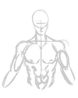
This is a very quick, very basic copy-sketch of the original picture. You can see where I used the construction lines to keep it aligned.
Next I do some shading in. This will help me understand the form of the muscles by studying the shadows and protrusions.
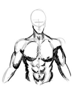
This is vitally important as I learn the geometric shapes that I will need to be able to memorise the overall form.
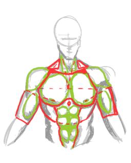
It's also good to study the symmetry lines so I know where to plonk the muscles the next time I draw wihout reference.
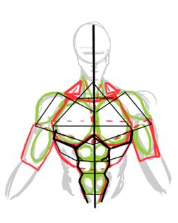
Okay we've done the study. Now to see if it pays off...
The position I chose to draw my next subject is slightly to the side. This is where the symmetry framework becomes important, sincei t allows me to be able to work out where all those muscles go when mapped out from a different angle:
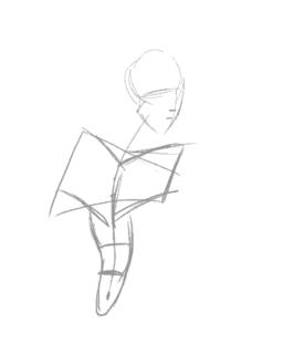
Here's me loosely adding the muscles into the frame. It's not exactly accurate, but once the muscles are more or less in place, you can guess where to tweak.
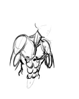
The end result. I'm not too happy with the result as the body seems too muscular for the guy's slimmish face. I'd really put more flesh onto the guy's cheek if he's that buff, really. Also, his shoulders look too narrow, making him look rather awful.
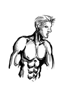
Note to self: Exaggerate shoulders for better effect.
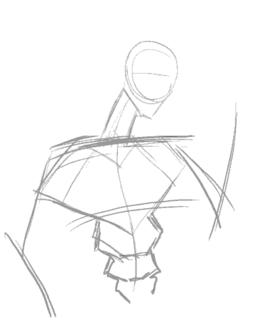
So let's try this again. This time with a slightly less ambitious posture...
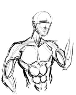
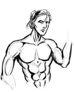
I'm happy to say the second try came out much better, with the very broad shoulders working well to give this guy the "sculpted from marble" look of of a hardened warrior. I forgot to draw the nipples this time around, but for some reason missing nipples seem to be considered acceptable on men. However, since I whine about comic book women having no nipples, I won't be hypocritical and will make a mental note not to forget them in the future.
Now comes the REAL challenge, a not-overly muscly man-chest.
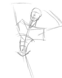
I'm quickly discovering that getting the frame in the right place is by far the most important factor in making the body look right.
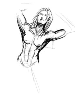
Adding the memorized mucles and adjusting them to fit the posture. Drawing a less muscly build turns out to be the process of simplification. Instead of individually drawing the muscles, use suggestive lines to give the overall curves of the muscle masses (if you look at the earlier study-charts, they're the lines in red.)
Of course I quickly realise that unless the guy is fat, he doesn't have voluminious breasts and thus they should not sag as much as you'd expect with women. A little correction is in order:
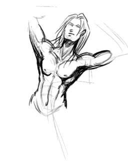
Another interesting thing I never noticed before undertaking this study was that there is a little depression in the center of the chest. A cute little touch that gives balance to the belly button, IMHO.
Edit: Smight of Soulgrind Squeezebox pointed out that "Something you might consider though is that when the shoulders move in certain ways the pectorals stretch to follow the arm a bit more so that the defining lines benieth them should be thinner and sharper on chest disappearing near the center of the chest."
And he's right. This looks more right than my last attempt before this, I think... and handily solves my problem of "Man-boobs" on "man-chests".
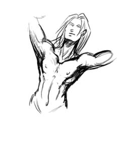
At this point I'm quite happy with my new-found knowledge of drawing man-chest, and with good fortune, I should be able to draw better-looking men in the future. I hope you enjoyed this study/tutorial, and found it helpful. Any comments, questions, and suggestions for improvements are welcome.
Stay tuned for the next entry to my art journal and thanks for reading!
The first thing any reasonable artist does when learning a new topic is get some reference. A friend of mine recommended this website for sexy hunk wallpapers, of which there's plenty of man-chest on display without it actually being porn. If you want more detailed erm... reference, Google Image Search is your friend. I'd recommend googling something like "simple nude male" but be warned you'll be likely to get lots of porn results mixed in them.
I picked the picture of this guy from the wallpapers website, because his posture is relatively natural and unobscured. Then I make a study of the chest by sketching it:

This is a very quick, very basic copy-sketch of the original picture. You can see where I used the construction lines to keep it aligned.
Next I do some shading in. This will help me understand the form of the muscles by studying the shadows and protrusions.

This is vitally important as I learn the geometric shapes that I will need to be able to memorise the overall form.

It's also good to study the symmetry lines so I know where to plonk the muscles the next time I draw wihout reference.

Okay we've done the study. Now to see if it pays off...
The position I chose to draw my next subject is slightly to the side. This is where the symmetry framework becomes important, sincei t allows me to be able to work out where all those muscles go when mapped out from a different angle:

Here's me loosely adding the muscles into the frame. It's not exactly accurate, but once the muscles are more or less in place, you can guess where to tweak.

The end result. I'm not too happy with the result as the body seems too muscular for the guy's slimmish face. I'd really put more flesh onto the guy's cheek if he's that buff, really. Also, his shoulders look too narrow, making him look rather awful.

Note to self: Exaggerate shoulders for better effect.

So let's try this again. This time with a slightly less ambitious posture...


I'm happy to say the second try came out much better, with the very broad shoulders working well to give this guy the "sculpted from marble" look of of a hardened warrior. I forgot to draw the nipples this time around, but for some reason missing nipples seem to be considered acceptable on men. However, since I whine about comic book women having no nipples, I won't be hypocritical and will make a mental note not to forget them in the future.
Now comes the REAL challenge, a not-overly muscly man-chest.

I'm quickly discovering that getting the frame in the right place is by far the most important factor in making the body look right.

Adding the memorized mucles and adjusting them to fit the posture. Drawing a less muscly build turns out to be the process of simplification. Instead of individually drawing the muscles, use suggestive lines to give the overall curves of the muscle masses (if you look at the earlier study-charts, they're the lines in red.)
Of course I quickly realise that unless the guy is fat, he doesn't have voluminious breasts and thus they should not sag as much as you'd expect with women. A little correction is in order:

Another interesting thing I never noticed before undertaking this study was that there is a little depression in the center of the chest. A cute little touch that gives balance to the belly button, IMHO.
Edit: Smight of Soulgrind Squeezebox pointed out that "Something you might consider though is that when the shoulders move in certain ways the pectorals stretch to follow the arm a bit more so that the defining lines benieth them should be thinner and sharper on chest disappearing near the center of the chest."
And he's right. This looks more right than my last attempt before this, I think... and handily solves my problem of "Man-boobs" on "man-chests".

At this point I'm quite happy with my new-found knowledge of drawing man-chest, and with good fortune, I should be able to draw better-looking men in the future. I hope you enjoyed this study/tutorial, and found it helpful. Any comments, questions, and suggestions for improvements are welcome.
Stay tuned for the next entry to my art journal and thanks for reading!
Pinging Art #0.1: Mission Statement and Index
So what is this, exactly?
I've decided to keep a journal... but it's an art journal. This is an attempt by me to replace my old Art Tutorials, with hope it'll make me easier to keep records of my art progress and write tutorials at the same time.
For those of you who don't know me, I'm Ping Teo. I doa couple of several online comics. I'm more well known for the Graphic Smash Series The Jaded, although I have more fun experimenting with my free Comic Genesis Comic The Longest Sojourn. I'm also involved in other comic projects such as the round-robin style comic Golden and parody How Not To Run a Comic on a on-off basis.
I don't consider myself a fantastic artist by any means. I'm still learning, which is why I thought keeping a journal might help me improve since I tend to forget stuff I've already learnt repeatedly.
Hopefully you'll find the rest of this interesting as well.
I've decided to keep a journal... but it's an art journal. This is an attempt by me to replace my old Art Tutorials, with hope it'll make me easier to keep records of my art progress and write tutorials at the same time.
For those of you who don't know me, I'm Ping Teo. I do
I don't consider myself a fantastic artist by any means. I'm still learning, which is why I thought keeping a journal might help me improve since I tend to forget stuff I've already learnt repeatedly.
Hopefully you'll find the rest of this interesting as well.
Thursday, July 21, 2005
Oh Here We Go With the Goddamn Helicopters Again.
I woke up to the sound of helicopters again. And this time around I didn't pay them as much attention, as they've been flying over quite regularly since the London Bombings a couple of weeks ago.
But just as I was about to set off, I got a call from my sister, and heard that some wanker bombed Warren Street station. (I'm told it was a nail bomb, not as serious as the last one)
I live in the Euston Towers area. My nearest tube station IS Warren Street. I pass that every day, I take that quite frequently, and would have been passing there if I had left a bit earlier. I suppose it was my guardian angel who was telling me I ought to have some breakfast before I go, which was what delayed me today.
Now the entire area is covered in police tape, I couldn't leave the building if I wanted to, and police, emergency services and reporters are effing everywhere. They just arrested some guy outside my hall.
Geez. Living in Central London sure ain't boring, is it?
Sunday, July 10, 2005
Stopover at The Green Avenger: There's Something About Abby
(Holy Crap! An actual Webcomics Find Post! Who'd have thought?!)
There are many reasons I like hanging around the Keenspace/ComicGenesis forums. The main one is I get to see all the budding talent first-hand, as most people start off at Keenspace and go indie when/if they get successful. Personally I think that's a great system.
Eric Burns wrote this long snark about the School of Keen a few months ago. Personally I always thought there was more learning to be done in Keenspace than Keenspot, because Keenspot is more of a business propostion, and Keenspace is there for well... starting out, experimenting, and making a comic for the hell of it.
Back to the topic, here's on of my finds discovered from hanging around Keenspace:

I think I've often mentioned I've not a devotee of superhero comics, so I wasn't sure what exactly attracted me to this comic. It might have been the art, there's something uniquely characteristic in the art style. Or that it gave off a different aura from what I expected from a typical superhero comic. I'm getting to be quite good at detecting those kind of auras.
So I checked out Green Avenger, and was amply rewarded for it. Green Avenger is an interesting hybrid superhero comic. There seem to be two kinds of comics, the story comics and the unrelated semi-autobiographical slice-of-life comics (which are usually sandwiched between the story comics, and are light bits of humour or commentary strips).
As far as I can tell, the story is about Abby, a girl who moonlights as the Green Avenger. How she got her powers and what exactly she's avenging isn't exactly clear. In fact I have a theory that she's not avenging anything, and calls herself the Green Avenger just for kicks, and doesn't really have a clue about superheroing. She also has a telepathic ex-superhero friend called the "ThePurple Lavender Fey" who seems like sardonic and serious foil for the happy-go-lucky Green Avenger.
Back to the story, this seems to be a "how superheroes deal with real-life" kind of comics. The amount of humanization the characters are given makes The Green Avenger stand out from the rest. I'm pretty sure the following scenario rarely happens in the run-of-the-mill Marvel comic, for example:
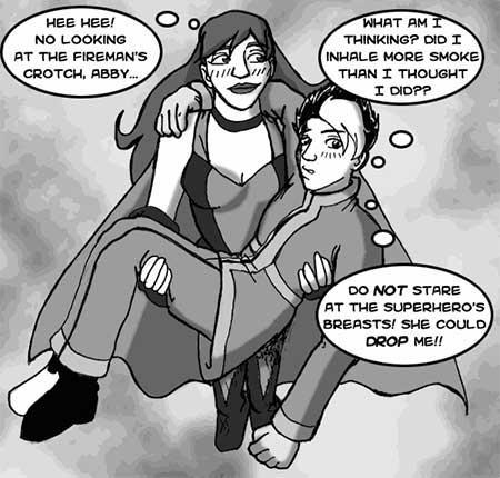
The story seems to be taking a dark and more serious twist recently, but remains intriguing. A definite plus is that the creator is colouring the more recent strips, which makes all the difference in the world. Especially since the comic is called the Green Avenger, after all. There is something endearing and quirky about this comic that I can't quite name, but whatever it is, it's really growing on me, and I can safely say The Green Avenger is one comic that I'll be definitely watching in the future.
By the way, is it ok for me to spaz out happily over this? I remember reading Argon Zark when I was a little kid of twelve or thirteen, and getting a mention is just undeniably cool, even if it's so many more years later down the line!
In other news, I'm almost finished with moving house again. Maybe staying put for a couple of months will result in more blogging from me as I get back into the mood for more Webcomic Finding again.
There are many reasons I like hanging around the Keenspace/ComicGenesis forums. The main one is I get to see all the budding talent first-hand, as most people start off at Keenspace and go indie when/if they get successful. Personally I think that's a great system.
Eric Burns wrote this long snark about the School of Keen a few months ago. Personally I always thought there was more learning to be done in Keenspace than Keenspot, because Keenspot is more of a business propostion, and Keenspace is there for well... starting out, experimenting, and making a comic for the hell of it.
Back to the topic, here's on of my finds discovered from hanging around Keenspace:

I think I've often mentioned I've not a devotee of superhero comics, so I wasn't sure what exactly attracted me to this comic. It might have been the art, there's something uniquely characteristic in the art style. Or that it gave off a different aura from what I expected from a typical superhero comic. I'm getting to be quite good at detecting those kind of auras.
So I checked out Green Avenger, and was amply rewarded for it. Green Avenger is an interesting hybrid superhero comic. There seem to be two kinds of comics, the story comics and the unrelated semi-autobiographical slice-of-life comics (which are usually sandwiched between the story comics, and are light bits of humour or commentary strips).
As far as I can tell, the story is about Abby, a girl who moonlights as the Green Avenger. How she got her powers and what exactly she's avenging isn't exactly clear. In fact I have a theory that she's not avenging anything, and calls herself the Green Avenger just for kicks, and doesn't really have a clue about superheroing. She also has a telepathic ex-superhero friend called the "The
Back to the story, this seems to be a "how superheroes deal with real-life" kind of comics. The amount of humanization the characters are given makes The Green Avenger stand out from the rest. I'm pretty sure the following scenario rarely happens in the run-of-the-mill Marvel comic, for example:

The story seems to be taking a dark and more serious twist recently, but remains intriguing. A definite plus is that the creator is colouring the more recent strips, which makes all the difference in the world. Especially since the comic is called the Green Avenger, after all. There is something endearing and quirky about this comic that I can't quite name, but whatever it is, it's really growing on me, and I can safely say The Green Avenger is one comic that I'll be definitely watching in the future.
By the way, is it ok for me to spaz out happily over this? I remember reading Argon Zark when I was a little kid of twelve or thirteen, and getting a mention is just undeniably cool, even if it's so many more years later down the line!
In other news, I'm almost finished with moving house again. Maybe staying put for a couple of months will result in more blogging from me as I get back into the mood for more Webcomic Finding again.
Thursday, July 7, 2005
The Helicopters are the Harbringers of Doom
After a late night out with a friend watching Kung Fu Shuffle Hustle, I woke up this morning to the sound of helicopters circling.
It took me about half an hour of the constant noise to make me realise something was wrong. Logging on to BBC's website, I quickly found out that it was due to a series of Tube 'explosions' on the London Underground.
But the enormity of the situation didn't sink in until we had reports of an explosion on a bus in Tavistock Square. That really gave me a chill.
You see, Tavistock Square is ten minutes walk from where I am.
Now they're talking about more blasts and terrorist attacks taking advantage of the timing, right after London Olympics bid.
So yes, it's kinda freaky to be living where I am right now.
Subscribe to:
Posts (Atom)