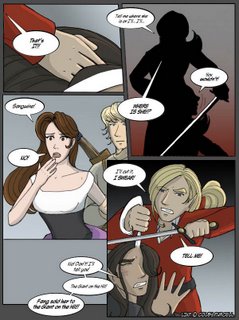
My latest column is up over at Comixpedia. It deals mainly with typical mystery tricks, and just for kicks I inserted some webcomic personalities and mascots in the comic. I may be a limited artist in some aspects, but I do flatter myself that I can ape art styles somewhat.
However, I have to say the recent theme, Mystery comics, gave me a bit of a twinge, because even more so than fantasy or sci-fi, Mystery has always been my favourite genre. I like stories that make readers think. I like the mystique of the unsolved. Most of all I like the concept of someone being able to see further than anyone else just because he/she observes and reasons accordingly.
So why does this give me a twinge? Well, one shortcoming of being in the Comixpedia staff is that I always feel I shouldn't ask or suggest that my own mystery comic, The Jaded be reviewed because it wouldn't be good journalism. There's no point writing/drawing a webzine if everyone who wrote for it just used it as a platform to talk about their own works. It'd be patting yourself on the back. Even worse, it just wouldn't have been fair, me misusing my influence that way.
And so, as a sucker who is very much at the mercy of her conscience, I held my tongue. And now that Mystery month is over, and despite the twinges, I'm very glad I resisted the temptation.
Ironically when I first started doing The Jaded a couple of years ago, to me, there was nothing I wanted so much, or considered a greater honour than having a Comixpedia review of the said comic. I suppose it sounds silly, and it's probably a sign of progress that I no longer feel so badly about it and even dare to admit it as I am doing now. It's not that I think a Comixpedia review is any less of an honour. It's not that I care any less for my comic. (Granted, it's on hiatus now, but that's because I'm too busy and I care too much for it to churn out a half-assed job. I'd rather put it on hold and do it properly when I have time.)
It's just because I want them to do it of their own accord, with no prompting from me. I want people to review my comic because they see something in it, not because they want me to write about theirs or link to them and it's a way of catching my attention. I want to be sure the comic is reviewed on its own merit. so only then I can be sure that it was picked because it's a comic of quality [x] about topic [y], and not because author [z] makes it.
I want all this because I know that more than anything else, it'd be a true test of whether it is good. And yes... I know that at this, many people will jump up and down and protest and declare that a review isn't proof that a comic is good.
On its own that point stands true.
But to me, if someone takes the time to analyse and write about something you created for the sake of the thing itself that you created, with no strings attached, no favours expected, and without knowing you...
No matter what anyone else says, in my not-so-humble opinion, that is the greatest compliment of all.
I rarely write and inform the comics featured on Webcomic Finds that they have been reviewed. I only do it for those cases where there's something on the site itself that leads me to believe that they are looking for feedback and would appreciate it greatly.
Why? Simply because that how I would want it myself.
Monday, November 21, 2005
Tuesday, November 8, 2005
Stopovers at two "Dies and is 'Ded' Laughing" moments
As you all know, I've been busy recently and even went for a spate of time without reading webcomics. Now that I'm bent on catching up, I'd like to share two moments from two of my favourite comics where I laughed so hard I choked:
The first is from LinT, where great drama and strife is being enacted.
Both moments need context to understand, so I'm going to be obliged to give a quick background blurb. Naturally, spoilers abound!
At the moment, Sangwine, the blond elf is confronting his long-time rival, Al'bert, who taunts him back by professing he knows where Sangwine's house fairy (long story), Hope, has been taken. The result is Sangwine flying off the handle and threatening Al'bert with the worse fate that can ever befall an elf.
And I'm not talking about balrogs here.
 (Clicky to see full sized page at source)
Next is Nahast, which managed to impress me by not pretending, like most fantasy comics do, that long flowy hair can hamper vision, and women do not need support while running around:
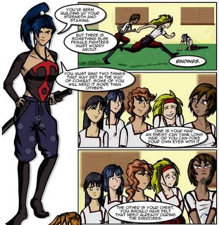
So while the girls go off to do their erm... supporting, Xu're, the shaman and his spirit guide, Thunder, arrive at the lighthouse where Tzelan is training the girls...
I suspect the thing that makes both jokes work so well is because they're so subtle and told with an entirely straight face. Ironically, it because these two comics are primarily fantasy comics, unlike the humour strips that people call the 'funnies', that makes the joke all the funnier for being unexpected.
On another note, most of you should notice that the current theme over at Comixpedia is Mystery comics, which alone should tell you why I asked for recommendations to Mystery-themed comics last post. Thanks for your suggestions so far, and keep em coming. Even if they're not used here or there, the recommendations will come in handy next time I'm bored and want to sink my teeth in a big fat mystery!
The first is from LinT, where great drama and strife is being enacted.
Both moments need context to understand, so I'm going to be obliged to give a quick background blurb. Naturally, spoilers abound!
At the moment, Sangwine, the blond elf is confronting his long-time rival, Al'bert, who taunts him back by professing he knows where Sangwine's house fairy (long story), Hope, has been taken. The result is Sangwine flying off the handle and threatening Al'bert with the worse fate that can ever befall an elf.
And I'm not talking about balrogs here.
(Clicky to see full sized page at source)Next is Nahast, which managed to impress me by not pretending, like most fantasy comics do, that long flowy hair can hamper vision, and women do not need support while running around:
So while the girls go off to do their erm... supporting, Xu're, the shaman and his spirit guide, Thunder, arrive at the lighthouse where Tzelan is training the girls...
I suspect the thing that makes both jokes work so well is because they're so subtle and told with an entirely straight face. Ironically, it because these two comics are primarily fantasy comics, unlike the humour strips that people call the 'funnies', that makes the joke all the funnier for being unexpected.
On another note, most of you should notice that the current theme over at Comixpedia is Mystery comics, which alone should tell you why I asked for recommendations to Mystery-themed comics last post. Thanks for your suggestions so far, and keep em coming. Even if they're not used here or there, the recommendations will come in handy next time I'm bored and want to sink my teeth in a big fat mystery!
Friday, November 4, 2005
Pinging Art #0.8: A Demonstration of Inking with Chinese Calligraphy Brushes
Hey everyone! It's been a while, but I've been too busy (god forbid) to draw so the blog didn't get updated in the meantime.
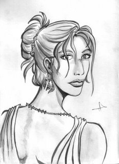
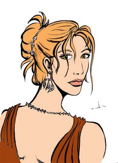
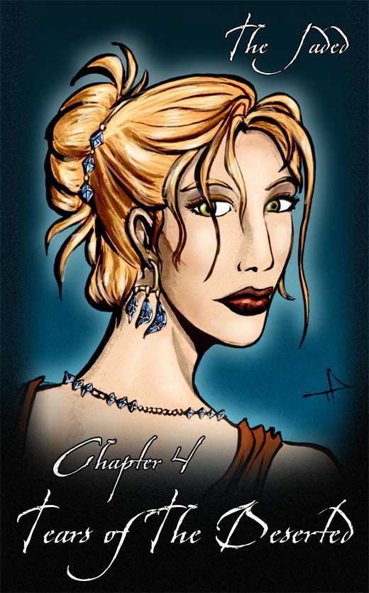
Today I'm making a cover for Chapter Four of The Jaded. It's been a custom for me to have a portrait of a different character for each cover, so we had Jade for Chapter One, Jin for Chapter Two, Doc Ice for Chapter Three... now it's Lysanne for Chapter Four.
The chapter name is "Tears of the Deserted" and there's some fun stuff in store as I get to draw lots of fancy-dress. I want Lysanne posing in fancy dress with a set of tanzanite jewelry.
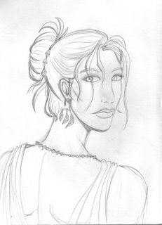
These are my pencils of the picture. You'll notice they're quite finished and clean. My friend Steve Bryant from Athena Voltaire once told me that best inking is done on good pencilling, and muddy, messy pencils are very difficult to ink, so I'm taking his advice as a philosophy to inking.
Let me introduce you to my new arsenal of inking tools. I like inking using brushes. Recently I switched from my usual sable brush and india ink setup to something closer to my roots: Chinese brushes and inks.
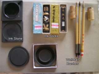
There are several reasons why I prefer the brushes and ink to their western counterparts.
Firstly, grindiing the ink sticks on ink stone to make ink everytime I want to ink may sound tedious, but I actually quite enjoy doing it. I'm told the process of grinding is supposed to calm you down and get you into the mood for writing/inking, but for me the main two advantages of this is 1) I can control how black I want the ink to be, which can be ridiculously black, and which my luckless india-ink counterparts have to resort to searching for super-black inks or drying out their ink bottles for. 2) My second advantage is I get fresh, new ink each time I ink. Anyone who has used india ink before should know that about half-way through the bottle, most india inks tend to "go off" after a few weeks/months, and start sedimenting (I hate it when that happens, it makes for horrible blotchy inking). With the sticks, I only make enough to use each time, so there's hardly any surplus left to go bad.
Secondly, the good chinese brushes, while larger at the base than the sable brushes, can retain just as sharp a point, and hold far more ink, making it easier to make long, smooth strokes as you need not dip the brush in as often. An added plus is that even the more expensive hair for the brush (xiao lang mau or wolf-hair) is still cheaper than sable. (Well, at least where I live). I guess they charge cut-thoat prices for these in America and Europe, but here they're literally a fraction of the price. Plus they actually have decent pencil-thick handles, instead of those ridiculously toothpick-thin ones. (Ok, I'm exaggerating, but you know what I mean).
It's worth noting that for any kind of brush inking, it's always worth investing in the best brush you can afford. For chinese brushes, steer clear of the goats-hair brushes. Those are horrible.
These are the results of my rough inking. As you can see, despite my best attempt to keep the paper clean, I smudged some ink across Lysanne's nose.
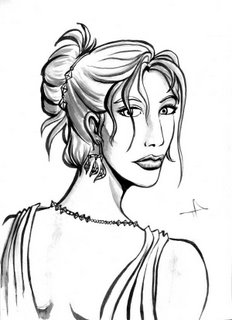
After scanning the image into Photoshop, I do some painting over (to get rid of the smudge) and some levels tweaking to emphasize the black and get rid of the paler greys. The lighter grey washes I use for shading,
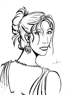
I make a copy of the clean inks and do some further levels tweaking, so that the images becomes almost pure black and white. I'll use this layer for quick colouring (easier to paint-bucket), then toss it away when I'm done.
Going banzai with the paint-bucket, I quickly fill in the large spaces with flat areas of colour, using a brush to fill in any spots the bucket misses.
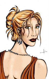
After that's we toss away the stark black-and-white layer, and superimpose the clean inks on top of the colours. I usually like to add a bit of colour and shading to this, and not to mention the high-lights. Note how alive the highlighting makes her hair look.

Add a frame, background and the text, and we're done.
Around this time I notice the mistakes in perspective and facial features in my original pencil, but it's rather late to do corrections now, which will be a pain and proves why Steve is right, it's always best to correct your mistakes at the pencil stage, and not when you've gotten to the end of the whole process!
Today I'm making a cover for Chapter Four of The Jaded. It's been a custom for me to have a portrait of a different character for each cover, so we had Jade for Chapter One, Jin for Chapter Two, Doc Ice for Chapter Three... now it's Lysanne for Chapter Four.
The chapter name is "Tears of the Deserted" and there's some fun stuff in store as I get to draw lots of fancy-dress. I want Lysanne posing in fancy dress with a set of tanzanite jewelry.

These are my pencils of the picture. You'll notice they're quite finished and clean. My friend Steve Bryant from Athena Voltaire once told me that best inking is done on good pencilling, and muddy, messy pencils are very difficult to ink, so I'm taking his advice as a philosophy to inking.
Let me introduce you to my new arsenal of inking tools. I like inking using brushes. Recently I switched from my usual sable brush and india ink setup to something closer to my roots: Chinese brushes and inks.

There are several reasons why I prefer the brushes and ink to their western counterparts.
Firstly, grindiing the ink sticks on ink stone to make ink everytime I want to ink may sound tedious, but I actually quite enjoy doing it. I'm told the process of grinding is supposed to calm you down and get you into the mood for writing/inking, but for me the main two advantages of this is 1) I can control how black I want the ink to be, which can be ridiculously black, and which my luckless india-ink counterparts have to resort to searching for super-black inks or drying out their ink bottles for. 2) My second advantage is I get fresh, new ink each time I ink. Anyone who has used india ink before should know that about half-way through the bottle, most india inks tend to "go off" after a few weeks/months, and start sedimenting (I hate it when that happens, it makes for horrible blotchy inking). With the sticks, I only make enough to use each time, so there's hardly any surplus left to go bad.
Secondly, the good chinese brushes, while larger at the base than the sable brushes, can retain just as sharp a point, and hold far more ink, making it easier to make long, smooth strokes as you need not dip the brush in as often. An added plus is that even the more expensive hair for the brush (xiao lang mau or wolf-hair) is still cheaper than sable. (Well, at least where I live). I guess they charge cut-thoat prices for these in America and Europe, but here they're literally a fraction of the price. Plus they actually have decent pencil-thick handles, instead of those ridiculously toothpick-thin ones. (Ok, I'm exaggerating, but you know what I mean).
It's worth noting that for any kind of brush inking, it's always worth investing in the best brush you can afford. For chinese brushes, steer clear of the goats-hair brushes. Those are horrible.

These are the results of my rough inking. As you can see, despite my best attempt to keep the paper clean, I smudged some ink across Lysanne's nose.

After scanning the image into Photoshop, I do some painting over (to get rid of the smudge) and some levels tweaking to emphasize the black and get rid of the paler greys. The lighter grey washes I use for shading,

I make a copy of the clean inks and do some further levels tweaking, so that the images becomes almost pure black and white. I'll use this layer for quick colouring (easier to paint-bucket), then toss it away when I'm done.

Going banzai with the paint-bucket, I quickly fill in the large spaces with flat areas of colour, using a brush to fill in any spots the bucket misses.

After that's we toss away the stark black-and-white layer, and superimpose the clean inks on top of the colours. I usually like to add a bit of colour and shading to this, and not to mention the high-lights. Note how alive the highlighting makes her hair look.
Add a frame, background and the text, and we're done.
Around this time I notice the mistakes in perspective and facial features in my original pencil, but it's rather late to do corrections now, which will be a pain and proves why Steve is right, it's always best to correct your mistakes at the pencil stage, and not when you've gotten to the end of the whole process!
Friday, October 28, 2005
So ok, I'm still Alive
Time flies when you're running around applying for jobs and going for interviews. I do apologise to those of you who worried about me. I didn't realise over a month had passed before Kelly over at Comixpedia gave me a poke about my Essence contribution. Which, btw, you can read here. I grouse a lot about vampires there.
As you will no doubt have noticed, there is a new review below. Hooray!
Lastly, if any of you feel like pimping comics, this is the time to do it. I'm looking for recommendations for comics with a mystery theme to them. Please post them in the comments section and I will be very grateful (and so would the creator, I suppose.)
I'm still going to be busy. I've had to put The Jaded on hold and am barely managing to keep The Longest Sojourn running, but one thing at a time, and as much as I love comics, some things are just more important sometimes.
Aaannd it's 2 am in the morning, I am going to sleep.
33rd Leg: The Dementia of Magic

Comic: The Dementia of Magic
By: Nicholas Killewald
Setting and Elements: Fantasy, Magical World, DnD Influenced
Content Type: Adventure, Humor
Art Medium: Inks, Cel-shaded colours
Art Style: Simplifed Cartoony.
Is About: The adventures of a thief and his soceress sister in a land ruled by and inept king who is constantly conscripting peasants into his army.
Website: http://www.dementiaofmagic.net
Frequency: Irregular
Availability: Free
First Impressions and Presentation:
I must admit my first impression wasn't very favourable. Whatever else I may think of the comic later, at first sight, the art for DoM isn't very impressive. As most comics rely on art to draw the reader in and writing to keep them there, I suspect the writing must be excellent to keep them there.
The website design is simple, although the slick Photoshopped (or should I say, GIMPed?) title image contrasts badly against the simple and cartoony art style of the comic. Link colours aren't bad, but a little tooo bright. Navigation however, is straightforward and easy to use.
The Concept: The Dementia of Magic is one of the many and common stereotypical DnD variant comics out there. You have your hero the thief, his sister the sorceress and the people of their village. I have to admit this premise didn't exactly thrill me, and if this comic had not been linked to by Catharsis, I probably would have taken a brief look and moved on. However, because the link IS there, I'm willing to give this a chance (See the importance of recommendation?). Good execution and new spins on non-original concepts can make for good reading, after all.
The Art:
The art for DoM isn't anything to talk about at. Nicholas' art is extremely simplified, which isn't a particularly bad thing, but simplified art often needs smooth lines and geometric shapes to carry it off. Despite the artist's best attempts, the wobbly linework with unvarying thickness results in a rather flat look.
The early strips are quite rough, but over time many improvements have been made, such as the change from black and white to full colour and the clear, more consistent art. The newer strips expecially show quite a bit of effort and attention to detail, and the new colouring work is actually quite good.
While the initial font was hard to read, the change to a more eye-friendly font was a godsend.
The art so far has shown a slow and steady rate of improvement, and whatever is lacking in artistic skill the artist more than makes up for with the amount of effort and attention to detail put in.
The Writing:
In all honesty, I wasn't very impressed by the first storyline. While the story was surprisingly original (No motely crew meeting up and setting out on a quest) a lot of the details didn't make sense.
Ping's train of thought:
"Eh? They killed the dragon and are heroes! Why are they running away? That doesn't make sense!"
*goes on reading anyway*
However, the writing improves drastically after Magic Mushroom storyline, and I'm happy to report that the stories often transcend their set-up and plot inconsistencies by being quite orignal and entertaining. There's also a lot of interesting world-building going on. OK, I generally don't like fantasy that's built on Tolkien unless it has a twist, but I do like to see attempts to develop the thing out of the bloody fantasy sterotype so it adds something to it. The latter strips especially show a lot of thought being put into the world-building, ranging from programming principles put into spellcasting and a forays into the properties of the plants and culture of the world.
Oh, and I'm pretty sure that the most distinctive thing about DoM is the concept of Nasal Flies. I won't tell you what they are and spoil it, but I laughed my head of and judging by the guest strips, they seem to be pretty popular.
While there are many plot inconsistencies early on (these get progressively less and less as time goes on), you get drawn in by the story so (most of the time) you're willing to suspend disbelief.
Another point about DoM is the frequent and regular use of self-insertion. The author often appears in strips pertaining to the creation of the comic, and sometimes at pivotal plot points, making jokes at his own execution of the comic. This makes the whole comic feel more like a comic where the creator learns how to make a fantasy comic. Self-insertion being what it is,it sometimes works and sometimes doesn', but all in all I found the self-insertion strips to be tolerable, instead of the usual closing of the browser window and the vow to never return ( though I shouldn't be one to talk. I've used it myself a few times.)
And... Do I see a reference to Catharsis here?
Problems:
Despite the fact the art is not exactly the comic's string point, my complaints are all concerning writing. Other than the aforementioned plot inconsistencies...
This is one thing about DnD variant stories that annoys the hell out of me. "Thief" is NOT, and should NOT, be considered a respectable profession. It is definitely an profession you DO NOT admit to having in the open unless you want to be tracked down and tossed in the dungeon for. No one should be able to say "Oh that's So-and-so the Thief's house over there", especially as they live in a place where there are lots of soldiers running around conscripting everyone. I know it's imperative for most fantasy stories to have the stealthy sneaky thief character, but for god's sake at least have the guy/girl pretend to be a shoemaker or peddler or farmer or something.
The other main problem I have with the writing is what I call "It's a Small World After All" and "The World Revolves Around Our Protagonists" syndrome.
The former refers to the fact how every character in the world seems to know everyone else, when logically, that should not be possible. Not only that, the in a lot of cases, some new character the protagonists meet knows someone else the protagonist knows from the past. Not only that, but the characters seem to run into the same people in different places over and over again. Whether it's the palace guard or the evil mage or the elven librarian, it does make you wonder after a while if the population of the entire fantasy world barely reaches double digits.
The latter syndrome is also one that is common in most fantasy fiction, but is no less annoying for that. This refers to the annoying tendency for everything important that ever occured to happen to, or around the main the characters. While I realise that the story wouldn't be very interesting if NOTHING happened to them, how believable everytime something major happens the main character just happens to be in the thick of it decreases.
Overall:
It's hard to put my finger on what exactly it is that makes this comic work. Despite having a number of non-trivial shortcomings (both in art and writing), I found myself enjoying the comic and actually liking the characters.
I suspect this may be due to the sheer amount of effort that has obviously gone into the comic. The creator shows such enthusiasm and depth of thought about the background and world that the reader feels it, and is pulled along with it.
DoM may not be to the taste of most people, but if you don't require lavish art, like original storylines and have a high threshold in suspension of disbelief, give DoM a try, and you may find that you'll enjoy yourself.
Oh, And the concept of "Nasal Flies" is genius.
The Next Leg:
I was going to review Stuff of Legends, but as the comic appears to have reached an end or hiatus, so I decided to head back to the DoM link page and pick another comic.
This is a good thing, really, since I seem to have a bias towards fantasy comics and really should be experimenting more of the other stuff.
Sunday, September 11, 2005
September...
...hasn't been a very good month so far, to put it mildly. Bad luck and more bad luck keeps stacking up one after another. I won't bore you with details. I'll just say comics aren't exactly my top priority right now.
I do have the report of the next leg (Dementia of Magic) in the works, but that's about it.
This is just in case you're wondering why I haven't been blogging much.
I do have the report of the next leg (Dementia of Magic) in the works, but that's about it.
This is just in case you're wondering why I haven't been blogging much.
Monday, August 22, 2005
Year #1: Ping's Favourite Finds of 2004/2005!
It took Eric Burn's Websnark to remind me, but Webcomic Finds turned 1 year old on August 12th... And I completely missed it.
Which annoyed me really, because I had a feature planned for it and stuff. I wanted to summarize the picks of the year.
Better late then never I guess.
A little over one year ago, I thought what a great idea it would be if I started reviewing comics. I liked doing it. I'd often done them in forums. But I wanted something more official. I considered doing a review site by proxy, with a drawn comic instead of a review (You'll recognise my prototype for the comic that eventually became "The Essence of..."), but then I decided there were review sites enough already. I really didn't have anything I wanted to add to them and reviewing in comic form has its limitations.
Then I got one of my ideas. You know, one of those weird notions. I was rereading a Dalton Wemble article over at Comixpedia, when Dalton mentioned several topics, including the importance of having people recommend comics through links. Then suddenly it stuck me what an interesting experiment it would be if someone explored the world of webcomics through the links page. Where would you go? How many new and interesting comics could you find from the links page of a comic that you like?
And Webcomic Finds was born.
There's been some misconceptions about Webcomic Finds, the main one being that it's a webcomics commentary site like Websnark and many others. It's not. This is my travel journal, and my journey is webcomics. Occasionally I might talk about other stuff, but the main focus is exploring webcomics and finding new ones.
Now that I've had a year of exploring, I've covered a staggering number of comics, some which were ok, some which weren't and some which were unmissable. It's time to go over the list and pick out my favourite Finds of the year. This is something I'll be planning to do every year, by the way.
Firsly, this is not a top ten list. This is the ten favourite new FINDS list, which means these are the top ten new comics I discovered last year than I am very glad I did. This also explains why old favourites of mine like Fallen Angels Used Books and Count Your Sheep aren't in this list. Love em to bits, but I did know about them waaaaaaay before I started the blog, so they weren't new. There are a lot of comics I like that aren't in here, many for different reasons, ranging from me knowing about them earlier or hiatus or rough spots. Doesn't mean I don't like them, but the ones in the list are the ones that I check religiously for updates.
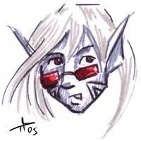
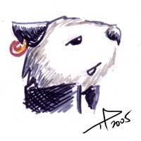
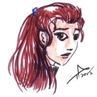
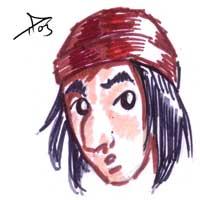
Now to make this a little more special, I decided that instead of just I list, I'd add a little fanart for each entry. It's not much, and I do apologise for the quality (I'm just learning markers) but it was great fun all the same.
Without further ado, we have, in alphabetical order, the ten comics that made the past year of writing this blog worth while for me:
Which annoyed me really, because I had a feature planned for it and stuff. I wanted to summarize the picks of the year.
Better late then never I guess.
A little over one year ago, I thought what a great idea it would be if I started reviewing comics. I liked doing it. I'd often done them in forums. But I wanted something more official. I considered doing a review site by proxy, with a drawn comic instead of a review (You'll recognise my prototype for the comic that eventually became "The Essence of..."), but then I decided there were review sites enough already. I really didn't have anything I wanted to add to them and reviewing in comic form has its limitations.
Then I got one of my ideas. You know, one of those weird notions. I was rereading a Dalton Wemble article over at Comixpedia, when Dalton mentioned several topics, including the importance of having people recommend comics through links. Then suddenly it stuck me what an interesting experiment it would be if someone explored the world of webcomics through the links page. Where would you go? How many new and interesting comics could you find from the links page of a comic that you like?
And Webcomic Finds was born.
There's been some misconceptions about Webcomic Finds, the main one being that it's a webcomics commentary site like Websnark and many others. It's not. This is my travel journal, and my journey is webcomics. Occasionally I might talk about other stuff, but the main focus is exploring webcomics and finding new ones.
Now that I've had a year of exploring, I've covered a staggering number of comics, some which were ok, some which weren't and some which were unmissable. It's time to go over the list and pick out my favourite Finds of the year. This is something I'll be planning to do every year, by the way.
Firsly, this is not a top ten list. This is the ten favourite new FINDS list, which means these are the top ten new comics I discovered last year than I am very glad I did. This also explains why old favourites of mine like Fallen Angels Used Books and Count Your Sheep aren't in this list. Love em to bits, but I did know about them waaaaaaay before I started the blog, so they weren't new. There are a lot of comics I like that aren't in here, many for different reasons, ranging from me knowing about them earlier or hiatus or rough spots. Doesn't mean I don't like them, but the ones in the list are the ones that I check religiously for updates.
Now to make this a little more special, I decided that instead of just I list, I'd add a little fanart for each entry. It's not much, and I do apologise for the quality (I'm just learning markers) but it was great fun all the same.
Without further ado, we have, in alphabetical order, the ten comics that made the past year of writing this blog worth while for me:
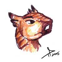
 Catharsis was the comic featured on the 32nd Leg of Webcomic Finds. One of the few webcomics online that prove suitable for all ages, it tells the story of a girl and her dragon... and naken squirrel... and dirt bunnies... and gargoyles... Well it's complicated. Catharsis is charming, well written, and overflows on the cute. It's got a huge archive, and if you like whimsical, heart-wrenching, imaginative humour, you owe it to yourselves to plow through this baby.
 Copper didn't win WCCAs for nothing, but back then at the 16th Leg, I didn't know that. Although some reader of the New York Times accused Copper of being a shameless clone of Calvin and Hobbes due to the story being about a boy and his non-human companion, other than the initial premise, there's not THAT muc similiarity, really. It's pretty much as much similarity as between say... Batman and Spiderman). Watterson deals with nostalgia, imagination and real-life. Kazu deals more with fantasy, philosophy and intellectual symbolism. Despite the infrequent updates, each page is good enough to stand alone, so it's worth your time to look over the small collection, and enjoy the thoughtful writing and fantastic art.
 Darken was one of my numerous stopover comics, and at that time wasn't updating very frequently. Now that the creator Kate "Komiyan" is in the 3-times-a-week "Lazy Grind", updates have been coming in thick and fast, and this comic has been nothing short of engrossing. A medley group of stock fantasy characters (Warrior, Dragon-priestess, Thief, Dark Elf and Black Widow) are out on a quest. The twist is: their quest is to take over the world of Darken! Finely balancing humour and adventure, if you can bear the roughness of the first few pages, this comic will have you in love with the fantasy genre all over again!
 Digger. Everyone's been rhaspodising about it, and with good reason. Digger is the wombat who by an arcane twist of fate, gets tunneled into a world entirely different from her own. Now she's lost in a world of oracular slugs, dead gods and metaphorical pigeons, and with no way to get back to her warren. Other than the spell-binding black-and-white art, the writing... well... this comic can somehow be charming and macabre at the same time, sweet yet scary, funny yet tragic, and Ursula Verson shows you how! Unfortunately at this time this comic requires a subscription over at Graphic Smash, but for those who would prefer it, Digger is now also available in print format. Stopovered due to metaphorical pigeons...
 LinT, the full name of which is "Life in Tehran" harks back to a time when comics were simpler and most importantly, FUN. The story is a praody of the typical DnD adventurers-on-a-quest set-up, but the heroic 'heroes' have been subtituted with the silliest, craziest and most lovable bunch of characters ever. From midget dwarves to wise orcs and sock-stealing theives, the characters go through adventure after adventure in the most unheroic ways. And although there's the occasional spare moment of drama, it never gets too far before the slapstick humor pops in to remind you this is all about fun, and that's the way comics should be.
 Magellan Justice Academy. Fans of superheros who have gotten bored of the incessant rehashes and ret-cons will find a breath of fresh air in Magellan. Kaycee is the underdog 'norm' hero who is accepted into Magellan Justice Academy, a training academy for superheroes. How can she hold her own, especially when things in Magellan seem to be going into odd directions? It's hard to but a finger on why Magellan works so well as a superhero comic. I think the reason is that the superhero facet is a secondary aspect of the characters, and who they actually are the first. It's less about who has what power and super-ability, but who has the guts, the responsibility, and the good sense. Rule One of good writing: Make the audience care about your characters. Stephen Crowley succeeds massively at this, and Magellan as a result is addictive and compelling. Graphic-Smash only, but with lots of free samples. Stopovered!
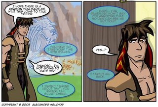
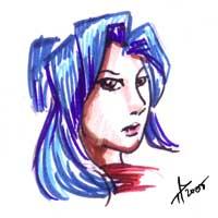 Nahast: Lands of Strife has been struggling with updates lately, but you can tell creator Alexander Melchor is really trying. Another one of the fantasy comics, Nahast is different in that it has its own world and high level of world-building. The story behind Nahast is serious, and intricate, with the occasional light moment. Humour really isn't the central theme of the comic though. This is a epic fantasy, though it reads more like mystery and mythology wrapped into one. It's hard to put my finger on why this comic is addictive as it is, but if you don't mind the filler and sporadic update, give it a try and maybe you can find a better way of describing it. Discovered through a stopover.
 No Rest for the Wicked is one of the most brilliant fantasy concepts online. Basically, it takes traditional european fairytales, interwines the plots and retells them in the most ingenious way imaginable. The moon has been missing, and Princess November, the Princess from "The Princess and the Pea" can find no rest until it is found. Accompanied by Little Red Riding Hood and Puss-in-Boots, they set out in search of the moon and her grave. The art for NRFTW is manga-styled, but creator Andrael has taken pains to make it her own personal variant of it. NRFTW is one of my favourite comics of all time, and if this comes out in print, I'm getting it. I like it that much. Found on the 6th Leg.
 Shivae! by Tiffany Ross is an anthro comic. When I first found it back in one of my stopovers, I was surprised that something this good had managed to exist this long and elude me. Shivae! is an interesting look at a non-human centric world of creatures known as Shivae, which are sort of part-dinosaur part-winged-horse-like creatures (that's a lot of dashes, isn't it?). When aliens start showing up and invading their world, the Shivae come into conflict with the settlers and more often than not, are hunted for the treat they present to the settler's livestock. Their only solution is to run, but how far can they run if the settlers keep spreading? Other the cute character design and the gorgeous colouring by Tiffany's colourist, Flowerlark, the writing is compelling, yet touches on a lot of serious issues in a non-preachy way. Definitely worth a read.
 Reviewed back in the 2nd Leg, The N00b is a tongue-in-cheek jab at the world of Massive Multiplayer Online Gaming. Our protagonist is a newbie who has just embarked on an adventure in the world of Clichquest, a cumulative parody of games like Worlds of Warcraft and Ultima Online. While the rougher language may turn a few people off, and The Noob's writing is ingeniously funny and more than make up for any shortcomings in any other department. When you hear an RPGer explain with a straight face that "deus ex machina means "God without a car", you know that Gianna Masetti is an evil evil genius.
That concludes my list. There were many many more comics that I would have loved to include in there, but sometimes a line has to be drawn. But if there were only ten new comics I could recommend to you, these ten would be it.
Looking at the list, I can't help but notice a really high percentage of fantasty comics in it. I must make a mental note to expand my reading tastes the next year. We'll see if things change. My agenda for Year Two is to have more random picks. I'm also thinking of doing more reader-interactive picks. We'll see.
It's been a long year, with many ups and downs. I've made a lot of new friends writing this blog, which I'm grateful for. No doubt I've made a few enemies too, but that's life, I can't please everyone. It also got me a number of of requests from numerous webcomic artists requesting for reviews (I'm working through the list guys. It's long. I'll get through it eventually) and invitation for other groups to write for them (which I would consider if I had more time).
But most of all, I'd like to think most of you out there liked reading Webcomic Finds, and I sincerely hope I've managed to introduce you to one of two new comics that you liked.
And that's the most important thing, really.
Saturday, August 20, 2005
Stopover at The Tenth Life of Pishio the Cat: This is me waiting far too long to write about this.
Several months ago, there was a completely new comic that debuted on Graphic Smash.
It was called The Tenth Life of Pishio the Cat. Other than having an incredibly long title, it also had something many other comics didn't... a refreshingly original plot for a webcomics and non-human centric characters.
From the very first few pages, I fell in love with Zack Giallongo's amazing art and set-up. This comic, I knew, was something special, and did something very few comics manage to do within their first few pages: Get bookmarked immediately.
I would have written about Pishio long ago, but seeing that the comic had barely started, I resolved to wait a while for a substantial archive to build-up. (My magic number is 20 pages).
However, in that time the comic had managed to get a WCCA nomination and recently went independent, moving from Graphic Smash to WebcomicsNation.
A perfect time to start writing about it, since the archives are free now. ;)
The premise behind The Tenth Life of Pishio the Cat is simple. Pishio the Cat has been carelessly squandering his nine lives. When his luck finally runs out one day and he finds out that he's dead, he strikes a bargain with the powers-that-be for a last chance. Unfortunately, that involves risking his life-on-loan doing a dangerous task that even the powers-that-be cannot do. Can a cat find redemption?
With the recent NYT article and it's subsequent Slashdotting, a number of complaints about webcomics surfaced. While I am rather skeptical about the NYT article's viewpoint due to the writer's position, the discussion on the Slashdot thread I found more interesting, as a lot of them were from the viewpoints of the actual audience webcomics target. But anyway, one particular complaint was the lack of good-quality artwork in the webcomics.
Personally I think there's plenty of stunning artwork in webcomics. But because webcomics are learner's medium, the masterpieces get drowned in a lot of practice works, so the means the skill level of art is dragged down. It's a price we pay for not having editors.
All that said, the art Pisho is what you get when the comic artist in question is a professional illustrator from the start.
 (Cat and Cock fight! (Yes, I'm aware how dirty that sounds) Click the thumbnail to see the original page).
The art speaks for itself, and in many cases, the writing as well. Zack is obviously from the the school of "show, not tell", so dialogue and narration are kept to a "need to know" basis, and never so much that the reader feels info-dumped. Instead, he prefers to let his composition and illustration skills do the talking and you get page after page of silent panels, where the reader is let to decide for themselves what they are seeing. Most of the time it works pretty well.
Those who need dumbing-down of their reading material and the main character narrating exactly what's going on so the reader gets it probably won't like Pishio. But those who like doing their own interpretation, a little bit of thinking, and lightning-bolt casting squirrel shamans will love Pishio.
All in all, Pishio is good from the get-go, and continues to be good so far. I'd even go so far as to call it a completely original, less-whimsical and more-violent cousin to Ursula Vernon's Digger. Given that Digger is one of my favourite webcomics ever, consider that high praise indeed.
It was called The Tenth Life of Pishio the Cat. Other than having an incredibly long title, it also had something many other comics didn't... a refreshingly original plot for a webcomics and non-human centric characters.
From the very first few pages, I fell in love with Zack Giallongo's amazing art and set-up. This comic, I knew, was something special, and did something very few comics manage to do within their first few pages: Get bookmarked immediately.
I would have written about Pishio long ago, but seeing that the comic had barely started, I resolved to wait a while for a substantial archive to build-up. (My magic number is 20 pages).
However, in that time the comic had managed to get a WCCA nomination and recently went independent, moving from Graphic Smash to WebcomicsNation.
A perfect time to start writing about it, since the archives are free now. ;)
The premise behind The Tenth Life of Pishio the Cat is simple. Pishio the Cat has been carelessly squandering his nine lives. When his luck finally runs out one day and he finds out that he's dead, he strikes a bargain with the powers-that-be for a last chance. Unfortunately, that involves risking his life-on-loan doing a dangerous task that even the powers-that-be cannot do. Can a cat find redemption?
With the recent NYT article and it's subsequent Slashdotting, a number of complaints about webcomics surfaced. While I am rather skeptical about the NYT article's viewpoint due to the writer's position, the discussion on the Slashdot thread I found more interesting, as a lot of them were from the viewpoints of the actual audience webcomics target. But anyway, one particular complaint was the lack of good-quality artwork in the webcomics.
Personally I think there's plenty of stunning artwork in webcomics. But because webcomics are learner's medium, the masterpieces get drowned in a lot of practice works, so the means the skill level of art is dragged down. It's a price we pay for not having editors.
All that said, the art Pisho is what you get when the comic artist in question is a professional illustrator from the start.
(Cat and Cock fight! (Yes, I'm aware how dirty that sounds) Click the thumbnail to see the original page).The art speaks for itself, and in many cases, the writing as well. Zack is obviously from the the school of "show, not tell", so dialogue and narration are kept to a "need to know" basis, and never so much that the reader feels info-dumped. Instead, he prefers to let his composition and illustration skills do the talking and you get page after page of silent panels, where the reader is let to decide for themselves what they are seeing. Most of the time it works pretty well.
Those who need dumbing-down of their reading material and the main character narrating exactly what's going on so the reader gets it probably won't like Pishio. But those who like doing their own interpretation, a little bit of thinking, and lightning-bolt casting squirrel shamans will love Pishio.
All in all, Pishio is good from the get-go, and continues to be good so far. I'd even go so far as to call it a completely original, less-whimsical and more-violent cousin to Ursula Vernon's Digger. Given that Digger is one of my favourite webcomics ever, consider that high praise indeed.
Thursday, August 18, 2005
Pinging Art #0.7: A Quick Note on Drawing The Jaded Summer Afternoon Stories
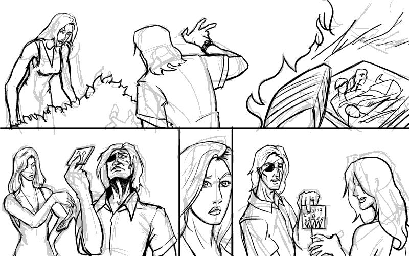
Today I'm working on a page of The Jaded. "Summer Afternoon Stories" is a run of short stories I'm planning on having in-between chapter instead of "Outtakes". I'm also using this opportunity to try out some experimental stuff.
I'm drawing a page where Lysanne and Doc Ice are tramping around in the Lanner Place shrubbery looking for Lysanne's lost shoe. Why the shoe is lost I won't get into, but what's important is when they find the shoe they also find a chewed-up CD case.
First, the preliminary scribbles:
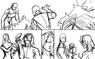
Then it's redrawing over the lines on a different layer:
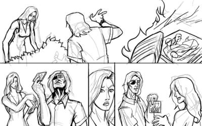
And then we add colours. I'm using the experimental washy-white colouring style to get a sketchy look for the comic. Ironically it takes me more time in the normal method I use for colouring, but such is experimentation.

I think the hard thing about not using heavy colour is having to restrict my use of the colours. I'm using the colours as the shadows, and by deafult everything else is white. It's like colours, you try to work with less and let the viewer's brain fill in the gap. Tricky. Full colour is so much more easier.
And that's it for today.
I'm drawing a page where Lysanne and Doc Ice are tramping around in the Lanner Place shrubbery looking for Lysanne's lost shoe. Why the shoe is lost I won't get into, but what's important is when they find the shoe they also find a chewed-up CD case.
First, the preliminary scribbles:

Then it's redrawing over the lines on a different layer:
And then we add colours. I'm using the experimental washy-white colouring style to get a sketchy look for the comic. Ironically it takes me more time in the normal method I use for colouring, but such is experimentation.

I think the hard thing about not using heavy colour is having to restrict my use of the colours. I'm using the colours as the shadows, and by deafult everything else is white. It's like colours, you try to work with less and let the viewer's brain fill in the gap. Tricky. Full colour is so much more easier.
And that's it for today.
Wednesday, August 17, 2005
Hotspot #11: Uncomplicating Webcomics
Apparently a journalist called Sarah Boxer from the New York Times wrote an article on webcomics.
And apparently it didn't go down very well in the webcomics world.
Eric over at Websnark wrote a strongly worded essay on it. Comixpedia has a raging debate going on as the indignant community rush to defend themselves.
Me? I don't understand how something so simple can be so damn convoluted.
Or to be precise, WHY anyone would even want to make it so damn convoluted.
Reading it over, it's an interesting point of view of an outsider to webcomics. It seems to have dragged a lot of preconcieved notions about 'webcomics' into ther article though. I mean look at this quote from the article:
No shit, Sherlock!You don't say, Holmes! What else is there between those two possiblities? Some super-duper hybrid?!
But seriously... What were they expecting webcomics to be? Taking all the fancy-shmancy theory out of it, in the end of the day they're still comics utilising the internet as a means of distribution.
They're comics on the internet.
In case you need it simplified further,
Some of them may chose to add effects you can't replicate on paper, true. Sure, some of them utilise different ways of trying to earn money. A large portion of them are free. Some blur the line between comics and cartoons, and frankly, why are we being anal about that again? Comics blur the line between art and writing, after all.
At the end of the day, they're still, they're just, they ARE comics. Distributed by the internet. Nuff said. (Have I reiterated that enough times yet?)
I suppose this is point where I confess I have no idea who this "Gary Groth" guy is, and why he seems relevant to this discussion at all. And before you shoot me that shocked look, this is where I say with a straight face: "And frankly, I don't care unless you can give me a good reason to." (In case you're wondering, I did look him up for the purposes of writing this.) I just wish he wouldn't let his opinion of Scott McCloud jaundice his whole outlook about webcomics.
Yes, Scott McCloud may have been a pioneer in many things, but he is not the King of Webcomic-Land, sorry. Sure, I respect the guy. I agree with some things he says, and disagree with others. But not everyone doing a webcomic is an ardent follower of Scott McCloud, and I really resent this viewpoint that we are all in "Cuckooland" and drunk on experimental McCloud kool-aid or whatever it is they're insisting.
I personally never heard of Scott McCloud until my third year of reading webcomics, and never read "Understanding Comics" until after I started making one of my own. And I've run into plenty of people who make webcomics who go "Scott who?"
And here's another startling confession: I have never read Reinventing Comics. And I don't plan to anytime soon. The closest I got to that was reading "I Can't Stop Thinking", and that's it.
In short:
So stop challenging points in Reinventing Comics already. My God, this whole thing is stupidity times TEN, and watching all this mud-slinging by the supposed "thinkers" of the form is like witnessing the stupidity trying to spread.
Why do these people have to make things so damn complicated?
Why are they acting so damn anal over a form of distribution?
And why can't someone for once, write an effing newspaper article about webcomics by taking them at face value and not mention Reinventing Comics even once?
Reinventing Comics isn't the origin of webcomics. Comics are the origin of webcomics. (Although, that really should have been obvious shouldn't it?)
Maybe that book advocated it, but let me tell you there are people who got into webcomics (and comics) because a news or gaming website somewhere linked a strip that got across the point they wanted to make. There are people who have never read a single issue of Superman or X-men who got hooked on a comic because someone sent them an email saying "Read this about [topic x], it's funny!". There are people who got their first introduction to comics through a Livejournal entry saying "This page just expresses exactly how I feel today".
Maybe those people who never read comics before started reading webcomics because they realised that hey, comics do not have to equal heroes in spandex, which before always got associated with the stereotype of nerdy teenage fanboys that made reading comics 'uncool' and "for kids" or "not for girls" or whatever bullcrap people spout.
Maybe they liked those webcomics because they were easily accessible through the internet. And maybe because it showed them how easy making comics could be, they too wanted to try their hand at it, not because they wanted make some statement on "art". Maybe they made comics and put them on the internet because it was simply the most convenient way to get it to their audience, and not because they wanted to reinvent the form.
A lot of maybes? I know that in one case at least, the person writing this rant got into webcomics this way.
Has it occured to anyone that there is a whole new audience who don't read comics getting into webcomics, and Oops! They bypassed traditional comics on the way? Maybe some will discover print comics on the way. Maybe some won't because they're happy to remain reading comics online.
Newflash: The comics world does not revolve around the (American) print comic industry, nor does it revolve around webcomics either. And frankly, I think it's better that way.
One more thing: Why is it no one expects comics in print to exploit the possibilities of the paper medium? *snorts* Seriously, Where are the 3D paper-pop outs going "POW!" when Batman punches The Joker? You don't expect paper comics to push the form towards the direction of origami just because they're on paper, do you?
While it would be pretty cool of someone did do that, you wouldn't expect every print comic to, so don't expect every webcomic to, because they're the same things... on different media.
Honestly, did people bitch like this about sequential art being presented on paper instead of paintings on stone walls?
Pffft! I really have to draw that one out!
And apparently it didn't go down very well in the webcomics world.
Eric over at Websnark wrote a strongly worded essay on it. Comixpedia has a raging debate going on as the indignant community rush to defend themselves.
Me? I don't understand how something so simple can be so damn convoluted.
Or to be precise, WHY anyone would even want to make it so damn convoluted.
Reading it over, it's an interesting point of view of an outsider to webcomics. It seems to have dragged a lot of preconcieved notions about 'webcomics' into ther article though. I mean look at this quote from the article:
"But when it comes to the content of Web comics, Mr. Groth was right. The comics that use digital technology to break out of their frozen boxes are really more like animated cartoons. And those that don't are just like the old, pre-digital ones, without the allure of the printed page and with a few added headaches for reader and creator alike."
But seriously... What were they expecting webcomics to be? Taking all the fancy-shmancy theory out of it, in the end of the day they're still comics utilising the internet as a means of distribution.
They're comics on the internet.
In case you need it simplified further,
- They are a hybrid of words and art with a message/story/joke.
- They don't get to their audience by being printed on paper
- They use a network of computers to deliver the content directly to their audience.
Some of them may chose to add effects you can't replicate on paper, true. Sure, some of them utilise different ways of trying to earn money. A large portion of them are free. Some blur the line between comics and cartoons, and frankly, why are we being anal about that again? Comics blur the line between art and writing, after all.
At the end of the day, they're still, they're just, they ARE comics. Distributed by the internet. Nuff said. (Have I reiterated that enough times yet?)
I suppose this is point where I confess I have no idea who this "Gary Groth" guy is, and why he seems relevant to this discussion at all. And before you shoot me that shocked look, this is where I say with a straight face: "And frankly, I don't care unless you can give me a good reason to." (In case you're wondering, I did look him up for the purposes of writing this.) I just wish he wouldn't let his opinion of Scott McCloud jaundice his whole outlook about webcomics.
Yes, Scott McCloud may have been a pioneer in many things, but he is not the King of Webcomic-Land, sorry. Sure, I respect the guy. I agree with some things he says, and disagree with others. But not everyone doing a webcomic is an ardent follower of Scott McCloud, and I really resent this viewpoint that we are all in "Cuckooland" and drunk on experimental McCloud kool-aid or whatever it is they're insisting.
I personally never heard of Scott McCloud until my third year of reading webcomics, and never read "Understanding Comics" until after I started making one of my own. And I've run into plenty of people who make webcomics who go "Scott who?"
And here's another startling confession: I have never read Reinventing Comics. And I don't plan to anytime soon. The closest I got to that was reading "I Can't Stop Thinking", and that's it.
In short:
So stop challenging points in Reinventing Comics already. My God, this whole thing is stupidity times TEN, and watching all this mud-slinging by the supposed "thinkers" of the form is like witnessing the stupidity trying to spread.
Why do these people have to make things so damn complicated?
Why are they acting so damn anal over a form of distribution?
And why can't someone for once, write an effing newspaper article about webcomics by taking them at face value and not mention Reinventing Comics even once?
Reinventing Comics isn't the origin of webcomics. Comics are the origin of webcomics. (Although, that really should have been obvious shouldn't it?)
Maybe that book advocated it, but let me tell you there are people who got into webcomics (and comics) because a news or gaming website somewhere linked a strip that got across the point they wanted to make. There are people who have never read a single issue of Superman or X-men who got hooked on a comic because someone sent them an email saying "Read this about [topic x], it's funny!". There are people who got their first introduction to comics through a Livejournal entry saying "This page just expresses exactly how I feel today".
Maybe those people who never read comics before started reading webcomics because they realised that hey, comics do not have to equal heroes in spandex, which before always got associated with the stereotype of nerdy teenage fanboys that made reading comics 'uncool' and "for kids" or "not for girls" or whatever bullcrap people spout.
Maybe they liked those webcomics because they were easily accessible through the internet. And maybe because it showed them how easy making comics could be, they too wanted to try their hand at it, not because they wanted make some statement on "art". Maybe they made comics and put them on the internet because it was simply the most convenient way to get it to their audience, and not because they wanted to reinvent the form.
A lot of maybes? I know that in one case at least, the person writing this rant got into webcomics this way.
Has it occured to anyone that there is a whole new audience who don't read comics getting into webcomics, and Oops! They bypassed traditional comics on the way? Maybe some will discover print comics on the way. Maybe some won't because they're happy to remain reading comics online.
Newflash: The comics world does not revolve around the (American) print comic industry, nor does it revolve around webcomics either. And frankly, I think it's better that way.
One more thing: Why is it no one expects comics in print to exploit the possibilities of the paper medium? *snorts* Seriously, Where are the 3D paper-pop outs going "POW!" when Batman punches The Joker? You don't expect paper comics to push the form towards the direction of origami just because they're on paper, do you?
While it would be pretty cool of someone did do that, you wouldn't expect every print comic to, so don't expect every webcomic to, because they're the same things... on different media.
Honestly, did people bitch like this about sequential art being presented on paper instead of paintings on stone walls?
"But when it comes to the content of sequential art on paper, Mr. Caveman Ugg was right. The paintings that use the bark of the tree to break out of the constraints of the immovable cave walls are really more like writings. And those that don't are just like the old cave-paintings, without the majesty of the towering stone and with a few added headaches for reader and creator alike (Due to difficulty in getting bark of tree and the durability of the work after being painted on the bark of the tree.)"
Pffft! I really have to draw that one out!
Saturday, August 6, 2005
Stopover at No Rest for the Wicked and Nightfall Yonder Bremen: Well, I'd say it's a pretty good indicator...
Ok, there are few comics out there that I can genuinely admit to waiting breathlessly for updates because they have me hooked so badly. But I can certainly say Andrael Peterson's No Rest for the Wicked is one of them.
For those of you who need an introduction to NRFTW, I point you towards the 6th Leg of the blog, which is where I fins stumbled across it (and was very very very glad I did).
But what I want to talk about today isn't NRFTW. Instead it's the little bit of news that's currently on the front page of NRFTW.
You see, No Rest for the Wicked now has its own fancomic.
It's called Nightfall Yonder Bremen, and while it has barely started, it shows a lot of promise, seems competently executed and most importantly, tries to stay faithful to the original material.
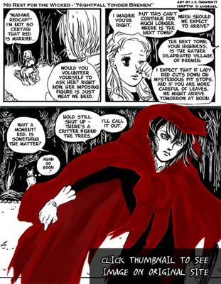
I can't help but wonder how many webcomics out there have their own well... fancomics? Heck, some of the more popular webcomics out there ARE fan-comics (See Powerpuff Girls Doujinshi). Sure, many have had guest comics and fan art. A few have fan-works like fanfiction... but a fancomic of a webcomic?
At the very least, it does say something for No Rest For the Wicked. I'd say that it's a pretty good indicator of being a good read. ;)
For those of you who need an introduction to NRFTW, I point you towards the 6th Leg of the blog, which is where I fins stumbled across it (and was very very very glad I did).
But what I want to talk about today isn't NRFTW. Instead it's the little bit of news that's currently on the front page of NRFTW.
You see, No Rest for the Wicked now has its own fancomic.
It's called Nightfall Yonder Bremen, and while it has barely started, it shows a lot of promise, seems competently executed and most importantly, tries to stay faithful to the original material.
I can't help but wonder how many webcomics out there have their own well... fancomics? Heck, some of the more popular webcomics out there ARE fan-comics (See Powerpuff Girls Doujinshi). Sure, many have had guest comics and fan art. A few have fan-works like fanfiction... but a fancomic of a webcomic?
At the very least, it does say something for No Rest For the Wicked. I'd say that it's a pretty good indicator of being a good read. ;)
Thursday, August 4, 2005
Stopover at Astronaut Elementary: The WCN Effect
I'm not sure how I missed it, seeing that it was on Websnark, but Dave Roman's Astronaut Elementary apparently moved from GAM to WCN, which is the webcomics equivalent of shifting rooms in the same building, except that one is behind the subscription curtain and one isn't.
I like Dave Roman and his stuff, and naturally his being able to unleash his creativity unrestricted upon the rest of the webcomics world can only be a good thing in my view. But I can't help but wonder about this new shift in direction, especially when I know Dave isn't the only one to be/who will be doing this.
From the point of view of Joey Manley of course, it probably wouldn't make that much of a difference, because whether it's Girl-a-Matic or Graphic Smash or WebcomicsNation, they'll all under the Modern Tales umbrella. Still, I can't shake off the feeling that things are going to change a lot after this. Like it or not, the WCN effect is in motion, and I highly doubt that there is much anyone can say or do to change that.
Ps: I realise that with that last link I am admitting to reading the webcomics tabloid, but tee hee... that silly stuff is interesting sometimes. ;)
32nd Leg: Cartharsis
After a nice long rest, we're back to travel the world of webcomics again! Today we're continuing from where we left off. If you recall (I highly doubt you do, it's been a heck of a time) the last time I was over at Super Hero Vindibudd and the banner of the ninja-cat caught my eye, leading me to...

Comic: Catharsis
By: J. Boeke
Setting and Elements: Modern Day, Slice of Life, Surreal
Content Type: Adventure, Drama, Humour, Severe Cuteness Overload ;)
Art Medium: Inked and coloured, Later Strips appear to be drawn digitally.
Art Style: Hand-Drawn, Stylised, Mix of B/W and Full-colour
Is About: Gwen, who happens to have a dragon as a pet in her apartment... along with a bad-tempered squirrel... and a ninja-cat... and a colony of dust-bunnies and fluffs...
Website: http://www.catharsiscomic.com
Frequency: Daily
Availability: Free
First Impressions and Presentation:
The dragon and stuff looks familair, then I realise that I've seen Catharsis being endorsed by Adis over at Count Your Sheep before. Other than the given that if Adis endorses a comic it's probably good, the art looks really good, especially the dragon.
The website is simple, but enhanced with lots of em... tribal-looking... erm cherries(?) that make up the navigation. I have to idea what they are but OMG they are cute!
The Concept:
Comparisons to Calvin and Hobbes in envitable in this genre, because it's well, the story of a kid and his/her imaginary friend. Now imagine what happens if the kid has grown up and has to take on the challenges of being grown up, but the imaginary friend isn't imaginary but mythical instead. And despite the kid having grown up, she's still very in-tune iwth her inner child. Heck, she even turns into her inner child from time to time.
That's pretty much describes the concept behind Catharsis.
The Art:
While early art is done in grayscale, and differs from what you see on the front page, art is always competent, done in a very individual semi-realistic but stylised cartoony art-style. As the series progress, the art keep improving dramatically until it reaches the very attractive a recognisable stuff you see on the front page.
The artist seems to particularly excel at (how can I say this without sounding idiotic?) drawing cute stuff. Ranging from the balls of fluff with darling beady eyes to the crazy tribal cherries and naked squirrels, the plethora of of excellent cute character designs never fail to astound me.
There's not much background in most of the strips, but where there's a need for them, they're there and competently executed. All in all the art while although not jaw-droppingly awesome, is excellent in a comfortable sort of way, and very distinctive, which most of you know by now scores major points with me.
The Writing:
As good as the art is, the writing for Catharsis is the major pull. It alternates between 'funny' and 'light-drama', but it never lets itself get too serious, and the jokes are consistently funny. JB also has the knack of capturing those 'slice-of-life' moments that most of us have been through, like constantly making a fool of yourself in front of the cute guy from your building, or those awww when something bad happens and all you have is your dragon friend to hug.
The thing that makes my cup run over, however, has to be the characters themselves. Gwen is a very easy character to identify with, while Rremly is endearing, all the more so because of his apparent naivete despite being a dragon with a long lifespan. The other supporting characters have individual personalities that are well fleshed-out. Seriously, when the writer can give three balls of fluff distinct and lovable characters, it's hats off to the creator's writing skills.
Oh, and Bitey rocks.
Problems:
Frequent fillers in the archives are annoying, but given that a comic of this quality updates daily it's understandable, although it doesn't make going through the archives any easier.
Other than that, no major quibbles I can lay my hands on.
Overall:
It's not often that I come across a comic that I start reading and forget that I'm reading, because I'm so caught up in the escapades of the characters. Catharisis is a Find of Finds, and I'm very glad I discovered this little gem.
As an added plus, Cartharsis is suitable for kids to read, which as you remember I was stating not too long ago, is a rare amongst webcomics.
And I want a shirt with one of those cherries on it. :D
The Next Leg:
The Catharsis link page has to be one of the cutest I've ever seen. Being responsible, it even has a ratings system for the links.
The Dementia of Magic looks intriguing. Besides, something with "Magically magnificent!" as a description sounds good ;)
Wednesday, August 3, 2005
Pinging Art #0.6: A Quick Note on Composition and The Importance of Camera Angles
So here I am drawing the last page of The Jaded Chapter 3: Black Earth.
The scene I'm trying to illustrate is Doc Ice sitting in the passenger seat of a car, with Jade in the driver's seat and his crucifix earring very visible. Jade asks Ice a question, Doc answers cryptically.
So here's the preliminary sketch (digital equivalent of a penciled sketch) that I use for layouts.
As you can see, there's nothing particularly wrong with this composition. Everything that needs to be depicted is being depicted, but for some reason, the whole scene just looks rather... boring. It's flat and there's nothing particularly interesting about it.
So I decide to give the same scene a second go, this time using a different camera angle and a more dramatic viewpoint. The result:
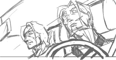
I really liked this composition. It's important to note that the steering wheel in the foreground helps break up the motony and gives the panel more depth. Unfortunately, at this point, I realise:
Ok you can laugh at me now. So for the sake of consistency we relegate the two to the back seat, and someone else (presumably Juno or Lysanne) will be driving.

This is kind of a blow because that means I have to remove my steering wheel, but adding the window and the little rain shield at the top of it will help give a kind of frame to the picture. The result is a more 'closed' look, and hence a less empty-looking panel and better comic page overall.
Now back I go to sketching, or T won't be pleased at the state of my buffer! ;)
Edit: Thought you might be interested in the final result. I added theoverlay of the trees to give it a reflection-on-the-glass effect. Since it was the last page I thought it deserved something special.

Edit 2: Abby and Mos pointed out the perspective error on Jade's face which I missed, so here's the correction.
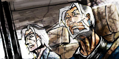
Having my mistakes pointed out to be is great, BTW. I can't improve without knowing what I'm doing wrong!
The scene I'm trying to illustrate is Doc Ice sitting in the passenger seat of a car, with Jade in the driver's seat and his crucifix earring very visible. Jade asks Ice a question, Doc answers cryptically.
So here's the preliminary sketch (digital equivalent of a penciled sketch) that I use for layouts.

As you can see, there's nothing particularly wrong with this composition. Everything that needs to be depicted is being depicted, but for some reason, the whole scene just looks rather... boring. It's flat and there's nothing particularly interesting about it.
So I decide to give the same scene a second go, this time using a different camera angle and a more dramatic viewpoint. The result:

I really liked this composition. It's important to note that the steering wheel in the foreground helps break up the motony and gives the panel more depth. Unfortunately, at this point, I realise:
- British cars have the driver's seat on the right side
- I can't flip the image because Jade's earring is on the left ear.
- Jade is supposedly nursing a recently broken arm, and shouldn't be driving anyway
Ok you can laugh at me now. So for the sake of consistency we relegate the two to the back seat, and someone else (presumably Juno or Lysanne) will be driving.
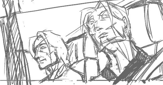
This is kind of a blow because that means I have to remove my steering wheel, but adding the window and the little rain shield at the top of it will help give a kind of frame to the picture. The result is a more 'closed' look, and hence a less empty-looking panel and better comic page overall.
Now back I go to sketching, or T won't be pleased at the state of my buffer! ;)
Edit: Thought you might be interested in the final result. I added theoverlay of the trees to give it a reflection-on-the-glass effect. Since it was the last page I thought it deserved something special.
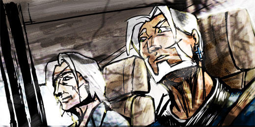
Edit 2: Abby and Mos pointed out the perspective error on Jade's face which I missed, so here's the correction.

Having my mistakes pointed out to be is great, BTW. I can't improve without knowing what I'm doing wrong!
Tuesday, August 2, 2005
Pinging Art #0.5: A Study of Drawing the Human Foot
Ah, my great nemesis. The foot. Worse than the hand... mainly because I don't get to draw it as much.
So today I decided: "Enough of avoiding the monster!", sat down and devoted a couple hours to studying the human foot.
One thing I hate about drawing the foot is that it's so hard to find detailed tutorials on it. Most books devote pages after page of how to the draw the face, body and hands, but barely include a page on feet as an afterthought. Even the great Loomis glosses over it, which annoys me to no end.
So here I go, Google for reference (BTW, don't google "bare feet" on Image Search. Just... don't). After a solid hours of attempts at drawing feet I won;t bore you with, I realised several things.
1. From the front, the human feet are a major a pain in the ass to draw.
Seriously, that wasn't really a revelation, but I just realised that anew. But back to the other points:
2. The human foot slants to the side.
There seems to be a line from the center of the foot to the center of the big toe which marks the split in directions the foot slants.
3. The heel is a cone.

I picked this one up from my copy of Action Cartooning by Ben Caldwell (An interesting book I'd recommend). The heel is sort of a cone, aligning with the leg bone at the point.
4. The human toes aren't just the bits you see at the end of the foot. They are connected to the pad thing at the base of the foot. (I never realised this before)
Don't forget to click on the image to read the notes I've scribbled on the diagrams. This is probably the most essential thing to understand to have the feet look right. Without the fleshy pads the feet don't look like feet.
5. The toes have joints. (Don't laugh, I should have known, but it just never occured to me)
This is the thing that make toes look like toes. They have to look crimped, otherwise they look unnatural. There's got to be that knuckle like bump and the little gap between the fleshy pad and the toe ends.
So with this new-found info, I'm going to test it out by drawing a series of feet from different positions:
The side of the foot is relatively easy. The important thing is to lay out the fleshy pads and the heels in the right places. The big toe is also bigger than the flesh pad, so it overlaps it.
This is the side of the foot, but from the side of the little toe. More common in view than the other side, it's imparative to note the little toe is smaller than the fleshy pad so you can see a bit of it over the toe end and knuckles.

View of feet from the top. I'm told by a very reliable source (my podiatrist friend) that the fleshy pad sticks out so exaggerating it makes for more realistic -looking feet when there's an in-curve.
The sole. Not particularly interesting, other than being a good map of the layout of the fleshy pads and toes. Note the you can't really see the second joint of the big toe from this angle.
The most difficult view to draw the foot from. You need to have good grasp of geometry and perspective to be able to lay the shapes in line and get the right shape. Important things in making it look right is having the fleshy pad in the right place and showing that it's slightly wider than the toe rows.
And that's it. While I would not like to pass myself off as an expert in drawing feet, I'm reasonably happier and won't be dreading drawing feet the next time they come up in any of my art projects!
So today I decided: "Enough of avoiding the monster!", sat down and devoted a couple hours to studying the human foot.
One thing I hate about drawing the foot is that it's so hard to find detailed tutorials on it. Most books devote pages after page of how to the draw the face, body and hands, but barely include a page on feet as an afterthought. Even the great Loomis glosses over it, which annoys me to no end.
So here I go, Google for reference (BTW, don't google "bare feet" on Image Search. Just... don't). After a solid hours of attempts at drawing feet I won;t bore you with, I realised several things.
1. From the front, the human feet are a major a pain in the ass to draw.
Seriously, that wasn't really a revelation, but I just realised that anew. But back to the other points:
2. The human foot slants to the side.

There seems to be a line from the center of the foot to the center of the big toe which marks the split in directions the foot slants.
3. The heel is a cone.
I picked this one up from my copy of Action Cartooning by Ben Caldwell (An interesting book I'd recommend). The heel is sort of a cone, aligning with the leg bone at the point.
4. The human toes aren't just the bits you see at the end of the foot. They are connected to the pad thing at the base of the foot. (I never realised this before)

Don't forget to click on the image to read the notes I've scribbled on the diagrams. This is probably the most essential thing to understand to have the feet look right. Without the fleshy pads the feet don't look like feet.
5. The toes have joints. (Don't laugh, I should have known, but it just never occured to me)

This is the thing that make toes look like toes. They have to look crimped, otherwise they look unnatural. There's got to be that knuckle like bump and the little gap between the fleshy pad and the toe ends.
So with this new-found info, I'm going to test it out by drawing a series of feet from different positions:


The side of the foot is relatively easy. The important thing is to lay out the fleshy pads and the heels in the right places. The big toe is also bigger than the flesh pad, so it overlaps it.


This is the side of the foot, but from the side of the little toe. More common in view than the other side, it's imparative to note the little toe is smaller than the fleshy pad so you can see a bit of it over the toe end and knuckles.

View of feet from the top. I'm told by a very reliable source (my podiatrist friend) that the fleshy pad sticks out so exaggerating it makes for more realistic -looking feet when there's an in-curve.


The sole. Not particularly interesting, other than being a good map of the layout of the fleshy pads and toes. Note the you can't really see the second joint of the big toe from this angle.


The most difficult view to draw the foot from. You need to have good grasp of geometry and perspective to be able to lay the shapes in line and get the right shape. Important things in making it look right is having the fleshy pad in the right place and showing that it's slightly wider than the toe rows.
And that's it. While I would not like to pass myself off as an expert in drawing feet, I'm reasonably happier and won't be dreading drawing feet the next time they come up in any of my art projects!
Friday, July 29, 2005
Stopover at WebcomicsNation
Webcomics Nation launched today. Granted, I've been a beta tester for WCN for a while so it hasn't really felt very different for me.
I do find myself in an interesting position of course, as you know I'm involved in Comic Genesis (formerly known as Keenspace) and now I'm also in the rival WCN camp. Given that CG is having humoungous teething problems at the moment (Teething? More like sabre-toothed Fangs) it probably couldn't be a better time for Joey to lauch WCN.
Personally, I think WCN is quite easy to use. People have been making comparisons to Blogger and Flickr, and they're almost spot on except the interface isn't as shiny yet. The only thing that recently I realised annoyed me about it is the dubious HCI-design aspect of it, where it commits a cardinal sin in HCI (Human Computer Interface) and has a shifting interface. Bad Bad Bad. You want all your navigational stuff to stay the same if possible.
However, putting up a comic in WCN is something like
1) Press button that says "Add New Page"
2) Press button that says "Upload Comic"
3) Enter date you want comic to display.
It's much simpler, though more restrictive compared to CG, but there are a lot of cool features, such as this "tooncasting" which I would use on a lot of my pages if the green "Hosted by WCN" text wasn't so big and ugly. Automated gallery and cast pages are pretty cool too, I admit. And having free advertising doesn't hurt either.
The price is $9.99 per month, which some people have mentioned as 'steep'. It'll be interesting to see if the price remains there or if it goes up or down.
All in all, I think WCN will be a good thing for webcomics. Anything that makes it easier to put up a webcomic is a good thing, certainly, and I like the idea that there's an alternative for Comic Genesis.
Granted I may have ulterior motives since I help run the Comic Genesis Help Center and less complaining is always welcome ;)
Edit: And it's ad free. I forget to mention that.
Thursday, July 28, 2005
Pinging Art #0.4: A Study of Drawing the Male Torso (Sideways)
Today I'm sketching a logo image for The Longest Sojourn. So here's another grand opportunity for a study of the male anatomy again.
This is based off a reference picture, but some fun things to notice. End of the shoulder muscles (deltoids?) line up with the bottom of the breasts in an arc. You'll also notice I used the symmetry grids from the first study to draw the muscles in. The way of drawing the pelvis and leg-bones is a technique I picked up from Loomis' Mannikins. (Incidentally, Loomis' Figure Drawing For All Its Worth is an amazing book I'd recommend to anyone. You can learn loads off it if you don't mind the textbook approach.
We'll ignore the muscles in green and red, since those were the ones we studied in the Man-Chest tutorial. What we want are the muscles in blue and purple, which are the side view ones.
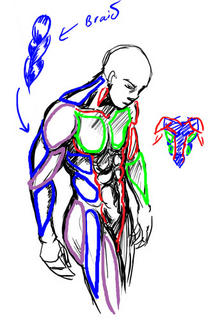
One thing you'll notice is that from the side, the arm mucles sort of resemble a braid. From this angle the triceps are visible, and the lower arm muscles (It's actually a group of several muscles) stretch over from the end of the bicep to the elbow. This is not really anatomically accurate, but very much simplified. You want detailed muscles Loomis has a very detailed chart.
Another good thing to notice is the huge neck muscle stretching all the way from the nape of neck to the shoulder muscle. Memorise that one.
So from this study, we can summarise the visible muscles from the side as such:
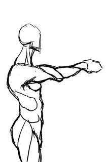
And turn them into a chart for easy reference in the future.
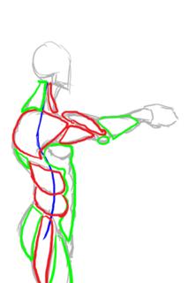
Hopefully that makes it easier to draw the male figure from sideways.
Incidentally, for those of you who wondered what was the outcome of this study:
This is the imagemap logo I got after I finished, which hopefully will feature on the next incarnation of the TLS website.

This is based off a reference picture, but some fun things to notice. End of the shoulder muscles (deltoids?) line up with the bottom of the breasts in an arc. You'll also notice I used the symmetry grids from the first study to draw the muscles in. The way of drawing the pelvis and leg-bones is a technique I picked up from Loomis' Mannikins. (Incidentally, Loomis' Figure Drawing For All Its Worth is an amazing book I'd recommend to anyone. You can learn loads off it if you don't mind the textbook approach.

We'll ignore the muscles in green and red, since those were the ones we studied in the Man-Chest tutorial. What we want are the muscles in blue and purple, which are the side view ones.

One thing you'll notice is that from the side, the arm mucles sort of resemble a braid. From this angle the triceps are visible, and the lower arm muscles (It's actually a group of several muscles) stretch over from the end of the bicep to the elbow. This is not really anatomically accurate, but very much simplified. You want detailed muscles Loomis has a very detailed chart.
Another good thing to notice is the huge neck muscle stretching all the way from the nape of neck to the shoulder muscle. Memorise that one.
So from this study, we can summarise the visible muscles from the side as such:

And turn them into a chart for easy reference in the future.
Hopefully that makes it easier to draw the male figure from sideways.
Incidentally, for those of you who wondered what was the outcome of this study:

This is the imagemap logo I got after I finished, which hopefully will feature on the next incarnation of the TLS website.
Subscribe to:
Posts (Atom)